Card War: Creating the User Interface
What This Tutorial Covers
Storyboard Layout
Build the game UI visually with constraints.
Custom Controls
Buttons and image views configured for the game.
Auto Layout
Constraints that adapt to every iPhone size.
Noble Desktop's Full-Stack Web Development Certificate teaches programming fundamentals that transfer across mobile, web, and desktop development.
Deepen your iOS Development skills by following this comprehensive tutorial which covers essential topics such as importing images, adding buttons and labels, setting constraints for UI elements, and building a simplified version of the card game War.
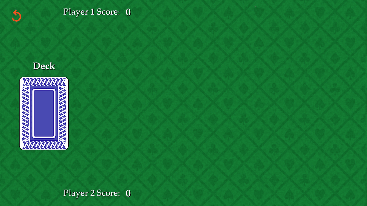
Exercise Preview
Setting up Our User Interface
In the Project navigator’s list of files, click on Main.
The UI we’re going to create will be Landscape orientation, so click its button
 .
.If the Document Outline is not showing to the left of the Project navigator, go to the bottom left of the Editor area and click the Show Document Outline button
 .
.In the Document Outline, expand both View Controller Scene and View Controller if they aren’t already.
We’re going to add a lot of objects to our View, so let’s make sure we don’t get confused later. Select the View and press Return so we can rename it.
Name it superView and press Return.
NOTE: Just like the super keyword we’ve used in previous exercises, the word super refers to inheritance. This view will have lots of child objects, hence the name.
We’ll add a background image once we’ve created the rest of our design. For now, let’s choose a color that is similar to the image we are going to use. In the list of inspectors on the right, make sure you are in the Attributes inspector
 .
.In the Attributes inspector next to Background, click once on the bar.
In the Colors panel that appears, make sure you are in the Color Palettes (the third button), and the palette menu below the buttons says Crayons.
Choose Clover and close the panel.
Adding the Button That Draws the Cards
The first element we’re going to add is a button that we will use to draw the cards. In the bottom search field, type button to filter the list.
Drag the Button to the view, dropping it on the left-hand side of the screen and horizontally centering it. This is around where we’ll eventually position it using constraints, so don’t worry about getting the placement exact.
In the Attributes inspector
just below Title, delete the Button text.Instead, we want this button to look like the back side of our deck of cards. Next to Image type: Card-Back
Press Return to apply the image.
Whoa, that’s huge! To shrink the card down, let’s apply some constraints.
In the Document Outline, hold the Control key and drag from Button to the superView just above it. As you drag, a blue line will appear showing you the connection you are creating. Once you release the mouse, you’ll get a pop-up menu where you will select Center Horizontally in Safe Area.
NOTE: Remember that if you have a two-button mouse (or an Apple Magic Mouse that behaves as such), either Right mouse button–drag or Control–drag will work.
Hold Control or the Right mouse button and drag up to the superView once more. This time, choose Center Vertically in Safe Area.
To set a proportional height on our card back button, repeat the process one more time, this time selecting Equal Heights.
At the bottom right, click the Update Frames button
 . Not quite there yet…
To prevent the image from distorting to fit the current constraints, we need to tell Xcode to always display the card at the image’s native aspect ratio.
To do so, we can assign a constraint to the card back object itself. Hold Control or the Right mouse button and drag Button to itself (by just dragging slightly along a horizontal line), and select Aspect Ratio from the pop-up.
Now that we’ve got our four constraints for position and size, let’s specify the aspect ratio we need. On the top right, switch to the Size inspector
 .
.In the Size inspector
under Constraints, locate the 329:375 Ratio constraint, which should be listed first. Next to it, click the Edit button.We want the ratio to be the size of the image (in pixels). Our image is 329 X 488 px, so change Multiplier to 329:488.
To close the pop-up and apply the changes, click outside the pop-up or press Esc.
TIP: If the image’s aspect ratio didn’t automatically change, Update Frames
now. Remember to do so for the next few steps if you don’t see changes once you have edited each constraint!Next to the Equal Height constraint, click the Edit button.
To make the image 36% of the superView’s height, change Multiplier to 0.36 and press Esc.
Now that we’ve got the size we want, let’s move the button toward the left-center of the screen. Next to the Align Center X constraint, click the Edit button.
We want the center of the card to be positioned 24% of the way between the left edge and the center of the superView. To change the alignment to a factor of 0.24, change Multiplier to 0.24 and press Esc.
NOTE: The default factor of 1 centers the image. Values smaller than that position it further to the left, and larger values push it rightward.
Next to the Align Center Y constraint, click the Edit button.
To position it a little lower on-screen than its current position, change Multiplier to 1.1 and press Esc.
Great, now our card back button object finally looks like it will in our app!
Labeling the Deck & Each Player’s Score
To create a good user experience, we want to place a label above the button that will inform users what the button represents. Additionally, we need labels that will keep track of each player’s score. Let’s style our first label, duplicate it a few times, then adjust each label’s text and position accordingly.
In the bottom right Objects filter, type: label
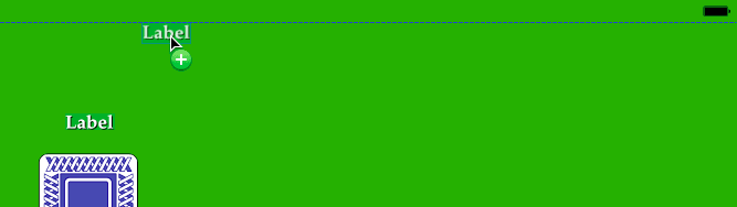
Drag Label to the view, dropping it once it’s vertically centered above the card back button. Exact positioning doesn’t matter yet.
Let’s alter a few of this label’s properties. On the top right, switch back to the Attributes inspector tab
.Next to Color, click once on the word Default and select White Color.
Next to Font click the
 button and set the following:
Font: To select a different font, choose Custom Family: Palatino Style: Bold Size: Keep it at 17 Click Done.
Next to Alignment, click the Center Align button
 .
.To make the label easier to read, let’s give this text some shadow behind it. Next to Shadow, click once on the word Default and select Black Color.
Change both Shadow Offset values (both the Width and Height) to 1.
In the Editor, resize the label to display all the Label text, repositioning it if needed.
With the label selected, hold down the Option key and drag a copy above and to the right of the original label, approximately as shown:
Once again, hold down Option and drag off another copy, positioning it directly to the right of the first copy, with a bit of space between them as shown:

Select the original Label, and change its text by doing one of the following:
- In the Attributes inspector just below Text, replace the Label text with Deck and press Return.
- In the Editor, double–click on the Label text to make the entire text editable (highlighted in blue). Replace the Label text with Deck and press Return.
Near the top of the user interface, select the left duplicate Label. Use one of the methods above to change the text to Player 1 Score: (including the colon!).
If you can no longer see all the text, drag out the text box’s right resize handle.
With the Player 1 Score label still selected, go to the Attributes inspector, click the
button, and change the following:Style: Roman or Regular Size: Shrink it down to 16 Click Done.
Change the Alignment by clicking the Left Align button
 .
.Select the right duplicate Label and change its text to 0 (the number zero). This is Player 1’s initial score before any cards have been drawn.
This is important info, so let’s make it bigger. Directly to the right of the
button, notice the menu arrows  . Click the up arrow once to change the font size to 18.
With the 0 label still selected, hold the Command key and click on the Player 1 Score label. Both objects should now be selected.
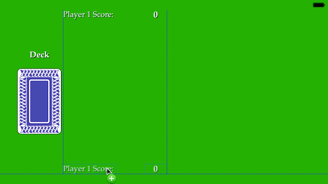
Hold Option and drag a set of copies directly down, dropping them near the bottom of the screen. Release the mouse when the blue guides indicate that the duplicates are aligned with the originals, similar to the following image:
Near the bottom of the screen, select the duplicate Player 1 Score: label and change it to read: Player 2 Score:
Adding Constraints to Our Labels
The size of a label is determined by the font size of its text, so each of our labels will only need two constraints. Let’s add them now.
We can also set constraints by dragging UI elements in the Editor. In the Editor, select the Deck label so we can set constraints in reference to the card back button.
Hold Control or the Right mouse button and drag from the Deck label down to the card back button, as shown:
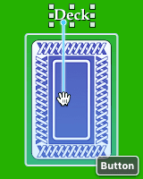
Choose Center Horizontally.
Hold Control or the Right mouse button and drag once more from the Deck label down to the card back button. Choose Vertical Spacing so we can establish a good amount of spacing between the text and the top of the card back.
Let’s edit the amount of spacing! On the top right, switch to the Size inspector
.Next to the Bottom Space constraint, click the Edit button.
To make the distance between the text and the button a little bit taller than the height of the text itself, change the following:
- To the right of Constant, notice the number. Delete whatever number you have and replace it with 0.
- Change the Multiplier to 1.06.
- Click outside the pop-up or press Esc.
At the bottom right, click the Update Frames button
.Let’s constrain our Player 1 Score label in relation to the superView. In the Document Outline (not the Editor!), hold Control or the Right mouse button and drag from the Player 1 Score label up to the superView.
Choose Center Horizontally in Safe Area.
Repeat the process once more, this time selecting Center Vertically in Safe Area.
In the Size inspector, edit the Multiplier for the constraints as follows (click the Edit button one at a time, enter the value, then dismiss the pop-up):
Constraint Multiplier Align Center X 0.5 Align Center Y 0.12 At the bottom right, click the Update Frames button
.Let’s vertically constrain our Player 2 Score label in relation to the superView. This time, we can do this in the Editor. Hold Control or the Right mouse button and drag from the Player 2 Score label to any empty green area, as shown:
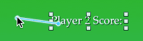
Select Center Vertically in Safe Area.
We also want to constrain this label in relation to the Player 1 Score label. This way, if we ever need to move both labels along the X-axis, all we will need to do is adjust the value for the first label.
Hold Control or the Right mouse button and in the Editor, drag from the Player 2 Score label up to the Player 1 Score label. Select Leading.
With the Player 2 Score label selected, go into the Size inspector and next to the Align Center Y constant, click the Edit button.
Change Multiplier to a factor of 1.88 and dismiss the pop-up.
At the bottom right, click the Update Frames button
.Hold Control or the Right mouse button and in the Editor, drag from the top 0 label to the Player 1 Score label. Choose Center Vertically so it will be at the same height as the label to its left.
Once more, Control–drag or Right mouse button–drag from the top 0 to the Player 1 Score label. This time, select Horizontal Spacing.
Go to the Size inspector and next to the Leading Space constant, click the Edit button and change the following:
Constant: Remove it by changing the number to the right of this menu to 0 Multiplier: Change it to 1.04 At the bottom right, click the Update Frames button
.Let’s rinse and repeat by applying the same constraints between the bottom 0 and the Player 2 Score label. To recap:
- Create two constraints, Center Vertically and Horizontal Spacing.
- In the Size inspector, edit the Leading Space constant.
- Change the number next to Constant to 0, and set Multiplier to 1.04.
- At the bottom right, click the Update Frames button .
Adding a Button to Restart the Game & Constraining It
Our game will end after 26 rounds—once all 52 cards in the deck have been drawn. Let’s add a button that allows the user to restart the game if they want to play our game of War again.
In the bottom search field, type button to filter the list.
Drag the Button to the view, dropping it near the top-left corner of the UI.
On the top right, switch to the Attributes inspector tab
.Just below Title, delete the Button text.
Next to Image type: restart and press Return to apply it.
This button will be the topmost and leftmost object in our UI. To make it easier to keep track of where any given UI element is located, we recommend ordering your Document Outline from top to bottom, and left to right. In the Document Outline, drag the bottom Button object up so it’s the first child object under the superView’s Safe Area.
The first two objects are named Button. How confusing! Rename them as follows:
Top Button: Restart Button Bottom Button: Deck Button To constrain the Restart Button in relation to the superView, set the following three constraints. (Remember to hold Control or the Right mouse button, drag to the superView, choose one of these options, then rinse and repeat until done.)
- Center Horizontally in Safe Area
- Center Vertically in Safe Area
- Equal Heights
Hold Control or the Right mouse button and drag Restart Button to itself (by dragging along a horizontal line), and select Aspect Ratio.
On the top right, switch to the Size inspector tab
.Edit the Multiplier for these constraints as follows:
Constraint Multiplier Align Center X 0.09 Align Center Y 0.15 Equal Height 0.07 NOTE: If the numbers next to the Ratio constraint (the third one) is anything other than 1:1 (for a perfect square), change its Multiplier to 1.
At the bottom right, click the Update Frames button
.
Adding & Constraining the Background Image
Our UI is just about done—all we need to do is to add in the actual background image, replacing the temporary solid green color. In the bottom right Objects filter, type image to filter the list.
Drag Image View to the Storyboard, dropping it towards the center of the UI.
On the top right, switch back to the Attributes inspector by clicking its button
.Next to Image, type Felt and press Return.
In the View section, find the menu next to Content Mode. Click into it and select Aspect Fill so the image will maintain its aspect ratio, and not be deformed.
To ensure that our background image is below everything else in the layer stack, go to the Document Outline and drag Felt above the superView’s other objects.
We can make the image the same size as the superView, create these four constraints by Control–dragging from Felt to the superView:
- Center Horizontally in Safe Area
- Center Vertically in Safe Area
- Equal Widths
- Equal Heights
Go to the bottom right of the Editor and click the Update Frames button
.Now the felt background image should fill the entire screen, and the other UI elements are displayed on top of it.
Save the file and keep Xcode open so that we can continue with this file in the next exercise.