Creating the Band Detail View
What This Tutorial Covers
Detail Controller
Display selected band data in a detail view.
Data Passing
Pass band info from list to detail via segue.
Layout & Styling
Build the visual layout in the storyboard.
Noble Desktop's Full-Stack Web Development Certificate teaches programming fundamentals that transfer across mobile, web, and desktop development.
Delve into the intricacies of iOS Development with this comprehensive tutorial, featuring step-by-step instructions on how to add image placeholders, titles, subtitles, descriptions, and dividers.
Exercise Preview
Adding an Image Placeholder, Title, & Subtitle
Let’s start by adding placeholders for some detailed info. We’ll add a placeholder for an image of the band along with the band name and type of music.
- In the Document Outline, under View Controller Scene, click View Controller to select it.
- In the Utilities area on the right, click the File inspector tab
 .
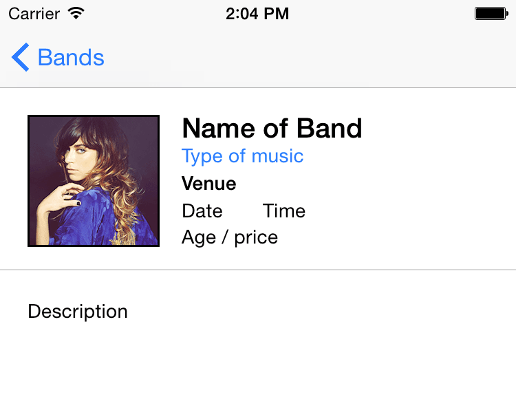
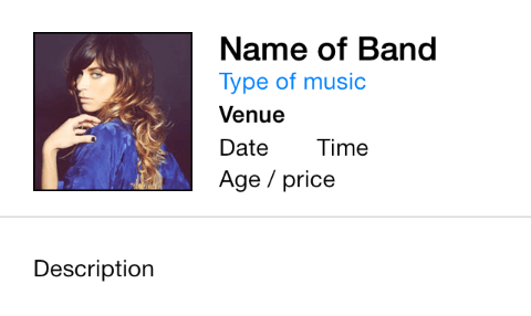
. To give you a better idea of the layout we want to create in this exercise, below is the final goal:
Let’s start by adding the image placeholder. We can use the Image View object to display a single image. In the search bar at the bottom of the Object library
 , type: image
- Drag Image View onto the empty view controller in the storyboard. (Don’t worry about placement. We’ll fix that next.)
- It’s too big, so let’s resize it. In the Utilities area on the right, click on the Size inspector tab
 .
. Set the following (make sure you hit Return when you enter the final value):
X: 20 Y: 96 Width: 96 Height: 96 - Let’s add a label object for the band name. In the search bar of the Object library , delete the text and type: label
- Drag the Label to the right of the Image View object. Don’t worry about a specific position yet.
- Double–click on the Label in the Editor, change the name to Name of Band and hit Return.
In the Size inspector
set the following:X: 132 Y: 95 Width: 166 Height: 21 - Click on the Attributes inspector tab
 .
. To the far right of Font, click the Text Menu icon
 and set:
Style: Bold Size: 20 NOTE: Currently the iOS default system font is San Fransisco.
- Click Done.
- Let’s add a label for the type of music. Drag out another Label from the Object library , and drop it below the Name of Band label. Don’t worry about its specific position yet.
- Double–click the new Label you just added.
- Rename it Type of music and hit Return.
- With the Type of music label still selected, in the Attributes inspector , click the Text Menu icon to the right of Font.
- Change the Size to 14.
- Click Done.
- Let’s change the Type of music label’s text color. In the Attributes inspector to the right of Color, click the menu that says Default.
- If you see a blue color in the Recently Used Colors, select it and skip the next step.
To select a blue that matches Apple’s blue, do the following:
- Choose Other to pull up the Colors window.
- At the top of the Colors window, click the second tab
 .
. - In the Slider menu, select RGB Sliders if you don’t already see them.
- Select a color with R:0, G:122 and B:255.
- Close the Colors window.
With the Type of music label still selected, in the Size inspector
set:X: 132 Y: 115 Width: 166 Height: 21
Adding Show Info Labels
Next we will create labels for the date, time, and venue of the show.
- From the Object library , drag out a Label and place it below the Type of music.
- Double–click on the new Label, rename it Venue and hit Return.
With the Venue label still selected, in the Size inspector
set:X: 132 Y: 135 Width: 166 Height: 21 With the Venue label still selected, in the Attributes inspector
, click the Text Menu icon to the right of Font and set the following:Style: Bold Size: 14 - Click Done.
- We want to add a label for the date, and it should look similar to the venue label, so let’s duplicate it by dragging out a copy of it. Hold Option and drag the Venue label down to create a copy.
- Double–click the second instance of Venue, rename it Date and hit Return.
- With the Date label still selected, in the Attributes inspector , click the Text Menu icon .
- Change the Style to Regular.
- Click Done.
With the Date label still selected, in the Size inspector
set:X: 132 Y: 155 Width: 55 Height: 21 - We need another label for the time. The time will go to the right of the date, so hold Option and drag the Date label to the right to create a copy.
- Double–click on the copy you just created and rename it Time.
With the Time label still selected, in the Size inspector
set:X: 191 Y: 155 Width: 60 Height: 21 - We need one more label for this top section. Hold Option and drag the Date label down to create a copy.
- Double–click the second (bottom) Date label and rename it Age / price.
With the Age / price label still selected, in the Size inspector
set:X: 132 Y: 174 Width: 166 Height: 21
Adding a Description
- Just one more label to go! Drag out a Label from the Object library , and drop it below the Image View.
- Double–click the label, rename it Description and hit Return.
With the Description label still selected, in the Size inspector
set:X: 20 Y: 219 Width: 280 Height: 39 NOTE: The description could end up being one or two lines of text. Currently the text is vertically centered within the label area. The alignment would look odd if we sometimes have one line of text, and other times have two lines. In a later exercise we’ll programmatically set it to vertically align to the top.
As shown below, in the Attributes inspector
to the far right of Font, click the down arrow until the font size ends up at 14.
Adding a Divider
Let’s add a horizontal line to visually separate the top info from the description. There’s no specific object to create a line, but we can use a short view as a line.
In the search bar at the bottom of the Object library
, delete the text and type view.NOTE: View will be one of the last objects listed in the Object library.
- Drag the View object below the description. Don’t worry about the size and positioning, we’ll adjust that shortly.
- In the Attributes inspector , next to Background click on the color bar to open the Colors window. (If a menu appears instead, choose Other and the Colors window will open.)
- At the top of the Colors window, click the second tab to see the color sliders.
- There will be a menu that says Color Sliders. From that menu choose Gray Scale Slider.
- To the right of the Brightness slider, type in 85 for the % and hit Return to apply it.
- Close the Colors window.
In the Size inspector
, set the following:X: 0 Y: 207 Width: 375 Height: 1 Those settings should position the line between the description and the info above it. Please note that we’re leaving so much empty space below the description so we can add a video in a later exercise.
Adding the Band Images
Let’s add one of the actual band images to the placeholder. First we need to add the images into our project.
In the Project navigator, click on Assets.xcassets.
- Switch to the Desktop and navigate into: Class Files > yourname-iOS Dev Level 2 Class > Band Images > fullsize
This folder contains both the regular images along with the Retina and Retina HD versions of the images. Press Cmd–A to select all the images in that folder.
NOTE: You may remember from a previous exercise that Retina images must be twice the pixel dimensions of non-Retina images and end with @2x in their filename. Retina HD images must be three times the dimensions of regular images and end with @3x.
- With Xcode visible, drag the images to either column in the Editor.
- Click on Main.storyboard.
- Click the UIImageView placeholder in the Editor.
- In the Attributes inspector , from the Image menu choose full-nicole-atkins.
- Let’s see how this looks so far. Click the Run button.
When the app loads in the Simulator, click on any of the bands to view the detail view we just made. Awesome!
NOTE: Currently, clicking any cell will lead to the same detail view. In the next exercise, we’ll show you how to code the app so the details for each of the bands are shown.
- Switch back to Xcode.
- Click the Stop button.
- Do a File > Save.
Leave the project open. We’ll continue to work on it in the next exercise.