April 1, 2026Dan Rodney/7 min read

Creating a Clickable Prototype with Sketch’s Native Tools

Transform Static Designs into Interactive Clickable Prototypes

Core Prototyping Concepts

Interactive Prototypes

Transform static designs into clickable experiences that simulate real user interactions. Essential for client presentations and user testing validation.

Artboard Linking

Connect different screens through interactive elements. Create seamless navigation flows that mirror the final product experience.

Fixed Position Elements

Keep navigation bars and key interface elements visible during scrolling. Ensures consistent user experience across all screens.

Topics Covered in This Sketch Tutorial:

Creating a Prototype, Linking Between Artboards, Fixed Position Elements

Exercise Preview

preview prototyping

File Organization Best Practice

Keep your Sketch class files organized in a dedicated folder structure. This tutorial uses Desktop > Class Files > Sketch Class > Pulse for easy navigation and file management.

Exercise Overview

In this exercise, you'll master the art of transforming static Sketch designs into interactive, clickable prototypes. This essential skill bridges the gap between design concept and user experience, allowing you to create realistic simulations of how your website or app will function. Interactive prototypes are invaluable for client presentations, stakeholder buy-in, and conducting meaningful user testing sessions that reveal insights impossible to gather from static mockups.

Creating a Prototype

  1. In Sketch, navigate to File > Open Local Document.
  2. Browse to Desktop > Class Files > Sketch Class > Pulse and double–click Prototyping.sketch to open the file.
  3. Now we'll begin building prototype interactions. Position your canvas so you can clearly see both the Home Page artboard and the Autumn Collection artboard to its right.
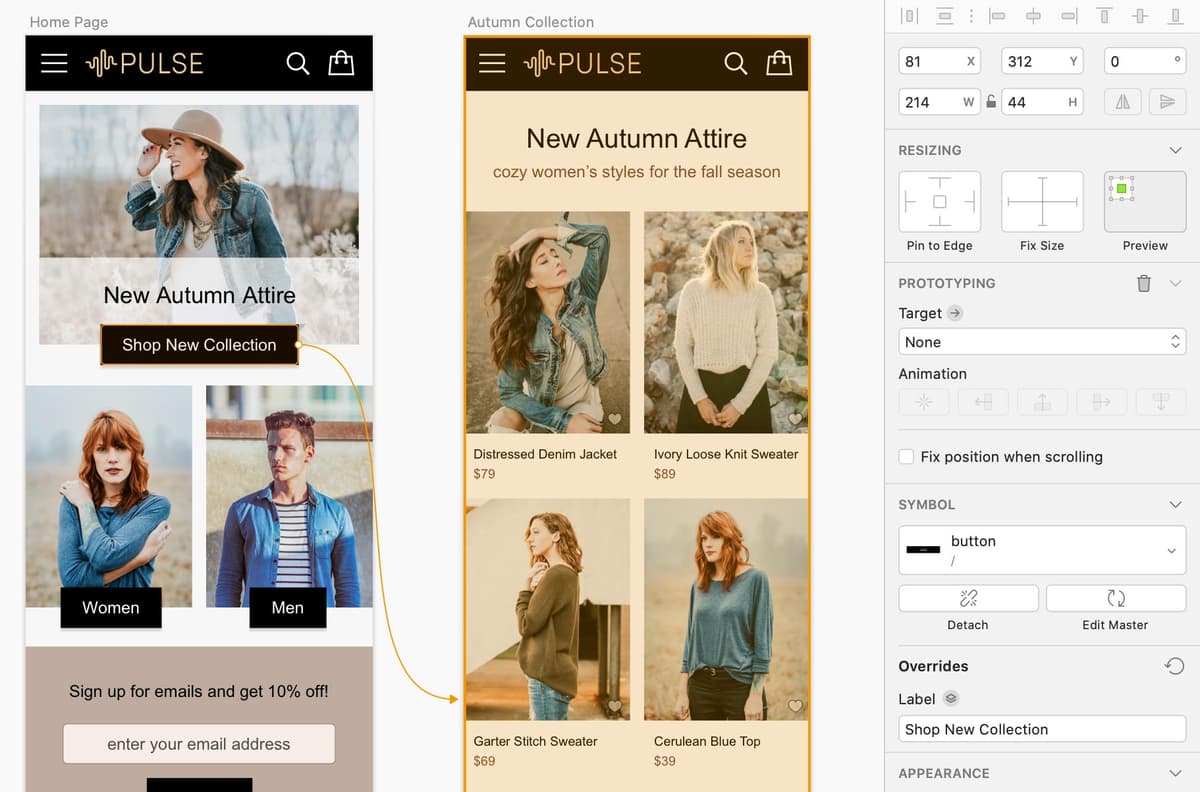
 This visual organization is crucial for understanding the user flow you're creating.
  4. On the Home Page artboard, click to select the Shop New Collection button.
  5. Access the Prototyping menu and select Add Link to Artboard.

    NOTE: Master the keyboard shortcut W (think "wire" as you're wiring up your prototype connections). This shortcut will significantly accelerate your prototyping workflow.

  6. Click directly on the Autumn Collection artboard to establish the connection.
  7. In the Inspector panel on the right side:

    • Within the Prototyping section, verify that Target has been automatically set to the artboard you just clicked.

    • Under Animation, click the Animate Artboard from Right button prototype animate from right. This creates a natural left-to-right navigation flow that users expect.

  8. Let's establish another connection to build out our user journey. Ensure you can see both the Autumn Collection artboard and the Product Page artboard to its right.
  9. On the Autumn Collection artboard, select the Distressed Denim Jacket photo. Notice that both the photo and accompanying text are selected—this happens because they're contained within a symbol, demonstrating the power of Sketch's component-based design system.
  10. Press the W key to quickly initiate the linking process.
  11. Click on the Product Page artboard to complete the connection.
  12. To preview your prototype in action, locate the Preview button preview button near the top right of the Toolbar and click it (alternatively, navigate to Prototype > Preview Prototype).
  13. If the preview window doesn't display the Home Page initially, select it from the dropdown menu at the top of the preview window.
  14. Test your first interaction by clicking the Shop New Collection button. You should see a smooth animation transitioning to the Autumn Collection artboard.
  15. Continue testing by clicking on the Distressed Denim Jacket photo or text to navigate to the product detail screen. This multi-step flow demonstrates how users will actually navigate through your interface.
  16. Use the back arrow at the top of the preview window twice to return to the Home Page.
  17. Since the home page should always be your prototype's entry point, click the Start Point button start point at the top of the preview window to designate it as the default starting screen.
  18. Close the preview window to return to your design canvas.
  19. Notice the small flag icon that now appears to the left of the Home Page artboard name—this visual indicator confirms that this artboard serves as your prototype's starting point.

    NOTE: You can also set starting points by selecting any artboard and choosing Prototype > Use Artboard as Start Point from the menu.

Now that you've established the basic prototype structure, let's enhance the user experience by wiring up the navigation elements that appear across multiple screens.

Prototype Creation Workflow

1

Open the Design File

Navigate to File > Open Local Document and locate your Prototyping.sketch file in the designated class folder structure.

2

Select Interactive Elements

Choose buttons, images, or other clickable elements that will trigger navigation between artboards.

3

Add Artboard Links

Use the Prototyping menu to Add Link to Artboard or press the W key shortcut for faster workflow.

4

Configure Animations

Set animation directions and targets in the Inspector panel to create smooth transitions between screens.

Keyboard Shortcut Efficiency

Use the W key to quickly add prototype links. The shortcut stands for 'wire' since you're wiring up your prototype connections.

Wiring up the Navbar

  1. Double–click on any of the black navigation bars to enter symbol editing mode. This powerful feature allows you to make changes once that will propagate across all instances of the symbol.
  2. Click on a blank area of the canvas to ensure nothing is selected before proceeding.
  3. Select the Pulse logo within the navigation bar.
  4. Since we're currently on the Symbols page and can't see the target artboards directly, click the plus + button to the right of Prototyping in the Inspector panel.
  5. In the Inspector panel:

    • From the newly appeared Target dropdown menu, navigate to Screens > Home Page. This ensures users can always return to the homepage by clicking your logo—a fundamental UX convention.
    • Under Animation, click the Animate Artboard from Left button prototype animate from left to create a natural reverse animation when navigating backwards.
  6. While we're in symbol editing mode, let's also configure the hamburger menu. Select the 3-lined "hamburger" menu icon on its dedicated symbol artboard (make sure you're selecting the standalone symbol, NOT the instance within the navbar).
  7. In the Inspector panel:

    • Click the plus + button to the right of Prototyping.
    • From the Target dropdown, select Screens > Nav Menu.
    • Under Animation, click the Animate Artboard from Top button prototype animate from top to simulate a menu sliding down from the header area.
  8. Next, configure the close functionality by selecting the X close button on its individual symbol artboard (again, not the instance within the navbar).
  9. In the Inspector panel:

    • Click the plus + button to the right of Prototyping.
    • From the Target dropdown, choose Previous Artboard. This elegant solution automatically returns users to wherever they came from, regardless of their navigation path.
  10. Return to your main design by clicking Screens at the top left of the Sidebar.
  11. On the Nav Menu artboard, click once on the navbar to select the symbol instance.
  12. Here's where Sketch's symbol override system demonstrates its power. The navbar currently displays the hamburger menu icon, but on the menu screen, we want to show a close button instead.

    In the Inspector under Overrides, locate the dropdown below Menu Icon and select close. This swaps the symbol while preserving all the prototyping connections we established earlier.

  13. Test your enhanced navigation by clicking the Preview button preview button (or press Cmd–P).
  14. Starting from the Home Page, click the Shop New Collection button to navigate to the Autumn Collection artboard.
  15. Click the Pulse logo in the navbar to verify it returns you to the home page, demonstrating consistent navigation behavior.
  16. Click the hamburger menu icon on the left side of the navbar to access the navigation menu screen. Note two important observations:

    • The transition takes you to a separate artboard rather than overlaying the menu on top of the existing content. While Sketch's prototyping capabilities have evolved significantly since earlier versions, true overlay interactions require more advanced prototyping tools or custom implementations.
    • If you scroll down, notice that the navbar scrolls off-screen with the content. Depending on your design requirements, you may want the navigation to remain fixed at the top for consistent accessibility.
  17. Scroll back to the top and click the X close button to return to the previous screen.

    Notice how the symbol override system seamlessly swapped both the visual element and its associated prototyping behavior—a powerful demonstration of component-based design thinking.

  18. Close the preview window to return to your design canvas.

One common UX pattern is keeping critical navigation elements visible as users scroll through content. Let's implement this behavior to enhance usability.

Symbol Prototyping vs Regular Elements

FeatureSymbol ElementsRegular Elements
Editing LocationSymbols pageArtboard canvas
Link MethodPlus button in InspectorDirect artboard click
Animation OptionsManual target selectionVisual artboard selection
ReusabilityUpdates all instancesSingle instance only
Recommended: Use symbols for navigation elements that appear across multiple screens for consistent behavior and easier maintenance.

Navigation Animation Patterns

Left Animation

Used for returning to previous screens or home navigation. Creates intuitive backward movement flow for users.

Top Animation

Perfect for overlay menus and dropdown navigation. Simulates content sliding down from the top interface.

Right Animation

Ideal for forward progression through content. Maintains natural left-to-right reading and navigation patterns.

Fixing the Position of Elements so They Don't Scroll

  1. Select all four black navigation bars across your artboards. Click on the first navbar, then hold Shift while clicking the others to create a multi-selection.
  2. In the Inspector panel, check the Fix position when scrolling option. This setting ensures the navigation remains accessible regardless of scroll position—a crucial consideration for mobile interfaces and long-form content.
  3. Launch the preview by clicking the Preview button preview button (or press Cmd–P).
  4. Test the fixed positioning by scrolling up and down within the preview. The navbar should remain consistently positioned at the top of the screen, providing users with constant access to navigation options.
  5. Close the preview window once you've verified the behavior.
  6. Click in an empty area of the canvas to deselect all elements and clean up your workspace.
  7. If the prototyping connection wires are cluttering your view, you can toggle their visibility by choosing View > Show Prototyping to uncheck the option. This gives you a cleaner view of your designs while preserving all the connections you've created.
  8. Save your file to preserve all your prototyping work, then close it. You've now created a functional prototype that demonstrates core user flows and navigation patterns—essential skills for any modern design workflow.

Fixed Position Implementation

0/4
Sketch Overlay Limitation

As of this writing, Sketch cannot overlay artboards for transparent menu effects. The makers have announced this feature is coming soon for more realistic menu overlays.

Symbol overrides preserve both artwork and prototyping functionality when swapping nested elements.
This powerful feature allows dynamic interface changes while maintaining interactive behavior, as demonstrated with the hamburger menu to close button transformation.

Key Takeaways

1Sketch's native prototyping tools enable creation of interactive, clickable prototypes without external plugins or software
2The W keyboard shortcut provides quick access to artboard linking functionality for efficient prototype wiring
3Symbol-based navigation elements update across all instances, ensuring consistent behavior throughout the prototype
4Animation directions (left, right, top) should match user expectations and natural interface flow patterns
5Fixed position elements ensure critical navigation remains accessible during content scrolling
6Symbol overrides maintain both visual changes and prototyping functionality when swapping interface elements
7Setting proper start points and preview configurations creates professional presentation-ready prototypes
8Prototyping wires can be hidden for clean presentations while remaining functional for editing purposes

RELATED ARTICLES