Designing Impressive Reports with Excel
What This Tutorial Covers
Visual Hierarchy
Typography and spacing that guide the reader's eye.
Conditional Formatting
Visual cues that highlight key insights.
Charts & Sparklines
Compact visualizations that fit alongside data.
Noble Desktop's Excel Bootcamp teaches advanced Excel — formulas, pivot tables, Power Query, and more.
In this article, we're going to look at how to build complex and thorough reports in Microsoft Excel
What Does “Impressive” Mean, Anyway?
First, let’s define the goal. What would make an Excel worksheet-based report look “impressive”? Here’s a list of common features one would expect in a report:
- No visible grid, unless it’s helpful for reading across several columns of data
- Colored backgrounds, including white, to hide the grid and delineate areas of the data
- Charts and diagrams appearing next to related data
- Clear, legible titles that make sections of the data stand out from each other
- Appropriate number formatting for accounting, currency, and statistical data
- Subtle use of shapes and lines to define areas, highlight information, or explain/instruct the viewer
- Photos, logos, and other graphics to associate brand elements and other images with the data
Combined, these attributes will enable you to export your worksheet – or an established print area within it – as a PDF for sharing with anyone who needs to see, understand, and be persuaded by your data.

Formatting Titles and Section Headings
For your own sake, it’s a good idea to start with your titles and section headings in terms of formatting. Why? Because that way you can begin to envision the report’s sections for yourself, and that makes all the subsequent formatting easier to map out and apply. For example, if you plan to make all the cells under a given section heading a different color than the cells in an adjacent section, that section heading (and that of its neighboring section) will help you define the range of cells to fill with a different background color.
I like to merge my titles – the main title across the top of the report and the titles above various sections – so that they’re living in a single cell that spans the width of the report and/or section. As shown in this image, a section that spans four columns is headed by a title that’s in a cell merged from four cells across that span.

The process of applying merge and center – and formatting titles – is simple, and you can learn more about it in this video.
Https://www.youtube.com/watch?v=Zg0w_fy76uA&list=PL_eVGUXO7Anha4lv9dp_Nk96KP1WuBpKi&index=53
Setting Alignments
Where your content appears within cells in the worksheet can significantly impact how well that content translates to a professional-looking report. As shown in the images here, see how much better a series of titles, especially those wrapped within the cell, look when vertically centered.


To control both vertical and horizontal alignment – and to indent content within cells – you can use the tools on the Home tab, in the Alignment group. Or, check out this video for all the help you’ll need.
Https://www.youtube.com/watch?v=sugRLJZbkyQ&list=PL_eVGUXO7Anha4lv9dp_Nk96KP1WuBpKi&index=50
Applying Colored Fills to Ranges
Putting a solid color behind your ranges of related content is an effective way to create sections in your report – both visually and conceptually – for the audience. And it’s unbelievably easy to do.
To begin, select the range by dragging through the cells that should have the same background color. If it’s a long or wide range (or both!), you can click in the first cell in the upper left of the desired range, and then scroll until you can see the last cell you want to fill with color. Press and hold the Shift key, and then click in that last cell in the desired range, and voila, the entire range is selected.
Next, with your selection made, go to the Home tab’s Font group – oddly enough – and click the Fill Color drop list, as shown in the image here.
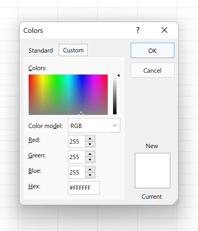
From the resulting menu, you can choose from Theme, Standard, and/or Recent Colors, or click More Colors for a dialog box (shown here) that gives you two different ways to choose a color by clicking the one you want with your mouse, or you can enter a hexadecimal color if you prefer.
Whichever color you choose, however you choose it, that’s now the colored fill within the cells in your selected range. Bear in mind this covers up the gridlines – so if this particular range is one that really would benefit from seeing the lines that help a person read from left to right in a row or from top to bottom in a longer color, you can restore them by using the Borders button, and choosing All Borders. Be sure the selection is in place before making this choice.

Telling Your Story with Charts & Diagrams
Complex data is always easier to absorb and understand if it’s shared in a way that makes it easy to get the major takeaways “at a glance” – and nothing achieves that more efficiently than a chart or diagram.
Charts shouldn’t be overly-complex – it’s better to have several separate charts that each visually explain or reveal a single set of related statistics than to have one or two inscrutable charts with lines, columns, bars, etc.… in a misguided attempt to consolidate the message. And charts should also have clear main titles and axis titles, so it’s obvious, right off the bat, what’s being shown.
To learn more about creating any kind of chart from your data, check out this video:
Https://www.youtube.com/watch?v=NFAa8lPY50c&list=PL_eVGUXO7Anha4lv9dp_Nk96KP1WuBpKi&index=8
And to make sure your chart is an attractive, cohesive part of your report – in terms of colors used, fonts, and so forth, you’ll want to watch this video on good editing and formatting techniques:
Https://www.youtube.com/watch?v=xx4QtLnUW4U&list=PL_eVGUXO7Anha4lv9dp_Nk96KP1WuBpKi&index=6
Now, if your report also requires explaining relationships between people, departments, products, or any other concept that would benefit from a picture rather than an assumed understanding, diagrams help, too. Here’s a video on using Excel’s SmartArt to show processes, connections, hierarchies, and other concepts, through illuminating, colorful, and eye-catching diagrams:

Https://www.youtube.com/watch?v=NqpvF6dPaNE&list=PL_eVGUXO7Anha4lv9dp_Nk96KP1WuBpKi&index=7
Using Shapes, Lines, and Arrows to Control Viewer Focus
While most worksheets that are set up to serve as reports are already laid out so that people can easily spot key information, the addition of shapes, lines, and arrows (which are just another kind of shape) are helpful additions. In the image shown here, an oval is used as a text box, with a key total showing inside it, and icons have been added, too – showing a series of building types that the insurance company in question covers.

Adding shapes – be they polygons, lines, or arrows – is easy, utilizing the Illustrations button on the Insert tab. From there, choose Shapes and then choose the one you want to draw from the drop list as shown here. Learn the full process of inserting, resizing, and formatting your shapes – including adding text to them, so they serve as a way to highlight important data, give instructions, or background info to the viewer – with these videos:
Https://www.youtube.com/watch?v=72XhCmKqZ_4&list=PL_eVGUXO7Anha4lv9dp_Nk96KP1WuBpKi&index=5
With these added features in place, your report takes another major step away from simplistic grid packed with text and numbers toward professional-looking report!


Saving or Exporting As a PDF
If you want to send your report as a PDF – your best bet, as everyone has the ability to view PDF files, even if they don’t have a copy of Adobe Acrobat – just choose Export from the File tab, and then click the Create PDF/XPS document button.
If you have Adobe Acrobat, you’ll also see the option to Create Adobe PDF.
After making the choice that’s right for you, you’ll be able to name and choose a location to save your PDF, as you would any other file in any Save operation.
Attach it to an email or share it via a link to its location via Teams – it’s up to you!
