Grid: Laying out an Article
What This Tutorial Covers
Article Grid Structure
Multi-column grids for editorial-style layouts.
Named Grid Areas
Declarative layout with named regions.
Responsive Adaptation
Grid changes structure across breakpoints.
Noble Desktop's Full-Stack Web Development Certificate teaches HTML, CSS, JavaScript, React, Node.js, and the modern web stack.
Explore a comprehensive tutorial on web development, covering topics such as using Grid to lay out an article, making elements go full-width, and adding elements into the side columns.
Topics Covered in This Web Development Tutorial:
Using Grid to Lay Out an Article, Making Elements Go Full-Width, Adding Elements into the Side Columns
Exercise Preview
Exercise Overview
In this exercise you’ll use CSS grid to lay out an article that looks good on all screen sizes. With full page-width images and notes in the margins, this kind of layout would be harder to create if we weren’t using grid.
Getting Started
- In your code editor, close any files you may have open.
- For this exercise we’ll be working with the Grid Article folder located in Desktop > Class Files > yourname-Flexbox Grid Class. You may want to open that folder in your code editor if it allows you to (like Visual Studio Code does).
Open index.html from the Grid Article folder.
- Notice this page is an article tag that contains a heading, paragraphs, figures, blockquotes, and asides.
Preview index.html in Firefox.
- Scroll down the page to look at the content.
- For our layout we’ll want to make the text column narrower, but to keep the images and pull quotes to extend beyond the width of the text column.
Leave index.html open in Firefox as you work, so you can reload the page to see the code changes you’ll make.
Starting the Grid
We’ll start by making a mobile phone appropriate grid (with one column, and an appropriate sized gap).
- Switch back to your code editor.
- Open main.css from the css folder (in the Grid Article folder).
Below the a:hover rule add the following bold code:
article {
   display: grid;
   gap: 30px;
   grid-template-columns: 1fr;
}
Save the file, and reload the page in Firefox.
- Now that we’re using grid gap to space things out, we’ll need to remove the paragraph margins so we don’t have too much space.
- Switch back to your code editor.
Above the a rule add the following bold code:
p {
   margin: 0;
}
Save the file, and reload the page in Firefox.
- Now the paragraphs have a more appropriate amount of space between them.
- Now let’s set up the desktop grid with multiple columns.
- Switch back to your code editor.
In the min-width: 700px media query at the bottom of the file, below the h1 rule add the following new rule:
article {
   grid-template-columns: 1fr 4fr 1fr;
}
Save the file, and reload the page in Firefox.
- Resize the window to make sure you’re seeing the 3 column layout.
- That gave us 3 columns, but things are not where we want them! Don’t worry, that will be quick to fix.
- Switch back to your code editor.
In the min-width: 700px media query, below the article rule add the following new rule:
article > * {
   grid-column: 2 / -2;
}
Save the file, and reload the page in Firefox.
- That looks much better already!
- Resize the window narrower, and notice the page needs some space on the left and right so the content does not touch the edge.
- Switch back to your code editor.
Above the min-width: 700px media query, add the following new media query:
@media (max-width: 699px) {
   article > * {
      margin: 0 20px;
   }
}
Save the file, and reload the page in Firefox.
- On small screens, the spacing now looks better.
- We want the images to be the full window width on all screens. It’s getting the 20px on small screens, but figures have default margin so the large screens also have margins. Let’s remove the margin on all screens, and make it full width on large screens.
Placing the Content in the Grid
- Switch back to your code editor.
Below the article rule (the one NOT in a media query) add the following bold code:
article > figure {
   margin: 0;
   grid-column: 1 / -1;
}
Save the file, and reload the page in Firefox.
- Resize the window from small to large. The full-width images look nice! Layouts like this were not this easy to create without CSS grid.
- Let’s also make the pull quote the full browser width as well.
- Switch back to your code editor.
In the article > blockquote rule, add the following bold code:
article > blockquote {
    grid-column: 1 / -1;
    font-family: Vollkorn, serif;
Code Omitted To Save Space
}Save the file, and reload the page in Firefox.
- Notice the quote is the full width.
- That’s nice on medium width screens, but on wide screens the text can too wide. Also, the main text column can get too wide on large screens as well. Let’s see how to limit the width of both.
Adding Max Widths for the Text
- Switch back to your code editor.
Below the min-width: 700px media query, add the following new media query:
@media (min-width: 950px) {
   article {
      grid-template-columns: 1fr 58ch 1fr;
   }
}
NOTE: 58ch means 58 characters wide. We’re using this as a max width so we don’t have too many characters per line.
Save the file, and reload the page in Firefox.
- Resize the window from narrow to wide, noticing how the text column now has a max width so it can’t get too wide. That’s much better.
- Next let’s limit the width of the pull quote.
- Switch back to your code editor.
Let’s prevent the pull quote from getting too wide. In the article > blockquote rule, add the following bold code:
article > blockquote {
    grid-column: 1 / -1;
    max-width: 50ch;
    margin: auto;
    padding: 20px;
    font-family: Vollkorn, serif;
NOTE: The auto margins will center the element when the element’s width does not fill the screen.
Save the file, and reload the page in Firefox.
- Notice the width of the pull quote is limited so it can’t get too wide.
- Scroll down to above the second photo. Notice there’s a paragraph that is a bit smaller than the other text and has a thin gray line on the left. This is in an aside tag, and there’s a second one farther down the page. We’d like to move these in the left or right columns (on wide screens).
- We’ve already added a class or left or right to each aside, so we only need to add the CSS to style them.
Putting Notes in the Margins on Large Screens
- Switch back to your code editor.
In the min-width: 700px media query, below the article >* rule add the following new rule:
article > aside.right {
   grid-column: span 1 / -1;
}
NOTE: This says to span 1 column that ends at -1 (the right-most column).
Save the file, and reload the page in Firefox.
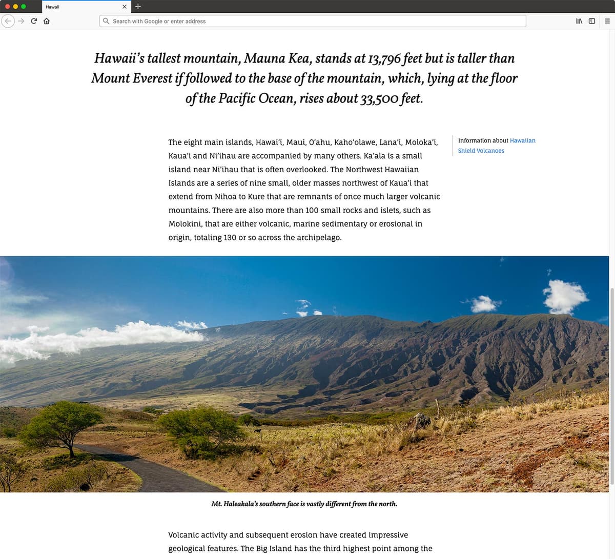
- Above the second photo, you should now see Information about Hawaiian Shield Volcanoes in the right column!
- The gray line on its left takes up the entire height of the paragraph it’s next too. Let’s align this to the top instead of having it stretch (which is the default).
- Switch back to your code editor.
In the min-width: 700px media query’s article > aside.right rule add the following bold code:
article > aside.right {
   grid-column: span 1 / -1;
   align-self: start;
}
Save the file, and reload the page in Firefox.
- The line no longer stretches to fill the entire grid area, and has collapsed to the height of Information about Hawaiian Shield Volcanoes (which is what we want).
- Switch back to your code editor.
In the min-width: 700px media query, below the article > aside.right rule add the following new rule:
article > aside.left {
   grid-column: 1 / span 1;
   align-self: start;
}
Save the file, and reload the page in Firefox.
- Scroll to the bottom of the page and notice that Learn more about Haleakalā and Hawaii Volcanoes National Parks is in the correct position in the left column.
- We’ll need to move the line to the right, and we’d like to right align this text as well.
- Switch back to your code editor.
In the min-width: 700px media query’s article > aside.left rule add the following bold code:
article > aside.left {
   grid-column: 1 / span 1;
   align-self: start;
   text-align: right;
   border-left-width: 0;
   border-right-width: 1px;
}
Save the file, and reload the page in Firefox.
- The line is now on the right and the text is now right aligned. Much better.
- On wide screens the asides can get too wide. Let’s limit their width as well.
In the min-width: 700px media query, below the article >* rule add the following new rule:
article > aside {
   max-width: 30ch;
}
Save the file, and reload the page in Firefox.
- The limited width looks good on the aside that’s in the right column, but the aside that’s in the left column needs to be moved over to the right side of the column.
- Switch back to your code editor.
In the min-width: 700px media query’s article > aside.left rule add the following bold code:
article > aside.left {
   grid-column: 1 / span 1;
   align-self: start;
   justify-self: end;
   text-align: right;
   border-left-width: 0;
   border-right-width: 1px;
}
Save the file, and reload the page in Firefox.
- Now the aside in the left column looks good too.
- Scroll through the page to admire the final layout.
- Resize the window to see it looks good across all screen sizes.