Jive Factory: Finishing the Wireframe
What This Tutorial Covers
Wireframe Polish
Refine alignment, spacing, and visual hierarchy.
Annotation
Notes that explain interaction and content rules.
Stakeholder Review
Wireframes ready for design and dev review.
Noble Desktop's Web Design Certificate teaches Figma, HTML, CSS, and responsive design.
Learn how to structure pages, utilize min and max-width media queries, use CSS calc() for fluid layouts, and hide elements for specific sizes/devices in our in-depth tutorial on Mobile and Responsive Web Design.
Exercise Preview
Using the Calc() CSS Function
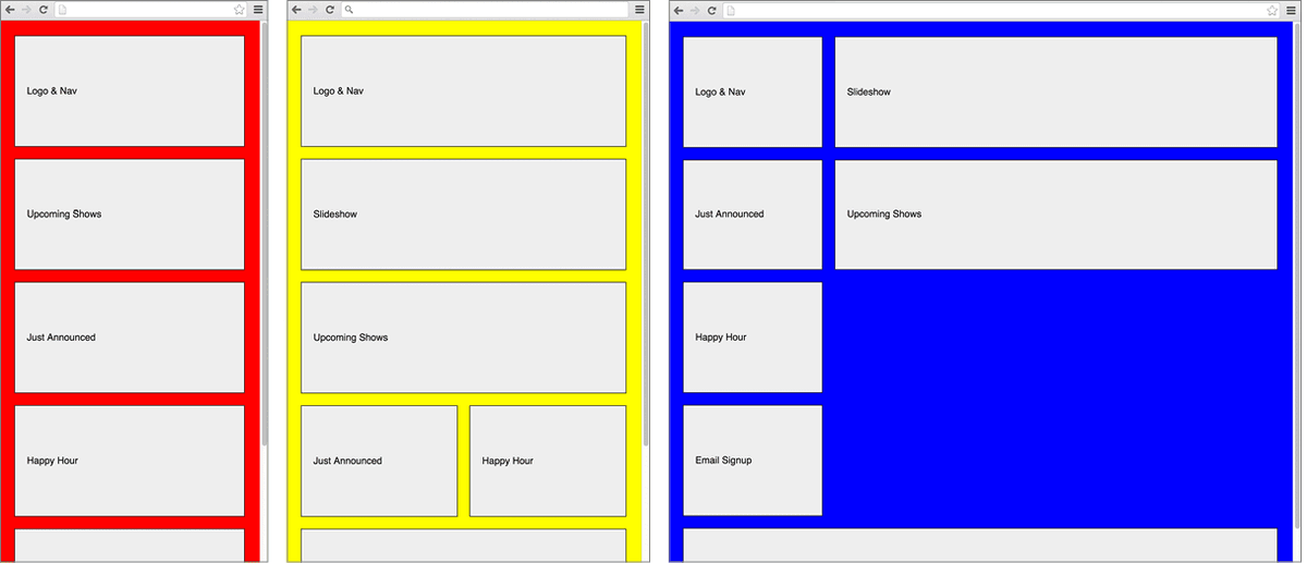
Although the 67% width for the shows content and the 33% width for the aside add up to 100%, the margin that we set on the .module style is causing some trouble. Let’s use the browser inspector to verify this.
CTRL–click (Mac) or Right–click (Windows) on Upcoming Shows and choose Inspect.
NOTE: The following instructions are written for Chrome’s DevTools. If you use another browser, the steps will be similar.
The DevTools window will open either on the bottom or the right of the browser. If you’re still in Device Mode, click the Toggle device toolbar button
 to leave the mobile emulator.
In the Elements tab, make sure the
<div class="shows module">line is selected.In the Styles tab, you should see the .shows rule. Just below, you should see the .module rule that is also being applied.
In the .module rule, uncheck the box next to margin: 0 10px 20px; to disable it.
Now the aside and shows content fits side-by-side into the browser. We’d still like to keep the margins though. The calc() function will come in handy here.
NOTE: Even though we’re using the new border-box for box-sizing, that only changes how padding and borders affect width. Margins are always outside an element’s width.
Return to main.css in your code editor and edit the rule for .shows as follows, making sure you include the spaces around the minus sign!
.shows {
   float: right;
   width: calc(67%—20px);
}
NOTE: Using calc() is a way to use CSS to ask the browser to do some math for us at render time. Here, we are asking the browser to maintain the 67% width for the element but subtract 20 pixels of margin to account for the 10 pixels on either side that the .module style also adds to this element. Remember that when using addition and subtraction with calc(), the + and—operators must always be surrounded by whitespace.
Save the file.
Preview index.html in a browser. Much improved!