Smart Layout
What This Tutorial Covers
Smart Layout
Auto-adapting symbols that resize based on content.
Resize Behaviors
Pin, fix, or resize child elements as parents change.
Modern Equivalent
Figma auto-layout offers more flexibility than Sketch's Smart Layout.
Noble Desktop's UX/UI Design Certificate teaches Figma — the modern successor to Sketch.
Enhance your skills in Sketch with this comprehensive tutorial covering advanced topics such as using the tidy button, adjusting symbol spacing, reordering content, and using the smart layout for symbols.
Exercise Preview

Creating a Smart Layout Using Symbols
We need to create a row of filtering tags for our search results. We have started making a symbol, but need to finish it. Using the power of nested symbols will let us do some pretty neat things when building this bar of tags.
- At the top of the Sidebar, click on the Symbols page.
- Scroll over to the right of the navbar and zoom in on the 2 symbols Tag and Checkmark so you can see them closely.
- We need to add the checkmark into the empty space of the Tag. It’s important this is a symbol so it will give us more options later. In the Toolbar, click the Insert button
 and under Symbols choose This Document > Checkmark.
 - Hover over the empty space to the left of TAG and click once to place the symbol.
With the Checkmark selected, in the Inspector set it’s X/Y position to 6 X and 8 Y.
- Sometimes we’ll want to hide this checkmark, so we need to ensure the layout can adjust. At the top left of the artboard, click on the Tag artboard name (which selects this symbol’s artboard).
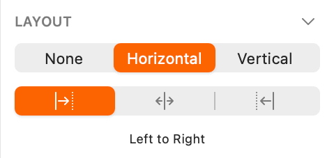
In the Inspector, under Layout:
- Click on Horizontal.
- Below that, make sure the Left to Right button is selected as shown below:
- Now the symbol is ready to use. At the top of the Sidebar, click on Page 1.
- Scroll up so you can see the top of the Search artboard.
- In the Toolbar, click the Insert button and under Symbols choose This Document > Tag.
Hover over the empty space below Results found for “women” and click once to place it, as shown below:

While we want the option to have a checkmark, we don’t want it there by default. With the tag selected, in the Inspector, under Overrides click on the menu under Checkmark and choose No Symbol.
Notice on the artboard that the checkmark has disappeared and the space it occupied is gone. That’s so smart of Sketch!
- We could have up to 4 tags in a search so we need to create copies. Make sure the tag is selected.
- Go to Arrange > Make Grid.
In the Inspector, set the following:
- Cells: 4 and 1
- Spacing: 15 and 0
Click Finish when done.
- You should now have a row of 4 tags. Let’s give them better layer names (which will show in the Overrides list). Select the leftmost Tag.
- Hit Cmd–R and rename the layer to Tag1 (do not hit another keystroke yet, remain there with the layer name editable)
- Hit the Tab key to move down to the next layer name and type Tag2.
- Then hit Tab and type Tag3.
- Once more hit Tab and type Tag4.
- We’re going to change the text, which will make the buttons get wider. Let’s group all the tags in one symbol so we can use the smart layout. Select all 4 tags.
- In the Toolbar, click the Create Symbol button
 (or choose Layer > Create Symbol).
 In the dialog that appears:
- Name it tag group
- Set the menu below the name to Left to Right Layout.
- Check on Send Symbol to “Symbols” Page.
- Click Create.
With the tag group selected, In the Inspector, under Overrides set the following:
- Under Tag1, under Tag type in SHIRT (in all caps).
- Under Tag2, under Tag type in SWEATER (in all caps).
- Under Tag3, under Tag type in JACKET (in all caps).
- Under Tag4, click on the first menu and choose No Symbol (which will hide this tag we don’t currently need).
Under Tag2, go into the Checkmark menu (currently says No Symbol) and choose This Document > Checkmark to make the checkmark appear!
NOTE: You can double–click on symbol text on the artboard and type it in, but that requires more clicks for this many different pieces of text.
- Click in an empty area of the canvas to make sure nothing is selected.
Save and close the file.
Optional Bonus: Creating Another Smart Layout
- In Sketch, go to File > Open Local Document.
- Navigate into Desktop > Class Files > Sketch Class > Pulse and double–click on Product Group.sketch to open it.
- Click on the button’s black background to select it.
- Hold Shift and click on the button’s Label text so both are selected.
- In the Toolbar, click the Create Symbol button (or choose Layer > Create Symbol).
In the dialog that appears:
- Name it button
- Set the menu below the name to Horizontally Center Layout.
- Check on Send Symbol to “Symbols” Page.
- Click Create.
- We’re going to have 2 buttons, so let’s give this one a more unique name. With the button still selected, hit Cmd–R to rename the layer (you’ll see the layer name in the Sidebar on the left).
- Type in primary button and hit Return to apply it.
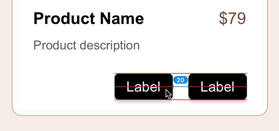
We need a secondary button to the left of this one. Drag the button to the left and then hold Option and Shift to pull off a copy and position it as shown below:
- With the new button still selected, hit Cmd–R to rename the layer, type in secondary button and hit Return to apply it.
- We want this group of buttons to be right aligned when their text changes, so we have to group them as another symbol. Select both buttons (click on one, then hold Shift and click on the other.)
- In the Toolbar, click the Create Symbol button (or choose Layer > Create Symbol).
In the dialog that appears:
- Name it button group
- Set the menu below the name to Right to Left Layout.
- Check on Send Symbol to “Symbols” Page.
- Click Create.
With the button group selected, in the Inspector’s Overrides area, set the following:
- Under secondary button set the Label to More Info
- Under primary button set the Label to Add to Bag
Notice how the buttons resize and the secondary button gets pushed to the left when the Add to Bag button gets wider. Awesome!
We made layer and text styles for an alternative button appearance (light and dark buttons). We had already applied the dark button styles to the content you turned into a button symbol so let’s change the secondary button to be light. In the Inspector’s Overrides area, set the following:
- Under secondary button, click on the button bg menu and choose light.
- Under secondary button, below Label is a menu for button text/light. Click on that and choose dark.
- Click in an empty area of the canvas to make sure nothing is selected.
We’re ready to add the proper text for the product name and description, but that could cause reflow when things break onto multiple lines. Let’s turn this entire area into one big symbol.
In the Sidebar, click on the product folder (group).
- In the Toolbar, click the Create Symbol button (or choose Layer > Create Symbol).
In the dialog that appears:
- Name it product
- Set the menu below the name to Top to Bottom Layout.
- Check on Send Symbol to “Symbols” Page.
- Click Create.
Let’s add the proper text for the product name. We could type it in, but we have the text ready for you to copy and paste. On the right of the artboard, click once on Distressed Blue Denim Jacket to select it and:
- Hit Return to select all the text inside this text layer.
- Hit Cmd–C to copy it.
- On the artboard double–click on Product Name.
- Hit Cmd–A to select all the text in this layer.
- Hit Cmd–V to paste the new text.
Click in an empty area of the canvas to make sure nothing is selected.
Notice how the text below moved down and the rounded rectangle container got taller too!
Now into the product description. On the right of the artboard, click once on Subtly acid washed and…
- Hit Return to select all the text inside.
- Hit Cmd–C to copy it.
- On the artboard double–click on Product description.
- Hit Cmd–A to select all the text in this layer.
- Hit Cmd–V to paste the new text.
- Once again the layout adjusts, with the buttons moving down and the container resizing to fit the content. That’s pretty smart!
Save and close the file.