Product Shot: Matching Colors
Match Liquor Colors with Curves
Load Tumbler Glass Path as Selection
Cmd/Ctrl-click the tumbler glass path thumbnail.
New Curves Adjustment Layer
Name it 'fix tumbler color' so future-you knows what it does.
Adjust Per-Channel
Darken RGB composite, add a touch of Red, increase Green contrast, add some Blue.
Mask Out Unwanted Areas
Paint the curves layer mask to limit the correction to just the liquor in the glass.
Noble Desktop's Photoshop Bootcamp covers retouching, compositing, color correction, and pro editing.
Learn the intricate skills of using Curves in Photoshop to match colors effectively, through a comprehensive tutorial on creating a seamless whiskey image.
Exercise Preview
Matching the Color of the Liquor in the Glass to That in the Bottle
If it’s not still open, re-open yourname-product-Adobe RGB.psd.
In the Paths panel, Cmd–click (Mac) or CTRL–click (Windows) on the tumbler glass path thumbnail to load it as a selection.
Go to the Layers panel and make a new Curves adjustment layer.
Name this adjustment layer fix tumbler color.
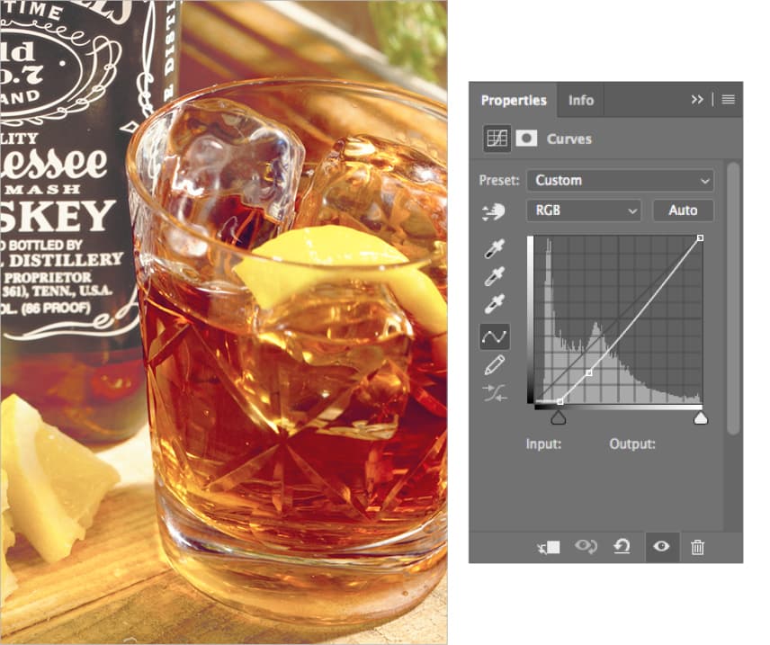
We want to match the color of the liquor in the glass to the color of the liquor in the bottle. (When you start selecting these areas in the next step, don’t worry about some of the areas in the glass becoming the wrong color. We’ll fix them in a moment. Just concentrate on matching the color of the liquor.)
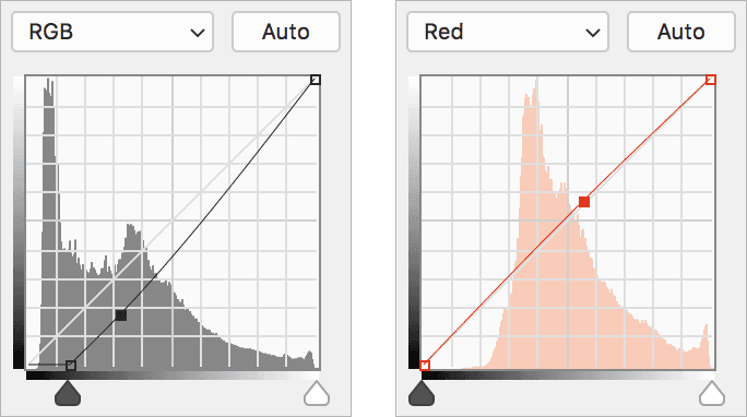
In the Properties panel, darken the RGB composite, and add a touch of Red. Use the following curves as a rough guide for matching the color.
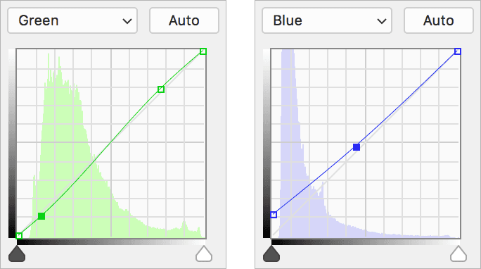
Increase the Green contrast and add some Blue as shown below:
There will be areas of the glass that are now looking bad. Make sure the curves layer mask is selected and use the Brush
 , set to black, to remove the color adjustment in the areas you don’t want it. Do this to the top areas of the glass, the lemon, and wherever else you feel it needs it.
Be sure to save the file and just leave it open. You’ll continue to work with it in the next exercise.