Fill Opacity & Effects
Common Photoshop Tools
Brush Tool
Paint with custom brushes, opacity, and flow control.
Clone Stamp
Sample one area and paint it elsewhere — perfect for repairs.
Healing Brush
Smarter than clone — blends texture and tone of the source.
Pen Tool
Create precise vector paths for selections or shapes.
Noble Desktop's Photoshop Bootcamp covers retouching, compositing, color correction, and pro editing.
Dive into this comprehensive Photoshop tutorial where you'll learn to control the opacity & fill of a layer's contents and effects to create dynamic results.
Exercise Preview
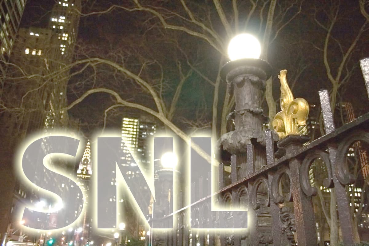
Photo by Dan Rodney
Setting up the Type Layer
- From the Photoshop Class folder, open the file nyc at night.jpg.
At the bottom of the Tools panel, click on the Foreground color swatch.
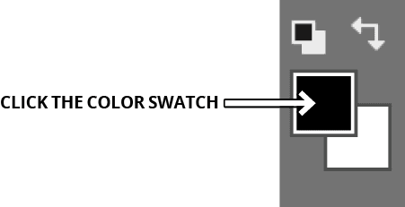
In the color picker that appears, choose white and click OK.
Choose the Horizontal Type tool
 .
.In the Options bar at the top of the screen, set the text formatting to Myriad Pro Bold and 135 pt.
Click in the center of the image.
Type: SNL
Choose the Move tool
 .
.Position the text in the lower-left corner so the Chrysler Building sits between the S and N.
Adding Effects & Adjusting Layer Fill
At the bottom of the Layers panel, click the Add a layer style button
 and from the menu, choose Outer Glow.
Set the following:
Spread: 6% Size: 50 px Click OK.
Near the top right of the Layers panel, adjust the Fill (%) of the layer. Try 15% first. Then just experiment.
TIP: When the mouse is over the word Fill, it will turn into a hand slider
 . Click and drag left or right to quickly adjust the value.
Notice how the white text fill is partially transparent, but the effect wasn’t altered? When you are satisfied, File > Save As a Photoshop document. Name the file yourname-nyc at night.psd