Adjusting the Layout for Tablets & Mobile Phones
What This Tutorial Covers
Multiple Artboards
Phone, tablet, and desktop sizes in one document.
Linked Smart Objects
Shared elements that update across artboards.
Mobile-First Workflow
Design phone first, scale up to larger screens.
Noble Desktop's Graphic Design Certificate covers Photoshop alongside Illustrator and InDesign.
Learn how to adapt your web design for tablets and mobile phones in this comprehensive tutorial on using Photoshop for web design, with special attention paid to comparing Bootstrap's desktop, tablet, and mobile grids.
Exercise Preview
Adapting the Design for Tablets
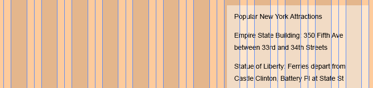
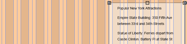
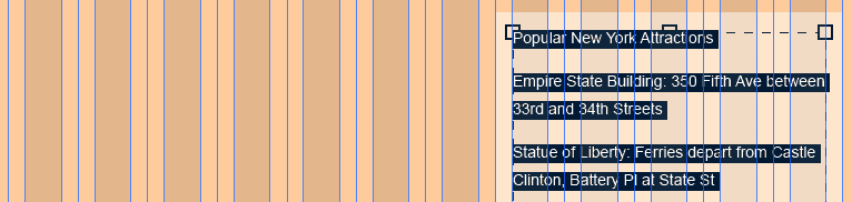
- Let’s copy over the elements from the Desktop artboard. In the Layers panel, click on the Popular New York Attractions layer to select it.
- Hold Shift and click on the sidebar bg layer to select both layers.
- In the Layers panel, CTRL–click (Mac) or Right–click (Windows) on the name of any of the selected layers and choose Duplicate Layers from the menu.
- In the dialog that opens, from the Artboard menu choose Tablet.
- Click OK.
- Notice that the two layers have been copied to the Tablet artboard. Both layers should still be selected.
- Feel free to zoom in (View > Zoom In) to see the artboard more clearly.
- If it’s not already selected, choose the Move tool
 .
. - At the top left of the Options bar, make sure Auto-Select is unchecked.
- If the guides are not visible, show them by hitting Cmd–; (Mac) or CTRL–; (Windows).
- So that we don’t accidentally move the guides while we’re trying to move the content, choose View > Lock Guides.
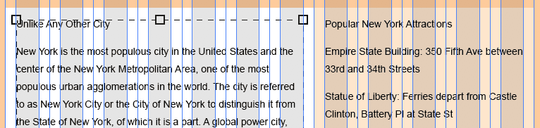
In the Tablet artboard, drag the sidebar up so that the top-right corner of the background is aligned to the far right guide, as shown below. The top position is up to you, but refer to the image as a guide. (You can also use the Arrow keys to nudge it into position as needed.)
- We need to resize the background (but not the text). In the Layers panel, in the Tablet artboard, click on the sidebar bg layer so that it’s the only layer selected.
Go to Edit > Free Transform (may say Free Transform Path depending on which tool you’re using).
The sidebar spans 3 columns on the desktop, but that’s a bit small for the tablet layout. Grid systems don’t require elements to span the same amount of columns across screen sizes. So on the tablet we’ll make the sidebar span 5 columns.
Drag out the left resize handle so it fills up the 5 gray columns on the right. Remember that background colors like this should align to the middle gutter guide, not the edge of the gray column.
- Hit Return (Mac) or Enter (Windows) to apply.
That resizes the colored background, but we still need to fix the text. In the Layers panel, in the Tablet artboard, double–click on the layer thumbnail (T) on the left of the Popular New York Attractions text layer.
This should switch to the Type tool
 and select all the text in the layer.
Drag the left side of the box so it fills the 5 gray columns:
NOTE: If we resized the text using Free Transform, it would scale the text (which we don’t want to do). By using the Type tool, we resize the text area without changing the type size.
- Choose the Move tool .
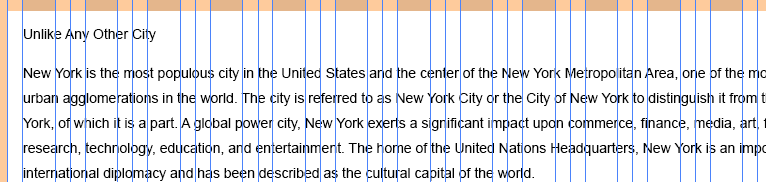
- Now let’s copy over the main text column. In the Layers panel, in the Desktop artboard, click the Unlike Any Other City layer to select it.
- Shift–click the main col bg layer.
- In the Layers panel, CTRL–click (Mac) or Right–click (Windows) on the name of any selected layer and choose Duplicate Layers from the menu.
- In the dialog that opens, from the Artboard menu choose Tablet.
- Click OK.
On the Tablet artboard drag the main background as shown below, aligning the left edge with the first blue guide. Use the pink Smart Guides to align the top of the rectangle with the top of the sidebar background.
- When we duplicated the layers from the Desktop artboard, the new layers were added above the columns layer. In the Layers panel, in the Tablet artboard, drag the columns layer to the top so we can see them.
- Lock the columns layer by selecting it in the Layers panel, then clicking the Lock all button
 .
. - In the Layers panel, in the Tablet artboard, select main col bg.
- We’re going to use Free Transform a lot, so to speed things up a bit, let’s use the keystroke. Hit Cmd–T (Mac) or CTRL–T (Windows).
- Pull the background’s right resize handle inward until it snaps to the edge of the sidebar’s background.
- Hit Return (Mac) or Enter (Windows) to apply the changes.
- Select the Type tool .
- Hover over the text and notice that most likely the cursor has a circle around it. That means the background’s vector shape is still selected. Hit Return (Mac) or Enter (Windows) to deselect it.
- Hover over the text again and you should get the normal I-beam text cursor with no outline. Go ahead and click into the text to put the cursor in it.
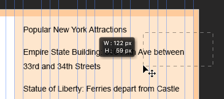
Drag anywhere on the right side of the text box (you don’t need to grab a resize handle) so it becomes 7 gray columns wide:
- Choose the Move tool .
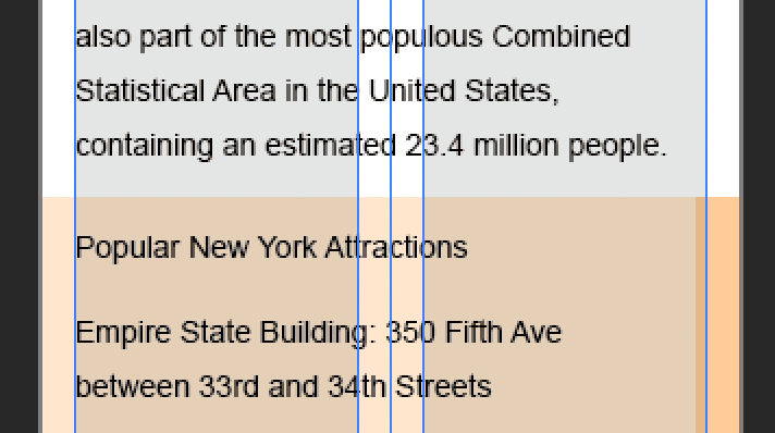
- On the Tablet artboard, the two background rectangles are a bit short. In the Layers panel, in the Tablet artboard, click on main col bg to select it.
- Cmd–click (Mac) or CTRL–click (Windows) on sidebar bg so both are selected.
- Hit Cmd–T (Mac) or CTRL–T (Windows).
- Drag the bottom resize handle down so they end a bit below the text.
- Hit Return (Mac) or Enter (Windows) to accept the sizing.
To better preview your progress:
- Hide the guides by hitting Cmd–; (Mac) or CTRL–; (Windows).
- Hide the columns layer in the Tablet artboard.
NOTE: If you think the padding on the left and right is a bit tight, don’t worry. This is the least amount of padding you’d see, because larger screens will have the same width content area, but more space on the left/right sides. Padding amounts in pre-built grid systems are predefined, and you may or may not be able to customize them. For this reason, some people prefer to create their own grid systems or customize the appearance of pre-made grid systems. To keep things simple, we’re sticking with Bootstrap’s predefined grid.
Do a File > Save.
Adapting the Design for Mobile Phones
Multiple text columns don’t fit on small screens, so we’ll make the mobile layout a single column, with the white main column on top.
- Let’s learn another way to select layers. Choose the Move tool .
- At the far left of the Options bar, check on Auto-Select.
Make sure the menu next to Auto-Select says Layer.
As we’ll see in a moment, this will allow us to select layers by clicking on them (or dragging over multiple layers).
- On the Tablet artboard, click anywhere on the Unlike Any Other City text to select it.
- Shift–click in an empty area of the white background.
- Notice in the Layers panel that they are both selected!
- In the Layers panel, CTRL–click (Mac) or Right–click (Windows) on the name of any selected layer and choose Duplicate Layers from the menu.
- In the dialog that opens, from the Artboard menu choose Phone.
- Click OK.
- On the Phone artboard, drag the selected layers so that the background aligns to the top-left corner.
- In the Layers panel, in the Phone artboard, drag the columns layer to the top so they are visible.
- To show the guides again, hit Cmd–; (Mac) or CTRL–; (Windows).
- To see all the text, we need to make the artboard taller. In the Layers panel, select the Phone artboard.
- If you do not see the resize handles, select the Artboard tool
 .
. - Grab the bottom resize handle and start dragging down just a little and then stop. Visually resizing can be nice, but we need a lot more space. Let’s type in a larger height.
- In the Properties panel on the right, set H to 1800 and hit Return (Mac) or Enter (Windows).
- Now that we’ve changed the artboard size, the columns layer no longer matches. Let’s fix it. In the Layers panel, in the Phone artboard, select the columns layer.
- Hit Cmd–T (Mac) or CTRL–T (Windows) to transform it.
- Drag the bottom resize handle down to the bottom edge of the artboard.
- Hit Return (Mac) or Enter (Windows) to accept the sizing.
- Notice that the text is cut off at the moment. Select the Type tool .
- Hover over the text. If the cursor has a circle around it, hit Return (Mac) or Enter (Windows) to deselect the columns.
- Once you see the normal I-beam text cursor, click into the text.
- Drag anywhere on the right side of the text box and align the right edge with the outer gray column.
- Drag the bottom edge of the text box until you can see all of the text.
- Choose the Move tool .
- The white background is also not tall enough. Click on it to select it, verifying that the main col bg layer in the Layers panel (Phone artboard) is selected. There’s not a lot of space around the text to click on it, so if you’re having a hard time clicking on it to select, just select the main col bg layer in the Layers panel.
- Hit Cmd–T (Mac) or CTRL–T (Windows).
- Drag the background’s right edge inward until it snaps to the artboard’s side.
- Drag the background’s bottom edge down to slightly below the end of the text.
- Hit Return (Mac) or Enter (Windows) to apply the changes.
- Choose View > Fit on Screen.
On the Tablet artboard, we want to select the sidebar text along with its background. We can do that by dragging a selection box around them.
NOTE: Remember how we locked the columns layer earlier? If it wasn’t locked, it would be selected and moved.
As shown below, starting outside the artboard, drag a selection box over the sidebar text and sidebar bg until the selection box touches them at least a little.
NOTE: With Auto-Select on, you’ll move an item if you drag on it. So to create this multi-layer selection you must start the drag from an empty place in your design. This could be outside the artboard, or an empty part of the artboard.
- Verify that the two proper layers were selected in the Layers panel (Popular New York… and sidebar bg).
- Let’s copy the sidebar across to the Phone artboard using a new technique. Hold Option (Mac) or ALT (Windows) and drag the sidebar layers across to the Phone artboard, putting it below the main text column.
- Zoom in to 100% or 200% and scroll so you can see the top of the Phone’s sidebar (below the white main text column).
If it’s not positioned properly, drag the sidebar under the main column so their edges are touching (and it’s aligned to the left of the artboard).
- In the Layers panel, in the Phone artboard, move the columns layer to the top.
- Rename sidebar bg copy to sidebar bg.
- With the sidebar bg layer still selected, hit Cmd–T (Mac) or CTRL–T (Windows).
- Drag the sidebar bg’s right edge to the right side of the artboard.
- Pull the bottom edge up to just below the text.
- Hit Return (Mac) or Enter (Windows) to apply.
- Choose the Type tool
- Hover over the sidebar text, and if the cursor has a circle around it, hit Return (Mac) or Enter (Windows) to deselect the rectangle.
- Once you see the normal I-beam text cursor, click into the sidebar text.
- Drag anywhere on the right side of the text box and align the right edge with the rightmost gray column.
- If needed, align the left side to the outer gray column as well.
- Choose the Move tool .
- Go to View > Fit on Screen to compare the three artboards.
- Hide the guides by hitting Cmd–; (Mac) or CTRL–; (Windows).
- Hide the columns layer in each artboard.
Do a File > Save.
In the next exercise, you’ll work more on the Desktop design. While we won’t be working with the Tablet and Phone designs, the workflow you just learned applies to moving and adapting other elements (such as graphics).
TIP: Hold Option (Mac) or ALT (Windows) and drag an artboard to duplicate it.