Lists: UI with Two View Controllers That Display Table Cells
What This Tutorial Covers
Master-Detail Pattern
Two controllers for list and detail views.
UITableView
Apple's native table view for scrollable lists.
Cell Configuration
Custom cell layouts with multiple labels and images.
Noble Desktop's Full-Stack Web Development Certificate teaches programming fundamentals that transfer across mobile, web, and desktop development.
Explore this comprehensive tutorial for iOS Development that covers creating files for a dual view controller app, managing two views with a navigation controller, and much more.
Exercise Preview
Creating Files for a Dual View Controller App
Our app will have two main screens. One will display all the lists a user has added (such as Groceries, To-Do, etc.). The second one will display the items in an individual list (such as ice cream, candy bars, and chips on a couch potato’s Groceries list). Let’s create a few files where we can write the code we’ll need for this setup.
Let’s get rid of the default View Controller. In the Project navigator, click on ViewController and press the Delete key.
In the dialog that appears, click Move to Trash to finish deleting it.
We need to create a few new files, including two for the View Controllers mentioned above. To ensure they get organized in the proper place, go to the Project navigator
 and click on the Lists folder (not the name of the project).
Let’s first create our data model! Go to File > New > File or use the shortcut Cmd–N.
Under iOS and Source, double–click on the Swift File template.
Next to Save As, type Data Model.swift
Make sure you are in Desktop > Class Files > yourname-iOS App Dev 2 Class > Lists > Lists, then click Create.
We next need to create a file that will hold a Swift class. Press Cmd–N.
Under iOS and Source, double–click on the Cocoa Touch Class template.
Set the following options for the new file. It’s important to do so in the order listed, so you don’t have to redo any typing!
- First, click into the Subclass of menu and type UIViewController. Once it fills in the class name, you can click out of the menu to accept the suggestion.
- Notice that Class is set to ViewController. We want to give it a more descriptive name, so replace it with: ListsVC (the VC stands for View Controller).
- Make sure Also create XIB file is unchecked, and Language is set to Swift.
TIP: If you were to type the name of the class before setting the subclass, you would have to get rid of the default suggestion it appends to the end of your custom class name. To avoid this annoyance, always set the subclass first as we did here.
Click Next if you haven’t already.
You should already be in the Desktop > Class Files > yourname-iOS App Dev 2 Class > Lists > Lists folder (if not, navigate there now).
Click Create.
We need another View Controller. Press Cmd–N once more.
Under iOS and Source, double–click on the Cocoa Touch Class template.
It should remember the options you selected before. If not, make sure it’ll create a Subclass of UIViewController using the Swift Language.
Name the class ListItemsVC and click Next.
You should be in the correct folder already, so just click Create.
We’ll need table cells to display both our lists (on the first screen), and the list items (on the second screen). Let’s create files to hold this code. Press Cmd–N again.
Under iOS and Source, double–click on the Cocoa Touch Class template.
Change the following options as listed:
Subclass of: UITableViewCell (Remember to set this first!) Class: ListTitleTVCell (the TV stands for Table View) Click Next, then in the next screen click Create.
Use Cmd–N to create another Cocoa Touch Class file that’s also a subclass of UITableViewCell. Name it ListItemTVCell and Create it.
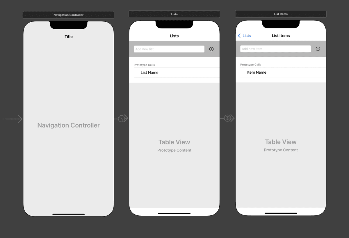
Adding a Navigation Controller to Manage Our Two Views
In an app with multiple screens, Swift needs to know which screen to display first, second, and so on. To manage the flow of navigation, we use a trusty Navigation Controller. Let’s start composing our Storyboard by adding one as our first controller.
In the Project navigator’s list of files, click on Main.storyboard.
We’ll add multiple controllers to our Storyboard, so let’s make room on-screen now. Go to the top right and click the Hide or show the Navigator button
 to hide the navigator panel on the left.
In the Editor, notice that the View Controller has a gray arrow to its left. We’ll explain what this does soon.
Just like we deleted the default View Controller file that came with the app, we also want to delete it here in the Storyboard. Still in the Editor, click anywhere on the View Controller to select it. Then press the Delete key. (You may need to do this more than once.)
Everything (including the gray arrow) will disappear from both the Document Outline and the Storyboard.
In order to navigate from view to view, we’ll first need a Navigation Controller at the helm. In the Objects library search field, find the Navigation Controller.
Drag the Navigation Controller to anywhere on the Storyboard.
True to its name, the Navigation Controller helps you navigate, segueing from view to view as needed. However, the Navigation Controller does NOT display things visually. It’s like a migratory bird’s magnetic sense that leads it to the exact place it will spend the winter—you can see the bird, but you can’t see this invisible compass.
The “bird” in this example is the Root View Controller to its right. It DOES display visuals, and is the controller that gets segued to first.
We want to use our own View Controller instead of this prefabricated Root View Controller. This time, let’s delete it using the Document Outline. If you can’t see it, go to the bottom left of the Editor and click Show Document Outline
 .
.In the Document Outline:
- Expand both items if they aren’t already.
- If both controllers are selected, click in a blank area to deselect all.
Under Root View Controller Scene, click on Root View Controller and press the Delete key.
Let’s add a replacement View Controller that we can more easily customize. In the Objects filter, drag a View Controller to the Storyboard, and drop it when it’s to the right of the Navigation Controller, as shown:

While holding down the Control key, drag from the Navigation Controller to the View Controller to its right. As you drag, a blue line will appear showing you the connection you are creating. Once you release the mouse, you’ll get a pop-up menu where you will select root view controller (under Relationship Segue).
NOTE: Remember that if you have a two-button mouse (or an Apple Magic Mouse that behaves as such), either Right mouse button–drag or Control–drag will work.
In the middle of the two controllers, you should now see a connection that looks like
 . This represents our segue!
Great, we’re ready to add some UI elements! Or are we…? To double-check, make sure you can see the left side of the Navigation Controller (you may need to scroll).
Remember the gray arrow you saw to the left of the default View Controller we deleted? This is our Storyboard entry point. Without it our app cannot run, because nothing will ever show up!
The fix is simple—you just need to remember to do it every time you delete the default View Controller. First, select the Navigation Controller on the left.
In the list of inspectors on the right, click the Attributes inspector
 tab if you aren’t already in it.
In the Attributes inspector under View Controller, check the box next to Is Initial View Controller.
Phew, there’s our gray arrow! Now the code knows which screen to initially display.
Adding UI Elements to the First View Controller
The Root View Controller (our first view controller in the navigation flow) will display all the user’s lists in separate table rows. In order to add a new list, we’ll need a text field where the user can input the name of their new list, as well as a button that adds the new list to the table. Let’s add these UI elements now.
When working with a team, the image assets and final design may not be ready when you start building an app. We’re currently waiting for the designer to finish this process, so we’ll make a basic looking app for now.
In the Editor, at the top of the View Controller, notice the pale gray area that is lighter than the rest of the interface. This is the Navigation Item. We want to add a title here so the user knows what this screen is about.
To select the Navigation Item, click near the bottom of the pale gray bar. Alternately, you can select it from the Document Outline.
In the Attributes inspector, set Title to Lists.
Press Return, and the name of the item will get updated in the Document Outline (as well as added to the UI).
Let’s add UI elements in order from top to bottom, and left to right. At the top of our interface, we’ll add objects that help the user add a new list. In the Objects search field, type text field to filter the list of UI elements.
Drag the Text Field to the View Controller, dropping it anywhere near the top left but under the header at the very top (the status bar and navigation bar area).
To make sure that users know what data to enter in this field, let’s add a handy hint. In the Attributes inspector’s Placeholder field, type Add new list and press Return.
Next, we’ll add a UIButton element that we will use to add a new list. In the Objects search field, type button.
We’ll eventually expand the text field’s width using constraints, so when you drag the Button item to the View Controller, drop it toward the top right of the UI.
We want this button to look like a Plus (+) so users know that this button adds a new list. To do so, go to the Attributes inspector
and set the following:- Just below Title, delete the Button text.
- In the Type menu at the very top, select Add Contact.
- By default, buttons and other interactive elements are tinted blue. Let’s make it darker so we can see it better on this background. Scroll down, and near the bottom find the Tint menu.
- Next to Tint, click on the word Default and choose Black Color.
In the Objects filter, type table.
Drag a Table View (not the similarly-named Controller or Cell!) to the View Controller, dropping it when it’s around the center of the screen.
A table view displays a scrollable list of items. But we still don’t have anything inside it. So it can display content in individual rows, we need to add a table view cell.
From the bottom right Objects filter (which should be displaying table objects), drag a Table View Cell into the table view. Once its borders are highlighted in blue, release the mouse and the cell will fill the entire width of the table view.
Inside the table view cell, we want to display a label with the list name. In the search field, type label.
As shown below, drag a Label into the blank white area in the table view cell (called the Content View because it displays the cell’s content):

In the Attributes inspector just below Text, replace the Label text with List Name and press Return.
Next to Alignment, click the Left Align button
 .
.On the Storyboard, drag out the text box’s right resize handle so you can see all the text.
Constraining the UI Objects on the First View Controller
Now that all of our UI elements for the Root View Controller are on-screen, let’s refine their size and positioning using constraints.
Near the top left of the Storyboard screen, click on the Add new list text field.
Shift–click on the Button so that they’re both selected.
We’re going to nest these two elements inside their own view so that it’s easier to constrain them. Go to Editor > Embed In > View.
Select the Add new list text field.
At the bottom right of the Editor, click the Add New Constraints button
 .
.In the options that pop-up, uncheck Constrain to margins.
At the top of the options pop up, under Add New Constraints, click all four red lines, making sure they are set to the following values:
- Top: 20
- Right: 15
- Bottom: 20
- Left: 20
At the bottom of the pop up, click Add 4 Constraints.
Select the Button.
Click the Add New Constraints button
.Set the following three constraints to these values so that all three red lines are selected:
- Top: 20
- Right: 20
- Bottom: 20
Below the constraints, check on both Width and Height and set them both to 30.
Click Add 5 Constraints.
Next, we’ll constrain the View that the text field and button are embedded in. In the Document Outline just below Safe Area, select View.
Click the Add New Constraints button
.Set the following three constraints to these values:
- Top: 0
- Right: 0
- Left: 0
Check on Constrain to margins.
Check on Height and set the value to 70.
Hit Return to add the four constraints.
In the Document Outline, make sure View is still selected.
In the Attributes inspector next to Background, click once on the word White Color.
Choose Light Gray Color. This is a temporary background color, to distinguish the view from the other elements.
Let’s constrain the table view next. Select the Table View in the Document Outline.
Click the Add New Constraints button
.Click all four red lines, making sure they are all set to 0.
Click Add 4 Constraints.
Lastly, we’ll constrain the List Name label. Select it now. (We want to see the square selection handles—you may need to click on its name more than once.)
Click the Add New Constraints button
.Set the following three constraints to these values:
- Top: 0
- Left: 30
- Bottom: 0
Copying the First View Controller to Create the Second
Now that we have our first View Controller in place, let’s do a nifty trick so we don’t have to redo all our hard work. Go to the Document Outline and right under Lists Scene, select Lists (with the View Controller icon
 next to it).
Press Cmd–C to copy it, then press Cmd–V to paste.
In the Document Outline under the duplicate Lists Scene that just appeared, click on Lists
and press Return to make the name editable.Change it to List Items and press Return to commit.
Look in the Editor. The new View Controller is directly on top of the original one, so drag it by the white bar at the top over to the right so they are nicely aligned and you can see both of them.
NOTE: Don’t worry if some of the UI elements have moved, they will realign shortly.
We want the second View Controller to show when we click on one of the list names. Control–drag from the left Table View Cell (either from in the empty white area or in the Document Outline) to anywhere on the second View Controller as shown:
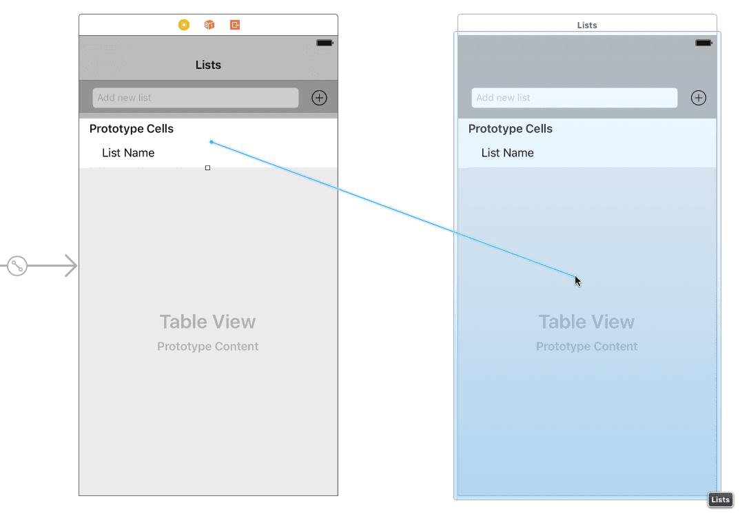
In the pop-up that appears, select Show (under Selection Segue).
There’s our navigation bar! However, it’s still an exact duplicate of the first one. In the Document Outline, expand List Items and select the Lists navigation item
 .
.We should change the text here and a few other places. On the top right, click on the Attributes inspector tab
.In the Attributes inspector, change Title to List Items and press Return.
On the second View Controller, click on the Add new list text field.
In the Attributes inspector, change Placeholder to Add new item and press Return.
On the second View Controller, click on the List Name label.
In the Attributes inspector just below Text, replace the List Name text with Item Name and press Return.
Click in a blank area of the Storyboard to deselect everything and admire your work.
Save the file and keep Xcode open so that we can continue with this project in the next exercise.