Multiple Column Ad with Text Wrap
What This Tutorial Covers
Multi-Column Layout
Text frame columns for newspaper-style layout.
Text Wrap
Flow text around images and other elements.
Wrap Options
Bounding box, alpha channel, and detect edges options.
Noble Desktop's Graphic Design Certificate covers InDesign alongside Photoshop and Illustrator.
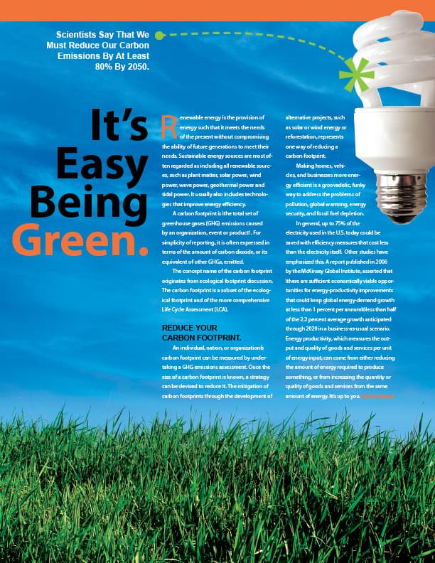
Gain a deeper understanding of InDesign with this tutorial, which covers multiple text columns, drop caps, the baseline grid, text wrap, and more.
Exercise Preview
Getting Started
- Create a new document:
- Go to the Print tab and click once on the Letter (8.5 X 11 in) preset.
- To the right of Width, set Units to Picas.
- Uncheck Facing Pages.
- Set Columns to 3.
- Set Column Gutter to 1p6 (or 0.25 in).
- In the Margins section, unlink
 the values and set Margins of Top: 12p11, Bottom: 18p7, Left and Right: 4p6
 - In the Bleed and Slug section, make all Bleed options p9 (or 0.125 in)
Click Create.
Go to Type > Show Hidden Characters to view hidden characters.
Go to File > Save As and name it yourname-eco-ad.indd.
Placing the Background Picture
Draw a Rectangle Frame
 that fills the Bleed guides (red guides outside the borders of your page).
Go to File > Place and from the InDesign Class folder, select green-grass.tif.
Go to Object > Fitting > Fill Frame Proportionally.
Use the Selection tool
 and the content grabber circle in the center of the image to move the photo up until the tallest blades of grass just reach the bottom of the margin guides.
Importing the Text
Make sure the Rulers are visible (View > Show Rulers).
Create a text frame that fills the two right column guides.
Switch to the Selection tool
and keep the frame selected.Go to Object > Text Frame Options and under Columns, set:
Number: 2 Gutter: 1p6 Click OK.
Using the margin and column guides, draw another text frame that fills the first column.
Into the right frame, place the file eco.txt.
In the left text box, type It’s Easy Being Green. (including the period).
Select all (Cmd–A (Mac) or CTRL–A (Windows)) the text you just typed.
Give the text in the left box these attributes:
Font: Myriad Pro Bold Size  :
:66 pt Leading  :
:54 pt Paragraph Alignment: Align right 
You will need to make the text box wider to accommodate the text. Extend the left side of the box out past the left margin guide, only enough to fit one word per line.
In the layout, highlight the word Green. (including the period).
Open the Swatches panel (Window > Color > Swatches).
At the bottom of the panel, Option–click (Mac) or ALT–click (Windows) the New Swatch icon
 .
.Uncheck Name with Color Value then set the following:
Swatch Name: Orange Color Type: Process Color Mode: CMYK Color: C=0 M=68 Y=85 K=0 Add to CC Library: Uncheck this option if shown Click OK. You will see that the word Green and the period after it got the new orange color.
Give the body text the following attributes (put the cursor in the text and press Cmd–A (Mac) or CTRL–A (Windows) to select it all):
Font: Myriad Pro Regular Size :8 pt Leading :13.5 pt First Line Left Indent  :
:1p3 Color: [Paper] (white)
Creating the Drop Cap & Other Type Changes
Click anywhere in the first paragraph of the body text.
Make sure the Control panel is showing the Paragraph options
 and set:
First Line Left Indent :0p Drop Cap Num. Of Lines  :
:3 The R of the first paragraph looks too close to the text next to it; insert the text cursor just to the right of it (between the R and e) and kern out
 until it looks right.
NOTE: You can kern it out with Opt–Right Arrow (Mac) or ALT–Right Arrow (Windows), adding Cmd (Mac) or CTRL (Windows) if you want to kern out in larger increments.
Select the R and make it Orange (apply the swatch you created earlier).
Highlight the line/paragraph Reduce Your Carbon Footprint. Remove the First Line Left Indent
and make the text:Font: Arial Bold Size: 10.5 pt Leading: 12 pt Color: [Black] Space Before  :
:1p1.5 Put a soft return (Shift–Return (Mac) or Shift–Enter (Windows)) just before the word Carbon to bump it to a new line.
Highlight the last two words in the last paragraph: Get Involved. (including the period) and make them:
Type style: Bold Color: Orange
Setting the Baseline Grid
Look closely at the alignment of the lines of text in both columns at the bottom of the page. (Zoom in as needed.) They don’t line up any more since we changed the leading of the carbon footprint subhead. Let’s fix it so both columns align again.
In the InDesign menu (Mac) or Edit menu (Windows), go to Preferences > Grids.
Under Baseline Grid, set the following:
Start: 2p9 Relative To: Top of Page Increment Every: 13.5 pt (This is the same as the text’s leading.) Click OK.
With the grid set up, we must tell the text to use it. Select all the text.
Make sure the Control panel is showing Paragraph options
.Click the Align to baseline grid button
 (located to the right of the Hyphenate checkbox). The lines in both columns should align again.
Click anywhere in the REDUCE YOUR CARBON FOOTPRINT paragraph.
Click the Do not align to baseline grid button
 .
.Add a bit more Space Before
the carbon footprint paragraph so it is now 1p3.
Placing the Light Bulb Picture
Draw a Rectangle Frame
in the top-right corner of the page.Switch to the Selection tool
and keep the frame selected.Click the top left reference point
 in the Control panel and set the following:
X: 41p1 W: 11p8 Y: 1p2 H: 25p2 Go to File > Place and select spiral.tif.
Go to Object > Fitting > Fit Content Proportionally.
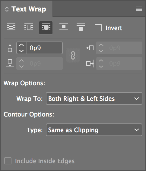
Open the Text Wrap panel (Window > Text Wrap).
At the top of the panel, click the third button Wrap around object shape
 .
.Set the remaining options as shown:
“Massaging” the Text to Fit
We want all of the text to be visible at the bottom of the ad and both columns to be the same length. The last words should be “Get Involved.” Notice that the text overflow symbol  is showing. This means you are missing text. We’ll use tracking to squeeze the rest of the text in.
To see how much text is missing, select the Type tool
 and click anywhere in the text frame so the blinking cursor is somewhere in the text.
Go to the Info panel (Window > Info). There is a count of the text you see plus (+) the overset text (text you don’t see). It should say something like Words: 350+11 and Paragraphs 6+1. This means there is one extra paragraph of 11 words overflowing. (These numbers may be different for you depending on how much kerning you applied after the Drop Cap R earlier.)
Go into the InDesign menu (Mac) or Edit menu (Windows), choose Preferences > Units & Increments and set Kerning/Tracking to 5.
Select the paragraph right next to the light bulb that starts with Making homes…
If the paragraph is already six lines, skip to the next step. Otherwise track it in using Opt–Left Arrow (Mac) or ALT–Left Arrow (Windows). You can do this keystroke up to three times (for a value of –15) but anything more will look bad. This should track the letters in just enough to shorten the paragraph by one line.
Select the last paragraph of text by clicking four times in it quickly. Track the text in using the keystroke listed in the previous step until you see the words Get Involved.
Use the Selection tool
(while holding Shift) to move the left text box up until the top of the letter s in the word It’s aligns with the top of the body text.
Adding the Color Bar
Draw a Rectangle Frame that fills the width between the left and right Bleed guides. Make it 3p3 in height. Its top should meet the top bleed guide.
Open the Swatches panel (Window > Color > Swatches).
As shown below, at the top left of the Swatches panel, make sure the Fill swatch is in front (active). If it’s not, click it to make it active.

Select the Orange swatch.
With the rectangle still selected, go to Object > Arrange > Send Backward. The color bar should now be behind the light bulb but above the background image.
Adding the Statistic
Draw a text frame in the top-left corner of the page.
Switch to the Selection tool
and keep the frame selected.Click the top left reference point
in the Control panel and set the following:X: 4p6 W: 13p Y: 3p8 H: 7p5 Place the file stat.txt in the text box.
Make the text:
Font: Arial Bold Size: 12 pt Leading: 15 pt Paragraph Alignment: Align right Color: [Paper] (white) Choose the Pen tool
 .
.As shown below, draw an arcing Bézier Curve from just beside the statistic to the left edge of the light bulb.

Open the Swatches panel (Window > Color > Swatches).
Make sure the Stroke swatch is in front
 . If it’s not, click it to make it active.
With the stroke still selected, go to the Swatches panel menu
 and choose New Color Swatch.
Set the following: C=50 M=0 Y=100 K=0, and name the new swatch Green.
Once you click OK, the stroke gets the green swatch.
Open the Stroke panel (Window > Stroke) and set the options shown below:

Make a new text box on the pasteboard outside the page, measuring W: 7p, H: 8p2.
- Type an asterisk (
*) and make it:- Myriad Pro Semibold
- 130 pt
- Green (use the swatch you created)
Use the Selection tool
and select the box.Go to Type > Create Outlines.
Move the asterisk shape to the opposite end of the curve, near the light bulb.
Deselect everything, then press W on the keyboard to see the lovely advertisement without guides.
Save the document.