More Text Styling
Multi-Page Layout Workflow
Set the Grid
Layout → Margins and Columns. Baseline grid for vertical alignment.
Create Master Pages
A-Master with template, additional masters for chapter openers.
Style Sheets
Build paragraph and character styles before placing copy.
Place Copy
File → Place. Auto-flow with shift-click to fill multiple pages.
Noble Desktop's Graphic Design Certificate covers InDesign alongside Photoshop and Illustrator.
Master the intricacies of text formatting with our InDesign tutorial, delving into topics like baseline shift, small caps, the line tool, and OpenType formatting.
Exercise Preview

Styling the “Exploration” Title
With the Type tool
 , select the word exploration.
In the Control panel, click the All Caps button
 .
.Don’t see it? Switch to the Character options
 via the button on the left.
That looks better, but we can make the Exploration title more interesting. Select the middle letters XPLORATIO (everything except the E and N).
Make those middle letters (XPLORATIO) smaller, 70 pts.
With the middle letters still selected, let’s Baseline Shift them to align with the top of the E and N. The fastest way is to use the following keystrokes:
Mac: Option–Shift–Up or Down Arrow Windows: ALT–Shift–Up or Down Arrow Try it. Press the keyboard shortcut until the text lines up at the top.
NOTE: To see how much your Baseline Shift is (or if you don’t like keystrokes), look in the Control panel. You’ll probably need to be viewing the Character options
. Baseline Shift  is near the middle of the panel.
To fill out that space we just created, we’ll add a line. Select the Line tool
 .
.Hold Shift (to make sure the line is perfectly horizontal) and draw a line that aligns with the bottom of the E and N and fills in that space.
NOTE: The line should already be the right color (orange), as we chose that ahead of time for you. If you needed to apply a color yourself, you would open the Swatches panel (Window > Color > Swatches) and click on the color to apply it.
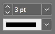
With the line still selected, in the Control panel, make the Stroke weight 3 pt as shown below:
Styling the 2-Line Subtitle
Using the Type tool
, select the two lines of text under Exploration.In the Control panel, click the Small Caps button
 .
.If you don’t see it, switch to the Character options
via the button on the left.
The Disclaimer
We need to add a footnote number to line 2 of the subtitle. Put the cursor at the end of the second line, after “…Wrong Way”.
Type in a 1 (that’s a number one).
Select the 1 and in the Control panel, click the Superscript button
 .
.Type another 1 at the beginning of the disclaimer text at the bottom of the page, which starts with “Not responsible…”
Select it and make it Superscript
as well.NOTE: Another way of applying options such as All Caps, Superscript, etc. is by using the Character panel (Type > Character) and going to its menu
 . The keystrokes for those options are also shown in this menu.
Making Proper Fractions
In the middle of that line is a fraction that isn’t properly styled (99/100). Select it.
On the far right of the Control panel, go into the panel menu
 and select OpenType > Fractions.
Proper Fractions Without OpenType
While OpenType fraction styling is ideal, it won’t work with TrueType or Postscript fonts. It also won’t work with all OpenType fonts! If the menu has square brackets around the [Fractions] option, that particular font lacks the special fraction characters. One of our instructors, Dan Rodney, wrote a script called Proper Fraction that formats fractions regardless of font. You can download a free version on his website at: danrodney.com/scripts
You’ll work with this file again in a later exercise, so save it as yourname-uninspirational poster.indd into the InDesign Class folder.