Simple Responsive Layout
What This Tutorial Covers
Table-Based Structure
Email still relies on tables for cross-client compatibility.
Responsive Patterns
Media queries and fluid widths that adapt to mobile.
Inline Styles
Email clients strip stylesheets — inline every important style.
Noble Desktop's Web Design Certificate teaches HTML, CSS, and the responsive design patterns behind every modern email and web project.
Dive into the intricacies of creating responsive HTML emails with our detailed tutorial, covering topics such as coding table structures, making emails responsive and more, while providing a step-by-step exercise on creating a simple one-column responsive email.
Topics Covered in This HTML Email Tutorial:
Coding the Table Structure, Fixing a Gap Below Images, Making the Email Responsive, Introduction to CSS Media Queries
Exercise Preview
Exercise Overview
In this exercise you’ll create a simple 1-column responsive email that works well everywhere: in desktop mail apps, webmail, and mobile devices.
Previewing the Finished Product
Navigate to Desktop > Class Files > yourname-Responsive Email Class > Simple Responsive Layout.
CTRL–click (Mac) or Right–click (Windows) on date-night-finished.html, go to Open with and select your favorite browser.
Resize the browser window, making it smaller, to see what the email will look like on a mobile device. The email shrinks down nicely to fit the smaller browser width. A simple 1-column email is the easiest layout that works well on any screen size.
Close the browser window.
Getting Started
In your preferred code editor (Visual Studio Code, Sublime Text, etc.) open the file date-night-feb-14.html from the Simple Responsive Layout folder.
NOTE: If your code editor allows you to open an entire folder (like Visual Studio Code does), open the entire Simple Responsive Layout folder.
Fill in the title by adding the text shown below in bold:
<meta name="viewport" content="width=device-width, initial-scale=1">
   <title>Date Night Exclusive—February 14</title>
</head>
Coding the Outer Table & Adding an Image
Even though we’re building a responsive email, we still have to structure the content in tables for it to work across the most popular email clients. We’ll create an outer table for the header image that will be the full width of the email. We will then put the text content into an inner table, where we’ll add more space to make sure it’s legible across email clients.
To create the outer table, add the following bold code inside the
<body>tag.TIP: If your code editor has Emmet installed, you “should” be able to type table+ and hit Tab to expand to the full table code, but a recent update broke this shortcut. We don’t know if it was removed intentionally or accidentally broken. Until it’s fixed, you can table>tr>td and hit Tab to expand to the full table code.
<body>
   <table>
      <tr>
         <td>

         </td>
      </tr>
   </table>
</body>
We want a super basic center-aligned table with default cellpadding and cellspacing stripped out. Add these bold attributes to the
<table>tag:<table align="center" cellpadding="0" cellspacing="0">To see our table structure in the browser as we build the layout, let’s temporarily add a 1-pixel border. Add the following attribute to the
<table>tag:<table align="center" cellpadding="0" cellspacing="0" border="1">Let’s make this table 640 pixels wide. Add the width attribute as well:
<table align="center" cellpadding="0" cellspacing="0" border="1" width="640">The outer table is the only part of a responsive email that has a fixed width. We’ll use percentages for the rest of the width attributes. We would only need to change the width on this outermost table to adjust everything inside it.
Align the contents of the
<td>to the center and make the cell the entire width of the table (currently 640px) by adding the following bold attributes:<table align="center" border="1" cellpadding="0" cellspacing="0" width="640"> <tr> <td align="center" width="100%"> </td> </tr> </table>Save the file.
To save you some typing, we created a snippet of prepared content for you. In your code editor, open header-image.html from Simple Responsive Layout > snippets.
Copy all the code.
Close the file. You should now be back in date-night-feb-14.html.
Around line 11, paste the content inside the
<td>tag like so:<td align="center" width="100%"> <img src="http://www.nobledesktop.com/nl-date-night/img/lights-on-street.jpg" width="640" ALT="Date Night Exclusives"> </td>NOTE: We uploaded this image file to our server. When you code your own HTML emails, you’ll need to host images on your server or on your email marketing service’s server. You cannot use relative image links in an email.
Save the file.
Preview date-night-feb-14.html in a browser. If your code editor does not have a preview keystroke, navigate to Desktop > Class Files > yourname-Responsive Email Class > Simple Responsive Layout and CTRL–click (Mac) or Right–click (Windows) on date-night-feb-14.html, go to Open with, and select your favorite browser.
Browser Preview Shortcuts
If you’re using Visual Studio Code with the open in browser extension installed, hit Option–B (Mac) or ALT–B (Windows) to open the saved HTML document in your default browser. If asked what browser you want to open it with, ideally you should choose Google Chrome (which is the most widely used browser).
The image is sitting nicely inside the outer table. There’s a small gap below the image, but we’ll fix that later.
Leave the file open in the browser, so you can reload the page to see your changes.
Nesting the Inner Table
Let’s add the second table for the text-based content. Return to date-night-feb-14.html in your code editor.
Copy the opening
<table align="center" …>tag with all its attributes.Paste it below the img, as shown in bold below.
<tr>
   <td align="center" width="100%">
      <img src="http://www.nobledesktop.com/nl-date-night/img/lights-on-street.jpg" width="640" ALT="Date Night Exclusives">
      <table align="center" cellpadding="0" cellspacing="0" border="1" width="640">
   </td>
</tr>
As shown in bold, change the fixed width to a relative width so the table will be 100% of the width of the outer parent table:
<table align="center" cellpadding="0" cellspacing="0" border="1" width="100%">Add the remaining structure for the second table, as shown in bold:
<td align="center" width="100%">
   <img src="http://www.nobledesktop.com/nl-date-night/img/lights-on-street.jpg" width="640" ALT="Date Night Exclusives">
   <table align="center" cellpadding="0" cellspacing="0" border="1" width="100%">
      <tr>
         <td>
         </td>
      </tr>
   </table>
</td>
We’ll soon place text inside this new table’s cell, and we want it aligned to the left. Add the following bold attributes to the td:
<tr>
   <td align="left" width="100%">
   </td>
</tr>
Save the file.
Adding the Remaining Content
To save you some time, we put the content in a snippet we prepared for you.
In your code editor, open email-text.html from the snippets folder.
Copy all the code.
Close the file. You should now be back in date-night-feb-14.html.
Around line 16, paste the content as follows.
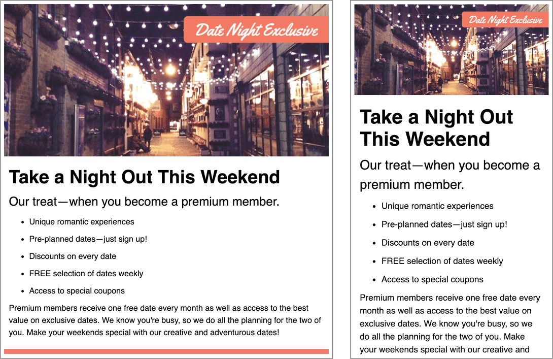
<td align="left" width="100%"> <h1>Take a Night Out This Weekend</h1> <p class="subhead">Our treat—when you become a premium member.</p> <ul> <li>Unique romantic experiences</li>Code Omitted To Save Space
</ul> <p>Premium members receive one free date every month as well as access to the best value on exclusive dates. We know you're busy, so we do all the planning for the two of you. Make your weekends special with our creative and adventurous dates!</p> </td>- Save the file.
- Preview date-night-feb-14.html in a browser.
Take a moment to note the table-within-a-table structure. Also notice the small gap below the header image.
The gap is because images are displayed inline and rendered like a character of text. By default, text and images are vertically aligned to the text baseline (the bottom of letters such as X or i). The space below the baseline is for characters with descenders like. An easy way to remove this space is to have change images to display as block rather than inline. Block-level elements are not baseline aligned.
- Return to your code editor.
Under the title, add the following
<style>tag that will hold our CSS:<title>Date Night Exclusive—February 14</title> <style> </style> </head>NOTE: Although styles must be inline to render correctly in all email clients, you can use a converter to change embedded styles (like we wrote) to inline styles. Most email marketing services offer this feature when sending the email. We’ll look at that process later in this workbook.
Add a rule for the img tag, as follows:
<style>
   img {
      display: block;
   }
</style>
Save the file, return to the browser and reload the page. The gap below the image has been closed!
Now that we know how the nested tables work, we can get rid of the unsightly borders. Return to your code editor.
Remove the borders from both tables by setting them to zero, as shown below in bold:
<table align="center" cellpadding="0" cellspacing="0" border="0" width="640">
   <tr>
      <td align="center" width="100%">
         <img src="http://www.nobledesktop.com/nl-date-night/img/lights-on-street.jpg" width="640" ALT="Date Night Exclusives">
            <table align="center" cellpadding="0" cellspacing="0" border="0" width="100%">
Save the file and reload the browser to see the streamlined layout. Better, but the content needs styling.
Styling the Text
The main point of this exercise is to focus on the responsive layout, so we’ve provided you with the CSS for text styling.
- Return to your code editor, and open text-styling.css from Simple Responsive Layout > snippets.
- Copy all the code.
- Close the file. You should now be back in date-night-feb-14.html.
Below the rule for img, paste the new rules.
img {
      display: block;
   }
   h1 {
      font-family: sans-serif;
Code Omitted To Save Space
.subhead {
      font-size: 24px;
   }
</style>
NOTE: In the p, ul rule you may notice we used a % for line-height. We’d prefer to use unitless values for line-height, but some email clients seem to have issues with those, so we’re using % instead. You could also use px.
Save the file and reload the browser. The text is looking better!
Adding a Splash of Color
- Return to your code editor.
Let’s add a red border across the bottom. Give the inner table’s table cell a class, as shown in bold below:
<tr>
   <td class="innerCell" align="left" width="100%">
      <h1>Take a Night Out This Weekend</h1>
The innerCell class allows us to target that specific cell. Underneath the rest of the CSS, make a rule for it:
.subhead {
      font-size: 24px;
   }
   .innerCell {
      border-bottom: 10px solid #e54c3b;
   }
</style>
Save the file and reload the browser. That’s a nice red border, but it’s too close to the last paragraph. In fact, the content could use more breathing room on all sides.
While cellpadding on the inner table could accomplish this, we do not recommend using that, as some email clients (some desktop versions of Outlook in particular) ignore cellpadding. It’s best to add padding to table cells using CSS.
- Return to your code editor.
Add the following padding property to the rule for .innerCell, as shown in bold:
.innerCell {
   border-bottom: 10px solid #e54c3b;
   padding: 10px;
}
Save the file and reload the browser. Nicely styled!
Making the Email Responsive
This email looks good on a desktop, but what about mobile users? Let’s do a rough simulation of what would show up in their inbox.
Resize the browser window. Nothing happens—the email doesn’t shrink down to fit the smaller browser width. This means on mobile devices the layout would be scaled down (like zooming out) so the text would be small and hard to read.
To turn this into a responsive email we need to tweak the styles a little bit. Return to your code editor.
Around line 36, give the outer table a class of wrapper so we can target it in the CSS:
<body>
   <table class="wrapper" align="center" cellpadding="0" cellspacing="0" border="0" width="640">
The first table’s width (and thus the second table with the content) is not resizing because we have a hard-coded width of 640px. Let’s make it flexible.
To override the hard-coded width of 640px, at the bottom of the styles, add a rule for .wrapper with the following bold rule:
.innerCell { border-bottom: 10px solid #e54c3b; } .wrapper { width: 100%; } </style>- Save the file and reload the browser. The table is no longer centered on the page, and the red border at the bottom is way too wide. The email is stretching across the entire window! We need to limit how wide the table can get.
- Return to your code editor.
In the .wrapper CSS, add the following bold rule to make sure the width never exceeds the desktop size of 640px:
.wrapper {
   width: 100%;
   max-width: 640px;
   display: block;
}
NOTE: Sometimes the max-width property is ignored on tables, but setting display to block should fix this.
- Save the file and reload the browser. The layout no longer exceeds 640 pixels, but is it responsive?
Resize the browser window smaller. Oh no, it’s still not getting smaller!
The image is refusing to shrink down. Making the image responsive will also allow the table to scale down.
Return to your code editor and add the following new properties to the rule for img:
img {
   display: block;
   width: 100%;
   height: auto;
}
This CSS does the following to make the image responsive:
- width: 100% essentially overrides the hard-coded width of the image in the HTML attribute to create a fluid image that scales down proportionally to the width of its parent container.
- height: auto makes it so the height shrinks down proportionally to the width. This protects the layout in some desktop versions of Outlook.
Save the file and reload the browser.
Resize the browser window. Finally, the entire email shrinks down! All the content will fit nicely on a small phone screen. The text will stay nice and big, so it’ll be as easy to read as on the desktop.
Writing a Media Query to Limit Scaling to Mobile Devices
Some versions of Outlook on the desktop do not support the max-width property. We have set the wrapper table width to 100%, so without the max-width, desktop Outlook will scale the content beyond the 640-pixel mark that we desire. Let’s investigate a work around.
Media queries are a way of adding CSS that is only applied if certain conditions are true (such as a specific screen size or type of device). If these conditions are not met, the CSS rules are ignored. Outlook on desktop does not support media queries, so we’ll use one to make sure that the responsive table styles won’t apply there.
Return to your code editor.
Let’s move the.wrapper rule into a media query. Select the rule for .wrapper:
.wrapper {
   width: 100%;
   max-width: 640px;
   display: block;
}
Cut it (Cmd–X (Mac) or CTRL–X (Windows)).
Add a media query in its place:
.innerCell {
      border-bottom: 10px solid #e54c3b;
      padding: 10px;
   }
   @media only screen and (max-width: 640px) {

   }
</style>
Paste the rule for .wrapper inside the media query as follows.
@media only screen and (max-width: 640px) {
   .wrapper {
      width: 100%;
      max-width: 640px;
      display: block;
   }
}
Save the file and preview the page in a browser. You should not see any change to the email, but this change ensure Outlook on desktop will look good.
Congratulations, you just coded a responsive email! All that would be left to do is to inline the CSS, which we’ll do on the next email we’ll build.
NOTE: When inlining an email with media queries, you don’t want to strip them out. Most CSS inliners have an option to leave the original embedded styles. For an example of how inlined styles would look, refer to: Class Files > yourname-Responsive Email Class > Simple Responsive Layout > inlined-date-night-finished.html
Parts of a Media Query
@media only screen and (max-width: 640px) {
   /* rules go here */
}
Media queries are structured as follows:
- They start with the @media keyword.
- The keyword only hides the styles from older browsers. There is no such media type as “only, ” so the style sheet is ignored by older browsers though modern browsers know to process the styles and ignore the keyword “only.”
- Then comes the type of media, in this case screen.
- The keyword and signifies that the screen condition and the condition in parentheses both need to be true (otherwise this code gets ignored).
- The code in parentheses is where you put another condition to test. In this case, we put the maximum width of the screen that we’re targeting (all screens that are 640px and smaller).
- The CSS rules for these screens are written inside the curly braces.