Mobile-Friendly Column Layout
What This Tutorial Covers
Table-Based Layout
Email still relies on tables for cross-client compatibility.
Inline Styles
Styles inlined directly because email clients strip stylesheets.
Responsive Techniques
Media queries and fluid widths for mobile.
Noble Desktop's Web Design Certificate teaches HTML, CSS, and the responsive design patterns behind every modern email and web project.
Learn how to create an optimized HTML Email layout that seamlessly transitions from a 2-column desktop setup to a 1-column mobile layout in this comprehensive tutorial, covering everything from coding tables for exclusive content to refining your CSS.
Exercise Preview
Exercise Overview
In this exercise, you’ll create a 2-column desktop layout and then turn it into a 1-column layout optimized for mobile devices.
Media queries are not supported in some mobile email clients, so this 2-to-1 column switch will not work everywhere. Gmail used to strip out the entire style tag and its media queries altogether, but now keeps them in most places. As of this writing, Gmail still strips out media queries in some cases though. Anyone who does not get the media queries will see the desktop version of the email, scaled down to fit onto their screen. It’s not ideal, but they can zoom in and read the email.
We recommend you finish the previous exercise (1C) before starting this one. If you haven’t finished it, do the following sidebar.
If You Did Not Do the Previous Exercise (1C)
- Close any files you may have open.
- On the Desktop, go to Class Files > yourname-HTML Email Class.
- Delete the 2-Column Layout folder if it exists.
- Duplicate the 2-Column Layout Banner Done folder.
- Rename the folder to 2-Column Layout.
Let’s look at the mockup again so we can strategize about what to do next. On the Desktop go into Class Files > yourname-Responsive Email Class
Double–click on 2-Column Email Design Mockup.pdf to open it.
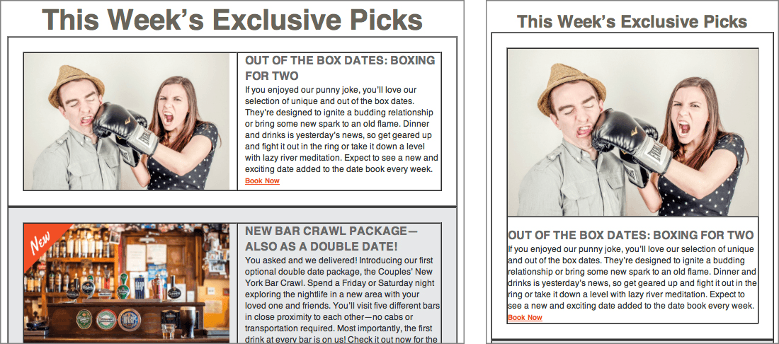
We need to add 3 exclusive picks that each have a picture, a heading, and a description. We want a 2-column desktop layout to change to a 1-column layout on mobile. Nesting tables will help us do this. While coding tables within tables may seem tedious and confusing at first, it’ll give us more control over the layout.
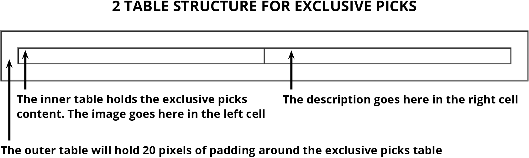
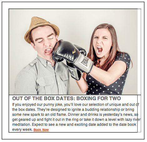
Let’s start by adding the 2-table structure for the first “exclusive pick” that advertises a boxing date. We’ll create a 1-column table in the current inner table that contains the heading about This Week’s Exclusive Picks. Inside that table, we’re going to insert another table that has 2 columns. The actual exclusive picks content will go in this table: the image will go in the left column and the heading and description for the listing will be displayed in the right column, as follows:
Coding Two Tables for the Exclusive Picks Content
In your code editor, open date-night-exclusive-picks.html from the 2-Column Layout folder if it isn’t already open.
NOTE: If your code editor allows you to open an entire folder (like Visual Studio Code does), open the entire 2-Column Layout folder.
Let’s grab the code for the first nested table we will add below the h1. In your code editor, open table-code.html from 2-Column Layout > snippets.
Copy all the code and leave the file open. We’ll copy it again later.
Switch back to date-night-exclusive-picks.html and below the h1 paste the code:
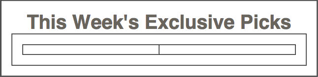
<td class="mainContent" align="center" width="100%">
   <h1>This Week’s Exclusive Picks</h1>
   <table align="center" border="1" cellpadding="0" cellspacing="0" width="100%">
      <tr>
         <td align="center" width="100%">

         </td>
      </tr>
   </table>
</td>
NOTE: The 1-pixel border is for testing purposes only. We’ll remove it later.
We want to add 20 pixels of padding around the 2-column table we’ll nest inside this cell. Instead of creating a class for this cell, let’s add a quick and easy inline style attribute. Around line 53, add the following bold style attribute to the td:
<td align="center" width="100%" style="padding: 20px;">You should still have the starter table code snippet in your clipboard. Around line 54, paste the code again as shown below:
<td align="center" width="100%" style="padding: 20px;">
   <table align="center" border="1" cellpadding="0" cellspacing="0" width="100%">
      <tr>
         <td align="center" width="100%">

         </td>
      </tr>
   </table>
</td>
This table will hold the first of 3 “exclusive picks.” Each exclusive pick table will have an image in the left column and the text-based information in the right column. Let’s have each column take up half the width of the table.
Change the width of the table cell and add a non-breaking space (
<td align="center" width="50%">

</td>
Copy the 3 lines of code shown in the previous step (the td around lines 56–58).
To make a second table cell, paste the code right below the td you copied:
<table align="center" border="1" cellpadding="0" cellspacing="0" width="100%">
   <tr>
      <td align="center" width="50%">

      </td>
      <td align="center" width="50%">

      </td></tr>
</table>
Save the file and preview date-night-exclusive-picks.html in a browser. You can see the nested tables under the heading!
Leave the file open in the browser, so you can reload the page to see your changes.
Let’s grab the content from a prepared snippet. In your code editor, open email-content.html from 2-Column Layout > snippets.
We’re adding the image right now, so copy only the code from line 6 (an image wrapped in a placeholder link).
Leave the file open. We’ll grab some of the other content later.
Switch back to date-night-exclusive-picks.html
Around line 57, replace the non-breaking space (
<td align="center" width="50%"> <a href="https://www.example.com" target="_blank"><img src="http://www.nobledesktop.com/nl-date-night/img/couple-boxing.jpg" width="290" ALT="Couple Fighting"></a> </td> <td align="center" width="50%"> </td>- Switch over to email-content.html.
- Grab the h2 and paragraph by copying the code from lines 7–8.
- Keep the file open and switch to date-night-exclusive-picks.html.
Around line 60, paste the code over the non-breaking space (
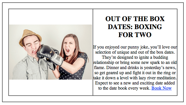
<tr>
   <td align="center" width="50%">
      <a href="https://www.example.com" target="_blank"><img src="http://www.nobledesktop.com/nl-date-night/img/couple-boxing.jpg" width="290" ALT="Couple Fighting"></a>
   </td>
   <td align="center" width="50%">
      <h2>OUT OF THE BOX DATES: BOXING FOR TWO</h2>
      <p>If you enjoyed our punny joke, you’ll love our selection of unique and out of the box dates. They’re designed to ignite a budding relationship or bring some new spark to an old flame. Dinner and drinks is yesterday’s news, so get geared up and fight it out in the ring or take it down a level with lazy river meditation. Expect to see a new and exciting date added to the date book every week. <a class="bookLink" href="https://www.example.com" target="_blank">Book Now</a></p>
   </td>
</tr>
Save the file and reload the browser. Both table cells are filled in with content, with the image on the left and the text content on the right:
Converting the Mobile Layout to 1-Column
Imagine trying to read this email on a narrow mobile phone. The columns would be too narrow, with a puny image and hard-to-read text. Not good!
While this 2-column layout works on the desktop, we want to switch over to a 1-column layout on mobile. To turn do that we have to tell the 2 table cells that hold the content to behave more like divs or block-level elements instead of table cells.
Return to your code editor.
Around lines 76 and 79, give both table cells the deviceWidth class, as shown in bold (named as such because these elements will switch over to take up the full width available to them on any mobile device):
<td class="deviceWidth" align="left" width="50%" valign="top" style="padding-right: 10px;">
   <a href="https://www.example.com" target="_blank"><img class="resImage" src="http://www.nobledesktop.com/nl-date-night/img/couple-boxing.jpg" width="290" ALT="Couple Fighting"></a>
</td>
<td class="deviceWidth" align="left" width="50%" valign="top" style="padding-left: 10px;">
In the media query under the rule for .wrapper, add the following new rule:
display: block!important;
}
.deviceWidth {
   display: block!important;
   width: 100%!important;
}.resImage {
NOTE: Just like in the previous exercise, we added the !important declaration so this rule will be powerful enough to override an inline style.
Save the file and reload the browser.
Resize the browser window. Pow! The page instantly turns into a 1-column layout once the width of the browser is 680 pixels, as shown below.
While the functionality is good, there are some minor layout issues we need to iron out. For one, the right edge of the content awkwardly sticks out. This is a remnant of the right and left padding attributes we added to the cells that hold the image and text content. To override this padding on mobile, return to your code editor.
In the rule for .deviceWidth, add the following bold rule that gets rid of the padding in the 1-column mobile layout:
.deviceWidth {
   display: block!important;
   padding: 0!important;
   width: 100%!important;
}
Save the file and reload the browser.
Resize the browser window. The content fits much more nicely without the excess padding! However, now that the text is displayed directly underneath the image, the h2 is a bit too close to it.
Let’s add some space. Return to your code editor.
In the media query, under the h1 rule add a new h2 rule:
font-size: 24px!important;
}
h2 {
   margin-top: 15px!important;
}
Save the file and reload the browser.
Resize the browser window. The image and text are now properly spaced, so we’re ready to add the images and info for the other 2 date listings!