Responsive Footer
What This Tutorial Covers
Footer Structure
Tables and inline styles for cross-client rendering.
Mobile Stacking
Multi-column footers that stack on small screens.
Compliance Links
Unsubscribe, privacy, and address requirements.
Noble Desktop's Web Design Certificate teaches HTML, CSS, and the responsive design patterns behind every modern email and web project.
Take part in this HTML Email tutorial and learn how to structure, style, and optimize your email's footer for mobile devices; the tutorial includes step-by-step exercises to create a responsive footer with tappable social media buttons.
Exercise Preview
Structuring the Footer Layout
It’s tempting to combine everything into one table cell that’s right-aligned. To gain the most control, we will add a new table row to our wrapper table. Inside that, we’ll nest a table with 7 columns (one for each element and the spaces between them).
Return to your code editor.
Let’s grab the code for the table cell that will hold the 7 nested tables. In your code editor, open table-code.html from 2-Column Layout > snippets.
Copy the code from the opening tr to the closing tr tag (around lines 2–6).
Leave the file open. We’ll copy the entire table code soon.
Switch back to date-night-exclusive-picks.html.
Near the end of the body, below the last
</tr>, paste the code as shown in bold:</tr> <tr> <td align="center" width="100%"> </td> </tr> </table> </body>The next step is to add the table that will hold our 7 footer elements. Switch back to table-code.html.
Copy all the code.
Close the file. You should be back in date-night-exclusive-picks.html.
Around line 151, paste the code into the new table cell, as shown below in bold:
<td align="center" width="100%">
   <table align="center" border="1" cellpadding="0" cellspacing="0" width="100%">
      <tr>
         <td align="center" width="100%">

         </td>
      </tr>
   </table>
</td>
The table has a temporary 1-pixel border so we can see the structure as we work.
We’ll need to target this table and its contents with some styles. Give it a footer class, as shown in bold below:
<table class="footer" align="center" border="1" cellpadding="0" cellspacing="0" width="100%">Around line 154, add a non-breaking space to the table cell, as shown in bold:
<td align="center" width="100%">

</td>
Next we need to add the remaining table cells to hold the footer content. Copy the 3 lines of td code shown above from (from around lines 153–155).
Paste the code 6 times, so you have a total of 7 table cells. As shown below, paste each copy on a new line, making it easier to see each cell:
<table class="footer" align="center" border="1" cellpadding="0" cellspacing="0" width="100%">
   <tr>
      <td align="center" width="100%">

      </td>
      <td align="center" width="100%">

      </td>
      <td align="center" width="100%">

      </td>
4 Identical TD Tags Omitted To Save Space
</tr>
</table>
Obviously, we can’t use a width of 100% for all the table cells.
Apple recommends that tappable areas be at least 44 X 44 pixels. The graphics inside that area don’t have to be that size, as long as there’s space around them to make the touchable area large enough. Our images are the Retina size (also known as high-res or 2x) of 88 X 88 pixels so we’ll make them 44 pixels in code for the mobile layout. On the desktop, our design calls for each to be 30 X 30 pixels, so let’s set that next.
Change the width to 30 (remove %) for the 3rd, 5th, and 7th tds, as shown below:
<td align="center" width="30">

   </td>
   <td align="center" width="100%">

   </td>
   <td align="center" width="30">

   </td>
   <td align="center" width="100%">

   </td>
   <td align="center" width="30">

   </td>
</tr>
For the even tds, change the width to 5 (remove %), as shown below:
<td align="center" width="5">

   </td>
   <td align="center" width="30">

   </td>
   <td align="center" width="5">

   </td>
   <td align="center" width="30">

   </td>
   <td align="center" width="5">

   </td>
   <td align="center" width="30">

   </td>
</tr>
In the first table cell, delete the width (so it’s size will be calculated as whatever space is left over). You’ll end up with this:
<tr>
   <td align="center">

   </td>
   <td align="center" width="5">
Save the file.
Return to the browser and reload the page.
As shown below, we have a nice wireframe for our footer:

Let’s add the content. Return to your code editor.
In the first table cell, around line 154 replace the non-breaking space with the following paragraph:
<tr>
   <td align="center">
      <p>FOLLOW US:</p>
   </td>
Give that first table cell followCell class so we can target it with CSS:
<tr>
   <td class="followCell" align="center">
      <p>FOLLOW US:</p>
   </td>
We prepared a file with the URLs for our 3 social buttons. In your code editor, open social-buttons.html from 2-Column Layout > snippets.
On line 1, copy the Facebook link.
Switch back to date-night-exclusive-picks.html and around line 160, in the 3rd table cell, delete the non-breaking space and paste the code as shown below:
<td align="center" width="30">
   <a href="https://www.example.com" target="_blank"><img src="http://nobledesktop.com/nl-date-night/img/facebook@2x.png" width="30" height="30" ALT="Facebook"></a>
</td>
Notice that the image has a set width and height that matches the space allotted to it on the desktop. To display the social icons larger on mobile, we’ll add a media query.
Repeat this process to fill in the remaining odd table cells with social buttons:
- Around line 166, fill in the 5th td with the X (formerly known as Twitter) icon from social-buttons.
- Around line 172, fill in the last td with the Instagram icon from social-buttons.
- Close social-buttons.html and return to date-night-exclusive-picks.html.
Save date-night-exclusive-picks.html and reload the browser. The desktop footer layout looks pretty good, but there are a few details we still need to style.
Styling the Footer
Let’s add some space between the footer, the red border above it, and the bottom of the page. As we have done in previous exercises, let’s add some padding to the table cell that contains the footer table.
Return to your code editor, and around line 150, add 20 pixels of top and bottom padding to the table cell before the footer table to put in a nice separation:
<tr>
   <td align="center" width="100%" style="padding: 20px 0;">
      <table class="footer" align="center" border="1" cellpadding="0" cellspacing="0" width="100%">
Save the file and reload the browser. We now have a nice buffer zone above and below the footer. Now the FOLLOW US: text needs to be aligned to the right, instead of center.
Return to your code editor and around line 153, align the followCell table cell to the right, as shown in bold:
<td class="followCell" align="right">
   <p>FOLLOW US:</p>
</td>
Save the file and reload the browser. Better, but we want the FOLLOW US: text to pop out a bit more.
Return to your code editor and scroll up to the desktop CSS styles because we want to add a rule that applies to all layouts.
Under the rule for .mainContent (ends around line 42), add the following bold rule for paragraphs within the class of followCell:
.followCell p {
   font-weight: bold;
   font-size: 16px;
}
Save the file and reload the browser. The desktop footer layout is done!
To see what the email looks like on a large mobile device, resize the browser window until the page changes to a 1-column layout.
The footer looks pretty good here too, but the icons are a bit small for people with larger fingers to tap. Let’s scale up the social buttons to 44 X 44 pixels for both mobile layouts. To do this we have to create two CSS rules: one for the social images, and one for the table cells that contain them.
Return to your code editor.
To distinguish the cells that contain icons from the cells that contain spaces, add a socialCell class to each of the 3 cells with a 30px-wide icon (the first one around line 167 is shown below). In Visual Studio Code, hold Option (Mac) or ALT (Windows) and click to create multiple cursors.
<td class="socialCell" align="center" width="30">
   <a href="https://www.example.com" target="_blank"><img src="http://nobledesktop.com/nl-date-night/img/facebook@2x.png" width="30" height="30" ALT="Facebook"></a>
</td>
Inside the max-width: 680px media query, below the .resImage rule, add a new rule for the socialCell class, as shown in bold below:
.socialCell {
   height: 44px!important;
   width: 44px!important;
}
Copy the new .socialCell rule and paste it right underneath. Change the target of the rule as shown in bold to target the images inside the socialCell:
.socialCell img {
   height: 44px!important;
   width: 44px!important;
}
Save the file and reload the browser. If the desktop layout is showing, resize the window smaller. The mobile icons are a larger (easier to tap) size of 44 X 44 pixels.
- Let’s see what this looks like on a smaller mobile device. CTRL–click (Mac) or Right–click (Windows) on the page and choose Inspect.
If the DevTools are not already on the right, put them there. To do that in Google Chrome, at the top right of the DevTools panel click the
 button and choose Dock to right as shown below:
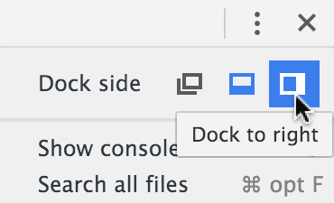
Resize the browser’s content area to be 480 pixels wide or less. In Chrome you can see the width as you resize the window.
The footer content looks like it’s almost filling the entire line. To make the footer less cramped on smaller mobile devices, let’s modify the layout on screens that are 480 pixels or smaller.
Optimizing the Footer for Smaller Mobile Devices
To make the footer look better on narrow mobile displays, we need to do 2 main things: move the FOLLOW US cell above the rest of the footer content, and center all the footer content.
It will take a few steps to accomplish this. We’ll start by changing the cells in the footer so they display as inline-block elements. When elements display as inline-block, you get the best of both worlds (inline and block): elements will still sit side-by-side in a line but you can also control the width, height, and alignment as you do on block elements.
Return to your code editor.
Inside the max-width: 480px media query, below the .mobileBanner a rule add a new rule for the table cells inside the footer class, as shown in bold below:
padding-top: 43.33%!important;
   }
   .footer td {
      display: inline-block!important;
      width: auto!important;
   }
}
NOTE: Make sure you do not have a space between inline-block and !important to avoid an issue in Yahoo.
We are setting the width to auto to make sure that the cells are only as wide as they need to be based on their content.
Save the file and reload the browser.
Notice that when the browser is at 480px, the footer moves to the left. Additionally, when the browser is even more narrow, the content may break into two lines.
To resolve this issue, let’s get the FOLLOW US text to display on its own line above the rest of the content. We can accomplish this by setting this cell to display as a block-level element. This will force the cell to go up to its own level above all the social buttons.
Return to your code editor.
Earlier we gave that td a class of followCell. Inside the max-width: 480px media query, below the .footer td rule, add a rule for table cells with the followCell class, as shown in bold below:
width: auto!important;
   }
   td.followCell {
      display: block!important;
   }
}
NOTE: Make sure you do not have a space between block and !important to avoid an issue in Yahoo.
Save the file and reload the browser. The browser should be at a narrow width.
The FOLLOW US text is displayed on top of the rest of the footer content, but it’s right-aligned. We want to center this text.
Return to your code editor and add the following code in bold:
td.followCell {
   display: block!important;
   text-align: center!important;
}
Save the file and reload the browser. The browser should be at a narrow width.
Now that the text is centered, we want to center the social buttons as well. However, if we do that now, the icons will be 5 pixels right of center, due to the extra 5 pixels of space we have in the table cell between each piece of content.
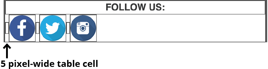
Let’s get hide the extra space cell.
Return to your code editor.
Around line 176, give the 2nd td (which has a width=“5”) in the footer table) the a hidden480 class:
<td class="hidden480" align="center" width="5">

</td>
The class name is a nice way to remember that we’re hiding this element on screens that are 480 pixels or narrower.
Inside the max-width: 480px media query, below the td.followCell rule, add the following bold rule for table cells with the hidden480 class:
text-align: center!important;
   }
   td.hidden480 {
      display: none!important;
   }
}
NOTE: Make sure you do not have a space between block and !important to avoid an issue in Yahoo.
Save the file and reload the browser. The browser should be at minimum width.
Woo hoo, the space is gone! It’s time to center the icons. The icons and remaining spaces are displayed as inline-block elements, so we can declare text-align: center for the footer table and all the content will comply.
Return to your code editor.
In the max-width: 480px media query, above the .footer td rule, add the following bold rule:
.footer {
   text-align: center!important;
}.footer td {
Save the file and reload the browser.
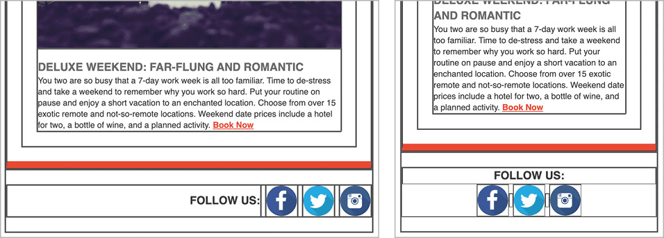
Slowly resize the browser window wider to see these differences between the small and large mobile layouts, as well as the desktop layout:
- In the max-width: 480px layout, the FOLLOW US text is displayed on top of the centered icons.
- In the max-width: 680px layout, the FOLLOW US text is right-aligned. Both it and the social buttons display on one line.
- The desktop layout looks similar to the large mobile layout, but the social buttons are a smaller 30 X 30 pixels.