Optimizing Images for Mobile
What This Tutorial Covers
Image Compression
Reduce file size without visible quality loss.
Retina-Ready Sizes
2x source images for crisp display on high-DPI screens.
Format Choice
JPEG vs. PNG vs. WebP for the right tradeoffs.
Noble Desktop's Web Design Certificate teaches HTML, CSS, and the responsive design patterns behind every modern email and web project.
Understand the specifics of HTML email image quality, and learn how to create responsive HTML emails with optimized mobile images through this detailed tutorial.
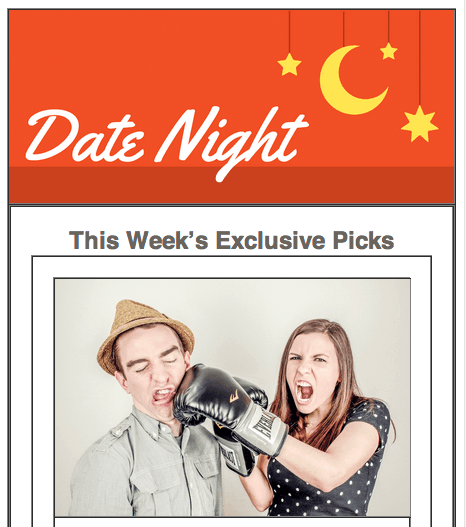
Exercise Preview
Further Optimizing the Mobile Banner
If you resize the browser window to see the first breakpoint where our layout transforms to the mobile-friendly single column (at 680 pixels), we see that our mobile banner will look absurdly large on a wider mobile screen. While we’re still primarily concerned with 320–414 pixel-wide phone screens, we want our email to look good on as many devices as possible.
The desktop banner still looks nice on large mobile screens, so let’s keep it displayed until the browser width is 480 pixels or smaller (the point around which the desktop banner no longer looks good on mobile).
Let’s add a media query for 480 pixel and smaller screens, then move the mobileBanner rules to this new media query. Switch back to your code editor.
Right above the closing style tag around line 73, add a media query for screens that are 480 pixels or smaller, as shown in bold below:
margin-top: 15px!important;
      }
   }
   @media only screen and (max-width: 480px) {

   }
</style>
Around lines 54–61, cut both the rules for .mobileBanner and .mobileBanner img
Get rid of any extra space in the remaining code.
Paste them inside the media query for screens with a max-width of 480px. The new media query should look like this:
@media only screen and (max-width: 480px) {
   .mobileBanner {
      background-image: url(http://www.Noble Desktop.com/nl-date-night/img/header-mobile@2x.png)!important;
      background-size: cover!important;
      padding-top: 43.33%!important;
   }.mobileBanner img {
      display: none!important;
   }
}
Save the file and reload the browser. Resize the browser window. The desktop banner still displays when the page transitions to the 1-column mobile layout, but it switches over to the mobile-optimized background image when it reaches 480 pixels. Great!
We have one more small issue to take care of. To see it, resize the browser window to any width at which the desktop image is displayed.
Hover over the banner image, and you’ll see the cursor turn into a pointer
 because there is a (currently empty) link surrounding the image. We presumably would want to link to Date Night’s website, so this is the behavior we want.
Resize the browser until the mobile-optimized banner image shows up. Hover over it to see that the cursor does NOT turn into a pointer
!By using display: none to hide the desktop image, there’s nothing inside the a tag, so it collapsed. We need to open this tag back up, even though there won’t be any visual content inside.
Switch back to your code editor.
Inside the max-width: 480px media query, add the following bold rule to target links (the a tag) inside the mobileBanner class:
display: none!important;
   }
   .mobileBanner a {
      display: block!important;
   }
}
Make sure you do NOT have a space between block and!important (because of the Yahoo bug).
We need to hold the link open at the same height that we’re holding open the entire cell. Let’s move the padding from the table cell to the link. In the rule for .mobileBanner, cut this line of code and remove any remaining whitespace:
padding-top: 43.33%!important;Paste the code inside the new rule for links inside the mobileBanner class, as shown in bold below:
.mobileBanner a {
   display: block!important;
   padding-top: 43.33%!important;
}
Save the file and reload the browser. It should look pretty good at a desktop width.
- Resize the browser until the mobile-optimized banner image shows up.
Now when you hover over the banner, the cursor should turn into a pointer
so it’s clickable again.Feel free to keep this page open in the browser as well as in your code editor. We’ll continue to build out the newsletter in the next exercise.
NOTE: Unfortunately, we cannot assign ALT text to a background image. For a workaround, refer to the bonus exercise ALT Text on Banner Swap.