2-Column Layout: Media Queries
What This Tutorial Covers
Desktop Two-Column
Side-by-side layout for spacious desktop email view.
Mobile Stacking
Media queries collapse columns on small screens.
Cross-Client Quirks
Outlook and Gmail handle media queries differently.
Noble Desktop's Web Design Certificate teaches HTML, CSS, and the responsive design patterns behind every modern email and web project.
Learn how to code a 2-column newsletter with media queries for optimal desktop and mobile viewing in this detailed HTML Email tutorial.
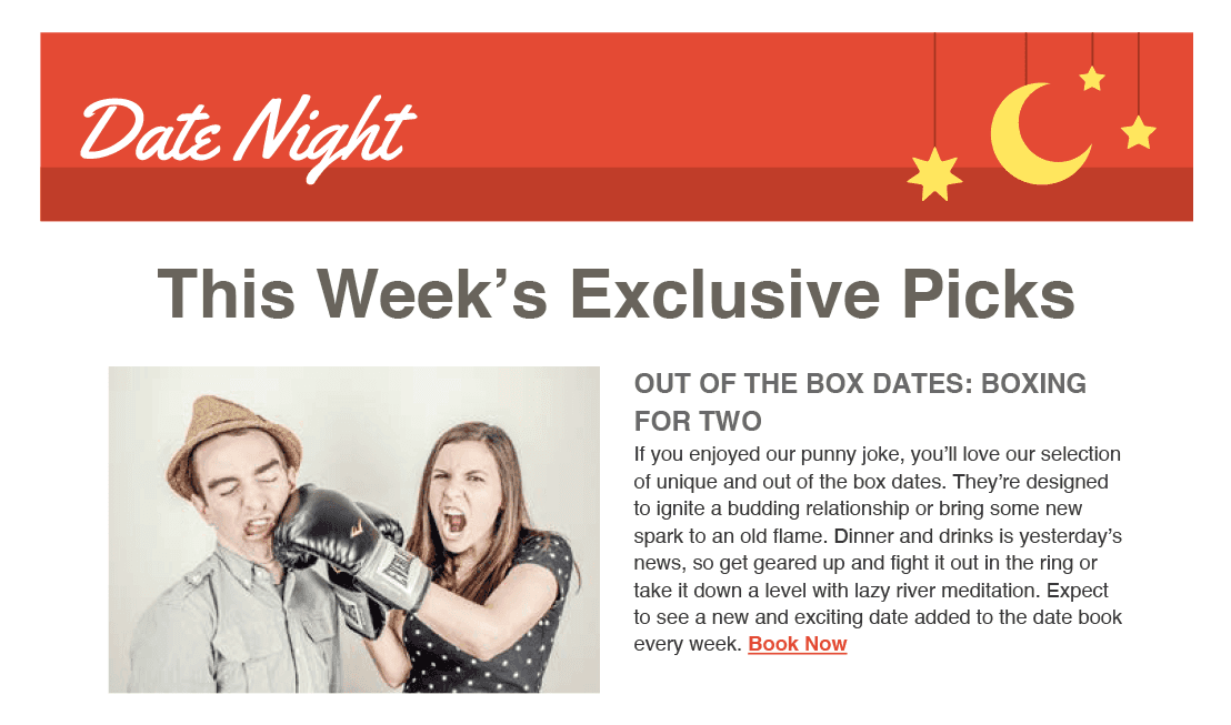
Exercise Preview
Nesting an Inner Table for the Main Content
Let’s come up with a working strategy before adding the email content. Switch to 2-Column Email Design Mockup.pdf to give it a second look.
For more complex layouts we take a modular approach: a table for each distinct section of content. Discrete tables give you consistent spacing and structure across email clients, and the are more easily updated for weekly newsletters such as this.
We could nest a new table under the banner image inside the current table cell, but let’s keep the banner in its own discrete table cell so we can have more control over the way the image will display across different devices. We’ll make the main table have 2 rows: a top row for the banner image and a bottom row the other content.
Return to your code editor and add a new table row and cell:
<table align="center" border="1" cellpadding="0" cellspacing="0" width="680">
   <tr>
      <td align="center" width="100%">
         <a href="https://www.example.com" target="_blank"><img src="http://www.nobledesktop.com/nl-date-night/img/header.png" width="680" ALT="Date Night"></a>
      </td>
   </tr>
   <tr>
      <td align="center" width="100%">

      </td>
   </tr>
</table>
Let’s nest a new table inside this new cell. Switch back to table-code.html to copy the starter table code.
Close the file and switch back to date-night-exclusive-picks.html.
Around line 17, paste the code, as shown below in bold.
<table align="center" border="1" cellpadding="0" cellspacing="0" width="680">
   <tr>
      <td align="center" width="100%">
         <a href="https://www.example.com" target="_blank"><img src="http://www.nobledesktop.com/nl-date-night/img/header.png" width="680" ALT="Date Night"></a>
      </td>
   </tr>
   <tr>
      <td align="center" width="100%">
         <table align="center" border="1" cellpadding="0" cellspacing="0" width="100%">
            <tr>
               <td align="center" width="100%">

               </td>
            </tr>
         </table>
      </td>
   </tr>
</table>
Let’s add the main heading inside the empty cell of this new table. In your code editor, switch back to email-content.html.
Copy only the code from line 3.
Close the file. You should be back in date-night-exclusive-picks.html.
Around line 20, paste the code inside the new table cell as shown in bold:
<td align="center" width="100%">
   <h1>This Week’s Exclusive Picks</h1>
</td>
Save the file and reload the browser. The image and text are displayed in 2 different tables. The border, at this point, looks doubled-up in the bottom section because of the nested tables; the outer table has a fixed width of 680 pixels and the inner table is 100% of its width.
Coding the Styles That Apply to Both Versions
It’s time to style the email. Let’s first code the styles that apply to both the desktop and mobile versions, and then add the media queries that will apply styles just to mobile versions.
First, we want to get rid of the space between the bottom of the banner and the header. Return to your code editor.
Under the title tag add a style tag that will hold our CSS rules:
<title>Date Night Exclusive Picks</title>
   <style>
   </style>
</head>
Add a rule for the img, getting rid of the gap below the banner image:
<style>
   img {
      display: block;
   }
</style>
Save the file and reload the browser. Great, the awkward space below the image is gone! Because the CSS applies to all images, we won’t encounter this problem again.
Hover over the image, and you’ll see the cursor turn into a pointer
 because there’s a link surrounding the image.
Some email clients in certain browsers will put an ugly blue border on an image with a link surrounding it. Let’s make sure our clients never see this.
Return to your code editor.
Inside the rule for the img, add this bold code:
img {
   display: block;
   border: 0;
}
Add a rule for the h1 that alerts users to this week’s exclusive picks:
img {
      display: block;
      border: 0;
   }
   h1 {
      color: #69655c;
      font-family: sans-serif;
      font-size: 40px;
      font-weight: bold;
      margin: 0;
   }
</style>
Save the file and reload the browser. There’s no margin on the top and bottom of the header text, and it is nicely styled in gray.
However, the text looks a little cramped with no padding. We want to add 20 pixels of padding to the contents of the header’s cell, which will contain the vast majority of the content. We could add padding to the individual cell that holds the h1 by inlining a style, but let’s give it a class so we can streamline our workflow and be able to add additional CSS to this element later.
Return to your code editor and around line 33, add a class of mainContent to the table cell that contains the h1:
<tr>
   <td class="mainContent" align="center" width="100%">
      <h1>This Week’s Exclusive Picks</h1>
Under the existing CSS rules, add a new rule for .mainContent:
margin: 0;
   }
   .mainContent {
      padding: 20px;
   }
</style>
Save the file and reload the browser. There should now be a 20-pixel space around the entire header text.
This portion of the email is more or less ready to send out to desktop users. To simulate what a mobile user would see, resize the browser window smaller.
Sure enough, the email doesn’t shrink down to size. Just like last time, we need to make both the outermost table and image flexible.