Creating Columns: Intro to CSS Grid & Media Queries
What This Tutorial Covers
CSS Grid Basics
grid-template-columns for flexible column layouts.
Media Queries
Adjust column counts and sizes per screen size.
fr Units
Fractional units that distribute space proportionally.
Noble Desktop's Front-End Web Development Certificate teaches HTML, CSS, and JavaScript — the complete front-end foundation.
Delve into the intricacies of HTML and CSS, as this tutorial guides you through creating a 2-column layout, identifying an ideal breakpoint, and implementing a media query to alter the layout depending on screen size.
Exercise Preview

Disabling Mobile Browser Text Size Adjustment
- On the upper left of the DevTools panel, click the Toggle device toolbar button
 to open the mobile simulator.
 Above the webpage preview, select a device such as the iPhone 5/SE:

- Click the Reload button, or hit Cmd–R (Mac) or CTRL–R (Windows).
- Notice that for the most part it looks like the desktop layout has been scaled down. It’s not the one column layout we want for mobile devices. That’s one issue we need to fix. But first, notice that some text (such as the heading and first paragraph) has not been reduced as much as other text (such as the two columns). That’s because some mobile browsers enlarge text they think is too small (if they think it doesn’t break the layout). We don’t want mobile browsers arbitrarily overriding some our font sizes, so let’s disable that.
- Switch back to your code editor.
- Go to Resume > snippets and open a code snippet we prepared for you, text-size-adjust.css.
- Hit Cmd–A (Mac) or CTRL–A (Windows) to select all the code.
- Hit Cmd–C (Mac) or CTRL–C (Windows) to copy it.
- Close the file.
At the top of main.css, paste the new code above the body rule:
html { -moz-text-size-adjust: 100%; -webkit-text-size-adjust: 100%; text-size-adjust: 100%; } body {- Save the file.
- Switch back to Chrome and reload the page.
The text is no longer being enlarged, so it looks like the desktop layout scaled down to fit a mobile phone. Now that the browser won’t be deciding what text it might enlarge, we must get it to display the layout appropriately for small screens, instead of scaling down the desktop layout.
The Viewport Meta Tag
Mobile devices assume websites were designed for desktops. They render the site on a large viewport (980px) and scale it down to fit their smaller screen. For responsive sites we must add a meta tag to tell it to render the page at the actual pixel width of the device, instead of the default 980px.
- Keep the browser open in device mode so we can come back to preview the changes we’re about to make.
- In your code editor, switch to resume.html.
In the
<head>tag, add the following bold code:<head> <meta charset="UTF-8"> <meta name="viewport" content="width=device-width, initial-scale=1"> <title>John Jacob J. Schmidt’s Resume</title>This tells mobile browsers to make the width of the viewport equal to the width of the device. Like other meta tags, it goes in the head tag.
Save the file and reload the page in Chrome (which should still be in device mode).
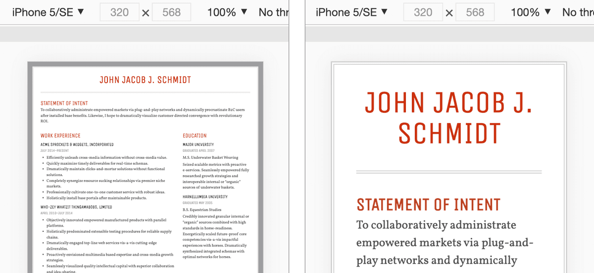
Now it should be the correct one column mobile appropriate layout! The viewport meta tag does not affect desktop browsers, only mobile browsers which employ the scaling behavior. As shown below, on the left is how the page looked before the meta tag, and on the right we see it with the meta tag!
Optional Bonus: Adjusting Text Size Across Screens
The John Jacob J. Schmidt heading (an h1) looks good on desktops, but is too big on phones. Let’s adjust that.
- Switch back to main.css in your code editor.
- In the h1 rule, change font-size to 32px.
To make the text larger on desktops only, inside the media query add the following new rule (shown below in bold):
@media (min-width: 700px) {
   body {
      margin: 20px;
   }
   h1 {
      font-size: 42px;
   }
Save main.css and reload resume.html in Chrome.
The phone layout now looks perfect, but let’s check the desktop size one last time.
- In the upper left of the DevTools panel, click the Toggle device toolbar button to close the mobile simulator.
Close the DevTools panel.
The desktop layout also looks great!