Hiding & Showing: Display, Visibility, & Opacity
What This Tutorial Covers
display: none
Removes the element from layout entirely.
visibility: hidden
Hides the element but keeps its space in layout.
opacity: 0
Visually transparent but still interactive and present.
Noble Desktop's Front-End Web Development Certificate teaches HTML, CSS, and JavaScript — the complete front-end foundation.
Refine your HTML and CSS skills with our step-by-step tutorial exploring how to hide and show elements, and the differences between display, visibility, and opacity.
Topics Covered in This HTML & CSS Tutorial:
Removing an Element from the Normal Document Flow with Display: None, Hiding/showing Elements with Visibility, Hiding/showing Elements with Opacity, How Display, Visibility, & Opacity Differ
Exercise Preview
Exercise Overview
In this exercise, we will investigate various ways to hide and show elements: setting the display property to none, the visibility to hidden, and setting opacity to 0. All of these approaches make content invisible for sighted users, but they have different effects on how the elements are rendered and whether or not the hidden text is accessible to the visually impaired.
Getting Started
- We’ll be switching to a new folder of prepared files for this exercise. In your code editor, close all open files to avoid confusion.
- For this exercise we’ll be working with the Hiding and Showing Elements folder located in Desktop > Class Files > Advanced HTML CSS Class. Open that folder in your code editor if it allows you to (like Visual Studio Code does).
- Open index.html from the Hiding and Showing Elements folder.
Preview index.html in Chrome (we’ll be using its DevTools).
We want to create an overlay on top of each of the four large featured art images. Each photo represents a different category (Oil, Watercolor, Mixed Media, and Installation), so we want to add this text to the respective overlays. Let’s create the Oil overlay first.
Leave the page open in Chrome so we can come back to it later.
Styling & Positioning the Overlay
Switch back to index.html in your code editor.
In the first
<div class=category>tag, add the following bold markup:<div class=category> <a href="#"> <img src="img/oil.jpg" ALT=""> <div class="description">Oil</div> </a> </div>- Save the file.
- Open main.css from the css folder (in the Hiding and Showing Elements folder).
Below the .category a rule (in the general styles, not the media query), style the overlay as shown in bold:
.category.description { text-align: center; text-transform: uppercase; font-family: Oswald, sans-serif; font-size: 2rem; line-height: 4rem; color: #fff; background: rgba(0,0,0,.4); }- Save the file, then reload the page in Chrome. It’s a start, but to place the overlay on top of the image, we need to use absolute positioning.
- Switch back to main.css in your code editor.
The anchor tag inside category div contains both the image and the overlay, so this is the closest parent element. In the .category a rule, declare a relative position as shown in bold:
.category a {
   box-shadow: 0 12px 18px rgba(0,0,0,.3);
   margin: 30px 0;
   display: block;
   text-decoration: none;
   position: relative;
}
NOTE: Remember that anchors are natively inline elements, which make poor relative parents due to the limited space these elements take up. To make this work, note that we already set the display property to block (inline-block would also work).
In the .category.description rule, set a position as follows:
.category.description { text-align: center; text-transform: uppercase; font-family: Oswald, sans-serif; font-size: 2rem; line-height: 4rem; color: #fff; background: rgba(0,0,0,.4); position: absolute; }- Save the file, then reload the page in Chrome. It’s a start, but the description has collapsed. To properly position it and open it up, let’s give it positioning coordinates.
- Switch back to main.css in your code editor.
To make the overlay stretch to fill the entire anchor tag, add the following bold coordinates to .category.description:
.category.description {Code Omitted To Save Space
position: absolute; top: 0; right: 0; bottom: 0; left: 0; }- Save the file, then reload the page in Chrome. The overlay is stretching to fill its container but we want to center the text vertically.
- Resize the browser window narrow and wide, to see that our layout is responsive. The image containers size up and down and maintain the same aspect ratio. This means we can’t use a fixed-pixel value to vertically center the text.
Switch back to main.css in your code editor.
Unfortunately, setting the vertical-align property to middle will not work. That property only works on inline or table elements, and we need the div to display as its native block so the overlay keeps on filling its container.
Fortunately there is solution that uses some math to calculate exactly how much top padding will center the text. Add the following to the .category.description rule:
.category.description {Code Omitted To Save Space
left: 0;
   padding-top: calc(33.33%—4rem/2);
}
How Did We Calcuate This?
Keep in mind that our text’s line height is 4rem and that padding is determined by the width of the container, not the height. All our images are the same aspect ratio. Once we know the ratio, we can divide it in half (for the top half) which will push the text half way down. That would put the top of the text half way down, but we want the middle of the text centered, so then we subtract half of the current line height. Here’s our calculation:
- (image height / image width)/2—line height/2
- In our case (560px/840px)/2 =.3333 (which is 33.33%)
- Save the file, then reload the page in Chrome.
Resize the browser window narrow and wide, to see that the Oil text is always centered. Leave the browser window as wide as possible when you’re done.
Removing an Element from the Normal Document Flow with Display: None
Let’s make this Oil text overlay only appear when a user mouses over the link. This means we need to hide it initially, and then show it on hover. There are multiple ways to hide things. Let’s start by taking a look at setting display to none.
- Switch back to main.css in your code editor.
At the end of the .category.description rule, add the following bold code:
.category.description {Code Omitted To Save Space
padding-top: calc(33.33%—4rem/2);
   display: none;
}
Save the file, then reload the page in Chrome.
The Oil text overlay should now be hidden, as if the element doesn’t exist. This is because display: none removes an element from the normal document flow. We’ll take a closer look at this shortly.
Let’s redisplay the element on hover. Switch back to main.css in your code editor.
We can’t hover over the description because it has been removed from the flow of the document. We can hover over the category’s anchor tag (which is on-screen at all times) and then show the description nested inside.
Below the .category.description rule, add this new following bold rule:
.category a:hover.description {
   display: block;
}
NOTE: It may be easier to read a CSS selector like this from right to left. We are targeting the.description div, but only when it is inside an anchor tag we’re hovering over (but only for anchors in the.category div). Because this rule is more specific than the rule above it, it will override that rule’s display property.
Save the file, then reload the page in Chrome:
- The overlay should initially be hidden.
- Hover over the oil painting image to see the overlay reappear. Great!
Hiding/Showing Elements with Visibility
Setting the display property to none removes an element from the flow of the document, making other elements on the page unaware of it. This poses a challenge for visually impaired users because screen readers also treat these elements as if they do not exist. These users may get lucky and hear their screen reader read out “Oil” if they hover over the link, but it’s not welcoming to people with special needs.
The visually impaired depend on web developers to follow best-practices for writing accessible code. There are two properties that can hide an element without hiding it from screen readers. Let’s first try setting visibility to hidden.
- Switch back to main.css in your code editor.
We want to temporarily disable the two display property declarations. Comment them out as shown in bold. TIP: Visual Studio Code users can put the cursor in each line and hit Cmd–/ (Mac) or CTRL–/ (Windows).
.category.description {Code Omitted To Save Space
padding-top: calc(33.33%—4rem/2);
   /* display: none;*/
}.category a:hover.description {
   /* display: block;*/
}
Setting the visibility property to hidden hides an element from sighted people but not from screen readers. We can reshow the element by setting it to visible. Add each property in the appropriate rule, as shown in bold:
.category.description {Code Omitted To Save Space
padding-top: calc(33.33%—4rem/2);
   /* display: none; */
   visibility: hidden;
}.category a:hover.description {
   /* display: block; */
   visibility: visible;
}
Save the file, then reload the page in Chrome.
- Hover over the image of the oil painting to see the overlay reappear, just like it did with display: none.
- This looks the same to sighted users, but is treated differently by screen readers.
Hiding/Showing Elements with Opacity
Another way to hide elements without “hiding” them from screen readers is to set opacity to 0. Opacity is more flexible than the previous two solutions because you can give it any value between 0 (fully transparent) and 1 (fully opaque).
- Switch back to main.css in your code editor.
- Comment out the visibility properties in both rules.
Make the .category.description 50% transparent, as shown in bold:
.category.description {Code Omitted To Save Space
/* display: none; */ /* visibility: hidden; */ opacity:.5; }- Save the file, then reload the page in Chrome to see the description is semi-transparent. Interesting to see, but not what we want.
- Switch back to main.css in your code editor.
Let’s make the.description totally transparent initially, and then fully opaque on hover with the following bold code:
.category.description {Code Omitted To Save Space
/* visibility: hidden; */
   opacity: 0;
}.category a:hover.description {
   /* display: block; */
   /* visibility: visible; */
   opacity: 1;
}
Save the file, then reload the page in Chrome. Hover over the image and once again it should visually appear the same, but this code (like visibility) is also accessible to screen readers.
How Display, Visibility, & Opacity Differ
Knowing how these approaches differ will help you choose the right solution. To get a better understand them, let’s test some code in the DevTools.
- Switch back to main.css in your code editor.
While previewing the page, you may have noticed the two pullquotes. Each is wrapped in a blockquote tag. In the blockquote rule, add the following bold properties, commenting out the last three properties in advance, as shown:
blockquote {
   border-left: solid 3px #17a99c;
   border-right: solid 3px #17a99c;
   color: #505050;
   margin: 20px;
   padding: 20px;
   cursor: pointer;
   /* display: none; */
   /* visibility: hidden; */
   /* opacity: 0; */
}
NOTE: We are going to run some tests in the browser. These commented properties can be enabled and disabled via checkboxes in the DevTools. Make sure each property declaration is commented out separately, as we want to be enable/disable each property individually.
- Save the file, then reload the page in Chrome.
- Below the top two images, hover over the blockquote that starts with “Art should bring us closer…” to see the cursor turn into a pointer. In order to see if the user can interact with the hidden blockquotes, we’ll look at one property at a time.
- CTRL–click (Mac) or Right–click (Windows) on the blockquote and select Inspect.
- If the
<blockquote>is not selected in the Elements panel of DevTools, select it now. - In the Styles panel, find the blockquote rule with the disabled properties. You may have to scroll down.
Check the box next to display: none; to enable that property and:
- Scroll down the page to see that all the blockquote elements have disappeared and are completely removed from the normal document flow.
- Hover over the empty white area where the blockquote was to see that the pointer does not appear.
- Back in the Styles panel, uncheck display: none; to disable it once more.
Check the box next to visibility: hidden; to enable that property and:
- Notice the gaps that appeared in place of each blockquote. This shows that the blockquotes are still part of the flow of the document, even though you can’t see the content.
- Hover over one of the gaps to see that the cursor does not turn into a pointer. Users cannot interact with elements hidden in this way.
- In the Styles panel, uncheck visibility: hidden;
Check on opacity: 0 to see:
- Once again, there is a gap. The blockquotes are in the normal document flow.
- Hover over one of the gaps to see the pointer hand. This happens because even when an element’s opacity is set to 0, it is still clickable and interactive!
Finishing up
Which solution works best for our project? We want our code to be fully accessible, so that eliminates the display property. In the next exercise, we will add CSS transitions so the overlay smoothly animates between the normal and hover states. There is no way to transition the visibility property. Because opacity values are numeric, they work well with CSS transitions, therefore we’ll use opacity.
- Switch back to main.css in your code editor.
In the blockquote rule, remove the four test properties at the end of the rule so it looks as shown below:
blockquote {
   border-left: solid 3px #17a99c;
   border-right: solid 3px #17a99c;
   color: #505050;
   margin: 20px;
   padding: 20px;
}
In the .category.description rule, remove the display and visibility declarations so you end up with this:
.category.description {Code Omitted To Save Space
padding-top: calc(33.33%—4rem/2);
   opacity: 0;
}
Do the same to the .category a:hover.description rule so you end up with:
.category a:hover.description { opacity: 1; }- Save main.css.
Save the file, then reload the page in Chrome. Make sure the hover effect is still working as expected.
Optional Bonus: Adding the Three Remaining Overlays
To complete the page, you’ll need to add overlays for the three remaining images.
- Switch to index.html in your code editor.
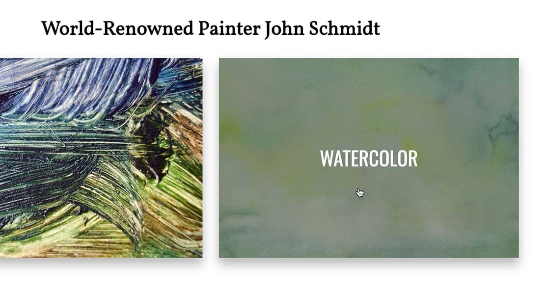
Under the watercolor image, add the following code:
<a href="#">
   <img src="img/watercolor.jpg" ALT="">
   <div class="description">Watercolor</div>
</a>
Do the same for the mixed-media:
<a href="#">
   <img src="img/mixed-media.jpg" ALT="">
   <div class="description">Mixed Media</div>
</a>
Do the same for the installation:
<a href="#"> <img src="img/installation.jpg" ALT=""> <div class="description">Installation</div> </a>- Save the file, then reload the page in Chrome.
Hover over all the images to make sure the code works and the labels are all correct.