Creating a Simple Sequence
What This Tutorial Covers
Sequenced Tweens
Chain animations with delays and timeline labels.
Position Parameters
Precise timing control with timeline positions.
Timeline Reuse
Build once, reuse across components.
Noble Desktop's JavaScript Development Certificate teaches modern JavaScript — the foundation behind GSAP and other animation libraries.
Dive into this detailed tutorial on understanding the GreenSock Animation Platform, where we'll discuss topics such as the TweenLite.from() method, relative versus absolute values, and the pros and cons of sequencing using delays. Explore exercises that include building animated sequences, previewing finished animations, manipulating DOM elements, and learning about sequencing with delays.
Topics Covered in This GreenSock Tutorial:
The TweenLite.from() Method, Relative Vs. Absolute Values, Pros & Cons of Sequencing Using Delays
Exercise Preview
Exercise Overview
In this exercise, we’re going to build a very simple animated sequence by creating a few tweens that have delays. Along the way we’ll explore another of TweenLite’s methods, TweenLite.from(). This method allows you to define the start values of the tween as opposed to the end values.
Previewing the Finished Animation
To take a look at the animation we’ll be building, open up Google Chrome.
Hit Cmd–O (Mac) or CTRL–O (Windows), navigate to Desktop > Class Files > yourname-GSAP Class > Simple Sequence, and double–click on finished.html.
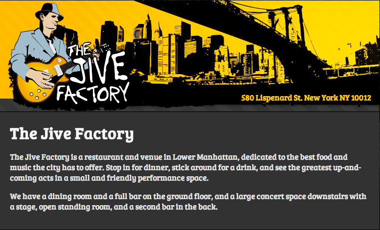
You will see a website for The Jive Factory, a restaurant and live music venue in Lower Manhattan.
- It’s helpful to view the sequence multiple times to get a feel for the animation. To do so, simply reload the browser by hitting Cmd–R (Mac) or F5 (Windows). As you review the animation, note the following:
- The page starts out empty. After a short delay, a header image with the Lower Manhattan skyline fades in.
- Shortly thereafter, the Jive Factory logo pops into view while rotating in from the left. It is placed onto the left-hand side of the skyline image.
- While the Jive Factory logo is still animating, the address moves in from the right. Notice how the logo overshoots its bounds, indicating a Back ease.
- Finally, the content area moves into place from the bottom.
Investigating the DOM Elements We’ll Animate
In a code editor, open start.html from the Simple Sequence folder.
Let’s familiarize ourselves with the structure of the page—the DOM tree. Scroll down around line 66 and note the IDs that have been assigned to the key elements we wish to animate, as shown in bold below.
<div class="panel">
   <img id="bg" src="img/skyline.jpg" width="760" height="225">
   <img id="logo" src="img/jf-logo.png" width="250" height="216">
   <div id="address">580 Lispenard St. New York NY 10012</div>
</div>
<div id="content">
<h1>The Jive Factory</h1>
<p>The Jive Factory is a restaurant and venue in Lower Manhattan, dedicated to the best food and music the city has to offer. Stop in for dinner, stick around for a drink, and see the greatest up-and-coming acts in a small and friendly performance space.</p>

<p>We have a dining room and a full bar on the ground floor, and a large concert space downstairs with a stage, open standing room, and a second bar in the back.</p>
</div>
DOM: Document Object Model
DOM is short for Document Object Model. Every document is organized in a tree structure, called the DOM tree, with the topmost node named Document object. JavaScript accesses and manipulates elements and/or the document itself according to the DOM.
Preview start.html in a web browser.
All four elements are in their final positions. In an animated page build like this, you will typically lay out all the HTML elements with the proper CSS before coding the animations. This gives you the assurance that the page is built the way you want it to resolve.
The TweenLite.from() Method
Since the DOM elements are already positioned where they should be when their tweens end, we must use a different method, TweenLite.from(). This method is similar to TweenLite.to(), except the numeric values inside the curly braces are start values instead of end values.
Return to your code editor.
Let’s tween the first DOM element that shows up on the finished page, the background image that has an ID of bg. Around line 85, delete the placeholder comment and type the following method shown in bold:
<script>
   TweenLite.from("#bg", 1, {opacity:0, delay:0.5});
</script>
Just like the TweenLite.to() method, the first parameter is the object you want to tween and the second parameter is the duration. The only difference is start vs. end values inside the curly braces. For instance, the bg will tween from an opacity of 0 and the end value will be completely opaque.
Save the file and preview the page in a browser.
Upon loading, there is a half-second delay and then the bg fades in over the duration of a second. The rest of the elements remain unanimated. The page will look a little funky until the entire sequence has been coded.
Return to your code editor and take a moment to review the code you just wrote.
In the last exercise, we created a variable and used document.getElementById() to target the icon element so that we could tween it. This meant that we were literally specifying which DOM element should be the target of the tween. Here, we are passing a CSS selector string of
"#bg"to TweenLite and it internally passes that string to document.querySelectorAll().document.querySelectorAll() gives you great flexibility in specifying which DOM elements a TweenLite tween should animate. You can select elements just like you would when creating C`SS rules like:
"h2":Will select every <h2>tag on the page.".feature":Will select every element with a class of feature. Example: <div class="feature">and<p class="feature">."h2.feature":Will select every <h2>tag with a class of feature. Example:<h2 class="feature">.You can learn more about how document.querySelectorAll() works at: developer.mozilla.org/en-US/docs/Web/API/Document.querySelectorAll
Now, using the same syntax, let’s tween the logo. Under the line you just edited, type the following bold code:
TweenLite.from("#bg", 1, {opacity:0, delay:0.5});
TweenLite.from("#logo", 1, {left:-200});
Save the file and preview the page in a browser. Perfectly serviceable but the animation could use a bit of spin and zoom.
Return to your code and type the following bold code to add rotation and scale:
TweenLite.from("#logo", 1, {left:-200, rotation:-90, scale:0});Save the file and preview it in a browser. Better! Let’s add an ease to jazz it up.
Return to your code editor and add the following ease shown in bold below:
TweenLite.from("#logo", 1, {left:-200, rotation:-90, scale:0, ease:Back.easeOut});Save the file and preview the page in a browser. Excellent. Except we really don’t want the logo to tween until the background image (#bg) has finished tweening.
To sequence the animation, we’ll need to add an appropriate delay to the logo tween. Return to your code editor and add a delay as shown in bold below:
TweenLite.from("#logo", 1, {left:-200, rotation:-90, scale:0, ease:Back.easeOut, delay:1.5});Save the file and preview the page in a browser. Perfect! The logo animation starts right after the bg tween has ended. This is because the first tween has a duration of 1 and a delay of 0.5, matching the logo’s delay of 1.5.
Relative Vs. Absolute Values
Up until now, all the values that we have used in our tweens have been absolute values. TweenLite also allows us to specify values relative to a property’s existing value by using String values with a += or –= prefix such as: "+=200" or "–=200".
For example, let’s assume an element has a CSS left property of 100. The following absolute value tween would change the element’s left property to 200:
TweenLite.to(element, 1, {left:200});On the other hand, a tween with a relative value of 200 is written like so:
TweenLite.to(element, 1, {left:"+=200"});Relative values are added onto or subtracted from whatever the value is set to. In this case, since the element’s initial value is 100, adding 200 would change the element’s left property to 300.
To find an element that might benefit from relative values, go into the browser window if you are not already there. Notice that the address is displayed on the right, indicating a fairly large left value. While the exact position (483) is listed in the CSS, why search for it if you can just use a relative value?
Return to your code editor and type the following bold tween that contains a relative value:
TweenLite.from("#bg", 1, {opacity:0, delay:0.5});
TweenLite.from("#logo", 1, {left:-200, rotation:-90, scale:0, ease:Back.easeOut, delay:1.5});
TweenLite.from("#address", 1, {left:"+=100", opacity:0, ease:Back.easeOut, delay:2});
Save the file and preview the page in a browser. The address text enters the screen to the right of the end value, from a value 100 greater than the CSS left position.
To test out the equivalent absolute value, return to your code and delete the quotation marks around 100 as well as the += before it. The left value will look like the bold code below:
TweenLite.from("#address", 1, {left:100, opacity:0, ease:Back.easeOut, delay:2});Save the file and preview the page in a browser. Whoa, this is a drastically different result! The text comes in from 100 pixels (under the Jive Factory logo), moving to the right instead of the left. This is too extreme for a basic address.
In your code editor, undo the changes by hitting Cmd–Z (Mac) or CTRL–Z (Windows) until the address tween’s left value looks like the bold code below:
TweenLite.from("#address", 1, {left:"+=100", opacity:0, ease:Back.easeOut, delay:2});Last but not least, let’s animate the content element. Type the following tween as shown in bold below.
TweenLite.from("#address", 1, {left:"+=100", opacity:0, ease:Back.easeOut, delay:2});
TweenLite.from("#content", 0.5, {opacity:0, top:100, delay:3});
Save the file and preview the page in a browser. Right when the address tween ends, the content comes in from the bottom. Your sequence is finished!
Downsides of Sequencing with Delays
Sequencing four tweens worked pretty well! However, there are a few downsides to using this approach. For instance, changing the duration or delay of any tween will mess up the sequence, something all too easy to do with multiple elements.
Return to your code editor.
In the first tween for the background, replace the half-second delay with an extreme delay of four seconds, as shown below in bold:
TweenLite.from("#bg", 1, {opacity:0, delay:4});Save the file and preview the page in a browser. Whoa, that looks awkward! You’d have to rethink the entire sequence to make an adjustment like this.
Return to your code editor and undo the changes by hitting Cmd–Z (Mac) or CTRL–Z (Windows) until the delay is once again 0.5 seconds.
Save your file.
Another downside: our sequence also can’t be paused, reversed, or controlled in any manner. All the tweens are running independently of each other. Don’t worry though—you’ll soon see how TimelineLite and TimelineMax can solve these issues.