Bootstrap: Spacing & Adapting Layout Across Screen Sizes
What This Tutorial Covers
Spacing Utilities
m-* and p-* utility classes for margin and padding.
Responsive Breakpoints
Apply spacing differently at sm, md, lg, xl breakpoints.
Auto Layout
Bootstrap's grid auto-adjusts content across breakpoints.
Noble Desktop's Full-Stack Web Development Certificate teaches HTML, CSS, JavaScript, React, Node.js, and the modern web stack.
Master the art of web development with our comprehensive tutorial covering a variety of topics such as adjusting spacing, changing the layout across screen sizes, and adding an Email Signup Form.
Topics Covered in This Web Development Tutorial:
Adding an Email Signup Form, Adjusting Spacing, Changing the Layout Across Screen Sizes
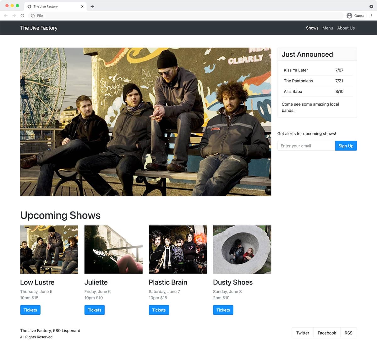
Exercise Preview
Photos courtesy of istockphoto, Hakan Çaglav, Image #14393929, Renee Keith, Image #7827478.
Exercise Overview
In this exercise you’ll look at adjusting spacing, changing the layout across screens, and more Bootstrap components.
Getting Started
The files for this exercise pick up where the previous exercise left off, but we’ll start with a new folder in case you experimented with anything in that exercise.
- In your code editor, close any files you may have open.
- For this exercise we’ll be working with the Bootstrap Spacing and Layout folder located in Desktop > Class Files > yourname-Flexbox Grid Class. You may want to open that folder in your code editor if it allows you to.
- Open index.html from the Bootstrap Spacing and Layout folder.
Preview index.html in a browser.
- This page is the same as what you created in the previous exercise.
Leave the page open in the browser and return to your code editor.
Adding an Email Signup Form
We need to add an email signup form in the right column and can use some Boostrap components to make it look better.
- Switch to your code editor.
- We’ve typed up some HTML to save you time (and included some sample code from the Bootstrap website). In your code editor, open input-group.html from the snippets folder.
- Select and copy all the code.
- Close the file.
- You should be back in index.html.
Below the card (inside the same column as the card), paste the code:
Come see some amazing local bands!
         </div>
      </div>
      <form action="">
         <p>Get alerts for upcoming shows!</p>
         <div class="input-group mb-3">
            <input type="text" class="form-control" placeholder="Recipient's username" aria-label="Recipient's username" aria-describedby="button-addon2">
            <button class="btn-outline-secondary" type="button" id="button-addon2">Button</button>
         </div>
      </form>
   </div>
</div>
<footer class="row">
Save the file and reload the page in your browser.
- In the right column (on wide screens) there should be a nice looking text field and a button.
- Click into the text field and notice it now glows with a subtle CSS transition.
- We need to change the text to suit our needs, and make the button’s appearance stand out more.
Let’s change the button’s appearance by changing its class. Return to your code editor and change the following bold code:
<button class="btn-primary" type="button" id="button-addon2">Button</button>Save the file and reload the page in your browser.
- The button is now colored so it stands out more.
- Return to your code editor.
Change the content to be appropriate for an email sign up form, by making the edits shown below in bold:
<input type="email" class="form-control" placeholder="Enter your email" aria-label="Enter your email" aria-describedby="button-addon2">
<button class="btn-primary" type="button" id="button-addon2">Sign Up</button>
Save the file and reload the page in your browser.
- The text field should now say Enter your email and have a Sign Up button.
Margins
Now let’s improve the spacing between elements. (Refer to getbootstrap.com/docs/5.0/utilities/spacing for all the details on margin and padding.)
- Return to your code editor.
Add margin space below the navbar by adding the following classes to it:
<nav class="navbar-expand-sm navbar-dark bg-dark mb-3 mb-sm-5 sticky-top">NOTE: The mb stands for margin-bottom. The lack of a size on mb-3 means it applies to all screen sizes. The mb-sm-5 increases the amount of space starting on small screens and larger (which will override the mb-3 at those screen sizes).
Save the file and reload the page in your browser.
- Notice the improved spacing below the navbar.
- The Upcoming Shows heading could use some space around it.
- Return to your code editor.
Add space above and below the h1 by adding the following classes:
<h1 class="mt-lg-5 mb-3">Upcoming Shows</h1>Save the file and reload the page in your browser.
- Notice the improved spacing around the Upcoming Shows heading.
- The 4 images below the Upcoming Shows heading could use some space below them.
- Return to your code editor.
Add bottom margin to all 4 images by adding the mb-3 class to each:
<div class="col-sm-6 col-xl-3">
   <img src="img/small-low-lustre.jpg" class="w-100 mb-3">
Code Omitted To Save Space
</div>
<div class="col-sm-6 col-xl-3">
   <img src="img/small-juliette.jpg" class="w-100 mb-3">
Code Omitted To Save Space
</div>
<div class="col-sm-6 col-xl-3">
   <img src="img/small-plastic-brain.jpg" class="w-100 mb-3">
Code Omitted To Save Space
</div>
<div class="col-sm-6 col-xl-3">
   <img src="img/small-dusty-shoes.jpg" class="w-100 mb-3">
Save the file and reload the page in your browser.
- Notice the improved space below the 4 images.
- We need some more space above and below the Sign Up form.
- Return to your code editor.
Instead of adding both margin top (mt) and margin bottom (mb), we can use my, which is margin on the y-axis (both top and bottom). Add the following class to the form:
<form class="my-5" action="">Save the file and reload the page in your browser.
- Notice the form now has space above and below it (the space below is needed on small screens where the form has the footer below it).
Gutters
While you can adjust the spacing of specific elements with margin and padding, each row can specify a gutter amount for the columns inside it. You specify horizontal gutters with a gx class, vertical with a gy class or both horizontal and vertical with a g class. To learn more visit getbootstrap.com/docs/5.0/layout/gutters
- Return to your code editor.
Increase the gutters around all 4 images by adding the mb-3 class to each:
<h1 class="mt-lg-5 mb-3">Upcoming Shows</h1>
<div class="row g-5">
Save the file and reload the page in your browser.
- Notice the increased space between the columns/rows of 4 images below Upcoming Shows.
- The space looks good on small screens when the columns stack, but is a bit too much on larger screens. Let’s reduce it a bit.
Add the g-md-4 class as shown below in bold:
<h1 class="mt-lg-5 mb-3">Upcoming Shows</h1>
<div class="row g-5 g-sm-4">
Save the file and reload the page in your browser.
- The gutters change from a 5 gutter amount (large gutters) on the xs (extra small) screens, to a 4 gutter (slightly smaller gutters) on sm (small) and wider screens.
- Make the window narrow so you can see there’s a horizontal scrollbar that allows us to scroll left/right just a few pixels. Bootstrap’s website says “The.container or.container-fluid parent may need to be adjusted if larger gutters are used too to avoid unwanted overflow”.
- Return to your code editor.
As instructed by Bootstrap’s website, add an overflow-hidden class to the container:
</nav>
<div class="container overflow-hidden">
    <div class="row">
Save the file and reload the page in your browser.
- The horizontal scrollbar should now be gone.
- Make the window narrow enough so you can see the footer (which includes the social links) doesn’t look good when it’s 2 columns on extra small screens.
Changing the Footer Layout Across Screen Sizes
Let’s make the footer look better on mobile.
- Return to your code editor.
We don’t want the footer to have columns on smaller screens. On both of the footer’s 2 columns, add -md as shown below in bold:
<footer class="row">
   <div class="col-md">
Code Omitted To Save Space
</div>
   <div class="col-md flex-grow-0">
Code Omitted To Save Space
</div>
</footer>
Save the file and reload the page in your browser.
- The footer is now a single column on smaller screens (the address and social items now stack).
- The social media buttons have grown to fill the entire width and are too wide.
- It would look nicer if the footer content was centered.
- Return to your code editor.
Center the footer’s text on smaller screens by adding the following classes:
<footer class="row text-center text-md-start">Save the file and reload the page in your browser.
- The footer’s text is now centered on small screens, but the buttons are still too wide.
- Return to your code editor.
Flex elements (like block elements) fill up the entire width of their container. Alternatively inline-flex elements (like inline elements) collapse to the width of their content (and they follow their parent element’s text alignment). Style the social network list-group to as inline-flex by adding the following class:
<div class="list-group-horizontal d-inline-flex">
   <a href="#" class="list-group-item-action">X (formerly known as Twitter)</a>
NOTE: The d- stands for display.
Save the file and reload the page in your browser.
- The footer layout on small screens is looking much better!
- What if we wanted The Jive Factory, 580 Lispenard to be below the social networks? We can use flexbox to reorder the elements.
- Return to your code editor.
Add the following classes to change the order:
<footer class="row text-center text-md-start">
   <div class="col-md order-1 order-md-0">
Save the file and reload the page in your browser.
- On mobile, notice The Jive Factory, 580 Lispenard is below the social networks.
- Now we need some space below the social networks.
- Make the window wider to see that the footer also needs space above.
- Return to your code editor.
Add the following classes to adjust the gutters and add more margin space above:
<footer class="row text-center text-md-start g-4 mt-4">
   <div class="col-md order-1 order-md-0>
Save the file and reload the page in your browser.
- Resize the window to see that the footer’s margins look across all screen sizes.
Optional Bonus: Revisiting the Fluid Container
- Return to your code editor.
Below the nav tag, find the container and add -fluid as shown below:
</nav>
<div class="container-fluid">
Save the file and reload the page in your browser.
- Resize the browser to see how the page behaves.
- Return to your code editor.
We prefer a non-fluid container for this page, so let’s switch back. Remove the -fluid you just added, so you end up with:
</nav>
<div class="container">
NOTE: Which style you like is personal preference and how it works with the site’s content. We prefer the regular container for this site. Also, there’s no limit to how wide the page can get, but most likely you’d want to add a limit. We’d suggesting adding the following rule in main.css and adjusting the size to whatever you desire:
.container-fluid {
   max-width: 1400px;
}
Optional Bonus: Borders & Rounded Corners
- Try adding the classes border-secondary rounded to all the images to add a gray rounded border.
Save the file and reload the page in your browser.
We’ve only scratched the surface of the components available in Bootstrap. You can learn about them all (with code examples) at getbootstrap.com
Even if you don’t use the pre-made components, and only use Bootstrap for a responsive grid, it can be useful.
Optional Bonus Challenge: Finishing the Margin Spacing
Use what you’ve learned to add space (margin) above the Just Announced card only when it moves under the other content (and not on wider screens when it’s in the right column).