Jive Factory: Final Touches & Limiting Flexible Content
What This Tutorial Covers
Flexible Content Constraints
Set max-widths to prevent over-stretching.
Polish Pass
Refine spacing, alignment, and edge cases.
Cross-Browser Testing
Verify the design holds up across browsers.
Noble Desktop's Web Design Certificate teaches Figma, HTML, CSS, and responsive design.
Gain a comprehensive understanding of mobile and responsive web design through this tutorial, where topics such as optimizing content for specific screen sizes and centering the design at certain screen sizes are covered.
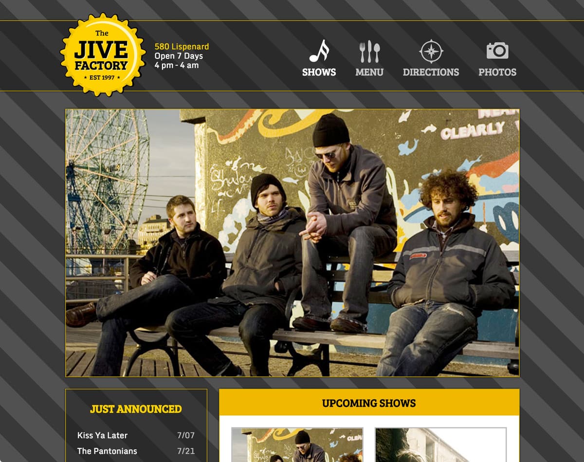
Exercise Preview
Improving Upcoming Shows on Mobile
- We’ll be using a new folder of provided files for this exercise. It contains the same Jive Factory page you’ve been working on in the previous exercises, but in a more completed state. Close any files you may have open in your code editor to avoid confusion.
- In Chrome, preview index.html (from the Jive Final Touches folder). Be sure to go into the right folder!
- Resize the browser from mobile up to desktop size to see the new content and how it adapts to different screen sizes.
- CTRL–click (Mac) or Right–click (Windows) anywhere on the page and select Inspect to open Chrome’s DevTools.
- On the upper left of the DevTools panel, click the Toggle device toolbar button
 to open the mobile emulator.
 - From the device menu above the webpage, select a mobile device such as the iPhone 5. (Make sure it’s in the vertical orientation.)
- Click the Reload button, or hit Cmd–R (Mac) or CTRL–R (Windows).
- At this small screen size, the Upcoming Shows has some reflow issues. The Tickets button and Featuring text flow under the photo, but our design calls for it to be aligned as a column under the band name and event detail text. We’ve already wrapped all that text (and Tickets button) in a div with an info class. Let’s style it now.
- Keep the page open in Chrome, with the DevTools open.
- Switch back to your code editor.
- For this exercise we’ll be working with the Jive Final Touches folder. Open that folder in your code editor if it allows you to (like Sublime Text does).
- Open main.css from the css folder.
- In the max-width: 479px media query, find the .shows h1 rule (around line 276).
Below the .shows h1 rule add the following:
.shows.info { overflow: hidden; }- Save the file.
Reload the page in Chrome. Awesome, now the text for each show will form into a column, instead of wrapping under the photo!
Why does this work? In this case nothing is actually being hidden, but invoking the overflow property has forced the page to re-evaluate how content is overflowing. Overflow hidden is restricting the content to the natural width of the info div.
- The Featuring text (below the tickets button) is probably more info than people need on such a small device. Let’s hide it on mobile. Switch back to main.css in your code editor.
After the .shows.info rule you just added (around line 279, in the max-width: 479px media query), add the following:
.shows.description { display: none; }- Save the file.
- Reload the page in Chrome.
- Notice that Upcoming Shows looks better now that the description has been hidden.
Close the DevTools window, but keep the page open in Chrome.