Flix: Setting the Viewport Meta Tag
What This Tutorial Covers
Why It Matters
Mobile browsers need this for native rendering.
Standard Pattern
width=device-width, initial-scale=1.
Accessibility
Don't disable user zoom — it harms accessibility.
Noble Desktop's Web Design Certificate teaches Figma, HTML, CSS, and responsive design.
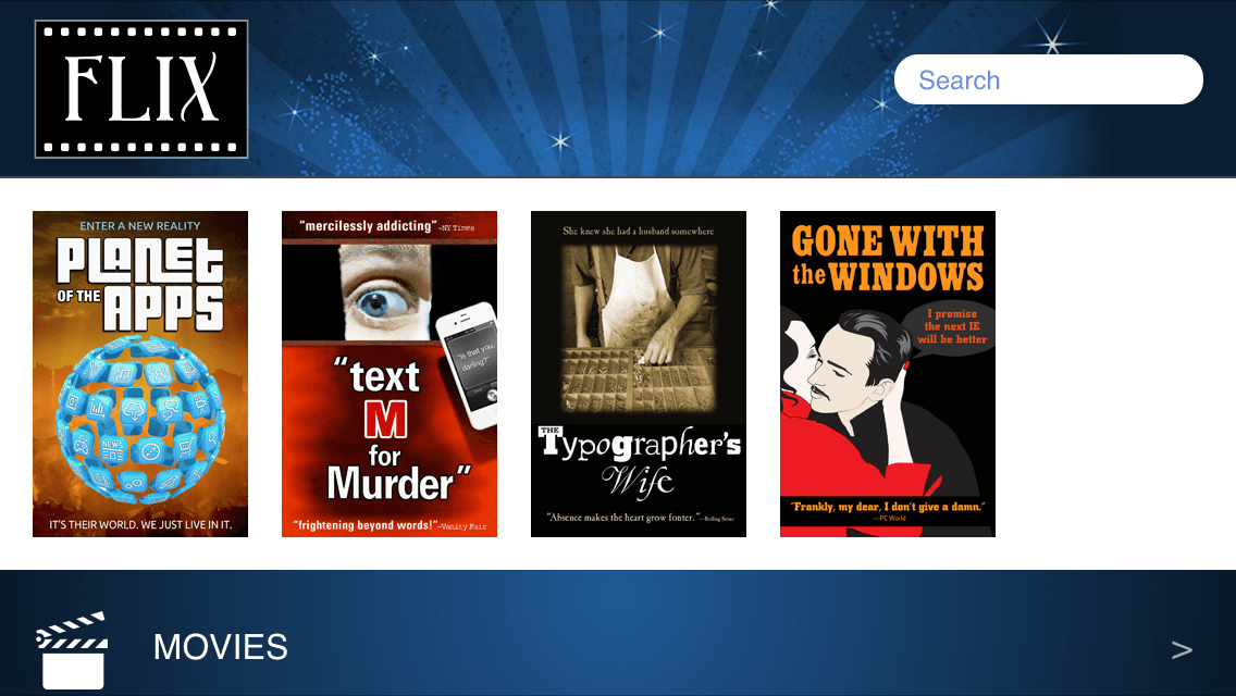
Dive into this detailed tutorial that covers the gamut of mobile and responsive web design, focusing on the crucial aspect of the viewport meta tag, utilizing the mobile website of Flix, a movie review platform, as a practical exercise.
Exercise Preview
Photos courtesy of istockphoto, unizyne, Image #19302441, Marcello Bortolino, Image #17472015, Sergey Kashkin, Image #318828, Sveta Demidoff, Image #2712135, Chen Fu Soh, Image #3794598.
The Viewport Meta Tag
- In Chrome, CTRL–click (Mac) or Right–click (Windows) anywhere on the page and select Inspect to open Chrome’s DevTools.
- On the upper left of the DevTools panel, click the Toggle device toolbar button
 to open the mobile emulator.
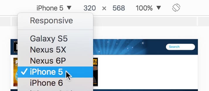
 As shown below, above the webpage preview select a device such as the iPhone 5.
- Click the Reload button, or hit Cmd–R (Mac) or CTRL–R (Windows).
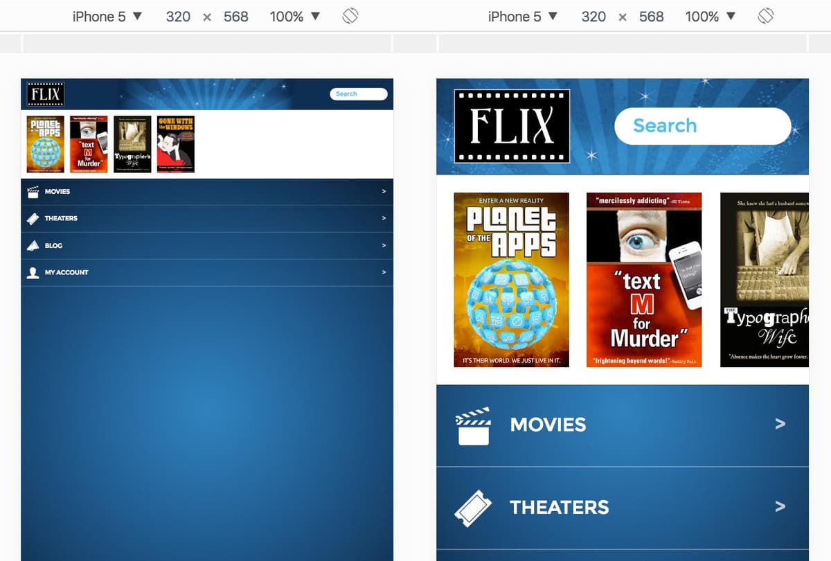
As you should see in the emulator (shown below), the content does not look optimized for a mobile device. It looks like a wide desktop page that has been scaled down to fit on a small mobile screen.
Photos courtesy of istockphoto, unizyne, Image #19302441, Marcello Bortolino, Image #17472015, Sergey Kashkin, Image #318828, Sveta Demidoff, Image #2712135, Chen Fu Soh, Image #3794598.
Mobile browsers employ a default width and scaling behavior. Small devices assume sites were designed for desktops. They render the site on a large viewport (980px) and scale it down to fit the smaller screen. We must use a viewport meta tag to tell it to render the page at the pixel width of the device, instead of the default 980px. This will prevent it from zooming out so far.
Keep the browser open in emulation mode so we can come back to preview the changes we’re about to make.
In your code editor open index.html from the Class Files > yourname-Mobile and Responsive Class > Flix Viewport folder.
In the
<head>tag, add the following bold code:<head> <meta charset="utf-8"> <meta name="viewport" content=""> <title>Flix</title> <link href="https://fonts.googleapis.com/css?family=montserrat:400,700" rel="stylesheet">NOTE: Like other meta tags, this tag always goes in the head of the document. This meta tag is generally referred to as the viewport meta tag or simply viewport tag.
The content attribute of the tag can take a few comma-separated key-value pairs for different settings. Add the following bold code:
<meta name="viewport" content="width=device-width">This tells mobile browsers to set the viewport’s width to the width of the device.
Save the file.
Reload the page in Chrome, which should still be in device mode.
The code we added won’t make any visual change to what you see in a desktop browser, only in a mobile browser which employs a default scaling behavior. As shown below, on the left is how the page used to look, and on the right we see that the width of the page is now set to the device’s width and looks correct!
Photos courtesy of istockphoto, unizyne, Image #19302441, Marcello Bortolino, Image #17472015, Sergey Kashkin, Image #318828, Sveta Demidoff, Image #2712135, Chen Fu Soh, Image #3794598.
What happens when we rotate the device to landscape? In Chrome, above the webpage preview, click the Rotate
 button to change the orientation.
That looks good. The portrait layout is recalculated to show more content in the wider, landscape preview.
If you viewed the page on a device running iOS 8 or older, you would see that the layout remains the same but is scaled up to fill the wider screen, as shown below:

Photos courtesy of istockphoto, unizyne, Image #19302441, Marcello Bortolino, Image #17472015, Sergey Kashkin, Image #318828, Sveta Demidoff, Image #2712135, Chen Fu Soh, Image #3794598.
Testing in the IOS Simulator
If you want to see the issue mentioned above for yourself, you’ll need to have a Mac with the iOS Simulator installed (see Before You Begin at the beginning of the book for installation instructions). Remember, this only affects iOS 8 and older, so you will no longer see this in iOS 9. The iOS version will be listed in the title bar of the simulator window if you’re unsure what version it’s running.
Launch iOS Simulator.
Go to Hardware > Device (go into the iOS submenu if you have it) and choose any iPhone option.
The iOS Simulator shows a Retina display. If this is too large to fit on your low-res screen, go to Window > Scale > 75% (or 50%, depending on the size of your screen).
Drag index.html from the Finder onto the Simulator window to preview.
- In the Simulator app, choose Hardware > Rotate Right (or hit Cmd–Right Arrow) to show landscape view. Take note of how the layout is scaled up, making it difficult to see much of the page.
Because the portrait layout is scaled to fit a wider landscape screen on iPhones running iOS 8 or older, you actually see less of the page. Most users would probably expect to see more of the page. We can control the initial scale of a page with a little more code that will fix this. Back in index.html, add the following bold code and don’t miss the comma!
<meta name="viewport" content="width=device-width, initial-scale=1">About Initial-Scale
The initial-scale value represents a scaling ratio, so setting initial-scale=1 tells the browser to set the scale of the page to 100%, which is the same as not scaling the page at all. For example, 1.5 would set the zoom to 150%.
Some mobile browsers such as Opera Mobile, set initial-scale to 1 by default once you set the viewport meta tag width to device-width. As we mentioned with iOS Safari, however, the portrait width will also be used for the landscape orientation unless specified with initial-scale. We recommend setting initial-scale=1 for the most consistent results across devices.
- Save the file.
If you reload the page in iOS 8 or older, it will show more content. (A bug in the iOS Simulator may show an incorrect preview of the landscape mode. Rotating back and forth between portrait and landscape should fix it.)
After: Layout Now Shows More Content
Before: Layout Was Scaled Up