Flix: Media Queries for Retina/HiDPI Graphics
What This Tutorial Covers
min-resolution Query
Detect high-density displays in CSS.
@2x Backgrounds
Serve high-res images only when needed.
Performance
Smaller images for non-Retina users.
Noble Desktop's Web Design Certificate teaches Figma, HTML, CSS, and responsive design.
Learn about using media queries to optimize high-resolution images for Retina/HiDPI displays in our Mobile & Responsive Web Design tutorial.
Exercise Preview
Photos courtesy of istockphoto, unizyne, Image #19302441.
Previewing
- We’ll be using a new folder of provided files for this exercise. Close any files you may have open in your code editor to avoid confusion.
- On your Desktop, navigate into Class Files > yourname-Mobile and Responsive Class > Flix Media Queries for Retina Graphics.
- Preview index.html in iOS Simulator or Google Chrome (either works, or do both!).
If you previewed in Chrome:
CTRL–click (Mac) or Right–click (Windows) anywhere on the page and select Inspect to open Chrome’s DevTools.
If you’re not already in device mode, click the Toggle device toolbar button
 on the upper left of the DevTools panel.
From the device menu above the webpage, select a device such as the iPhone 5.
Click the Reload button, or hit Cmd–R (Mac) or CTRL–R (Windows).
If you previewed in iOS Simulator, go to Window > Scale > 100% (or hit Cmd–1).
Take a look at the header’s background graphic (the blue rays). Currently this is the low-res (1x) background image, which looks good, except on hi-res displays it could be sharper.
NOTE: If you previewed in the iOS Simulator, you’ll be able to see that it’s blurry even if you’re on a low-res Mac display, but the simulator window will be large on your screen.
Leave the page open in Chrome or iOS Simulator so we can reload it later to see the change.
Sizing the Background Image
- Leave the page open in Chrome or iOS Simulator.
- Switch back to main.css in your code editor.
Let’s make the header background scale to fit the header area, no matter whether it’s the low or hi-res version. On line 35, find the header rule and add the following bold code to give the background an auto width and 100% height:
header { background-color: #0A1D32; background-image: url(../img/header-bg.png); background-repeat: no-repeat; background-position: center bottom; border-bottom: 1px solid rgba(255,255,255,.2); padding: 0 15px; background-size: auto 100%; }- Save the file.
- Switch back to Chrome or the iOS Simulator and reload the page. The header background should once again be the correct size.
If you’re in iOS Simulator, the header background should now appear sharper than it was previously.
- If you have a Retina display, the page will appear sharp and appropriately sized.
- If you have a low-res display, the page will also appear sharp, but the entire layout appears twice as large as it should be (which is the only way Apple can show you more detail on your low-res display).
If you’re in Chrome, let’s use the device pixel ratio to see the change. This setting is not shown by default, so we’ll have to enable it. As shown below, click the 3 dotted button
 and choose Show device pixel ratio.
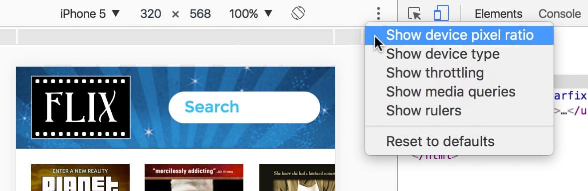
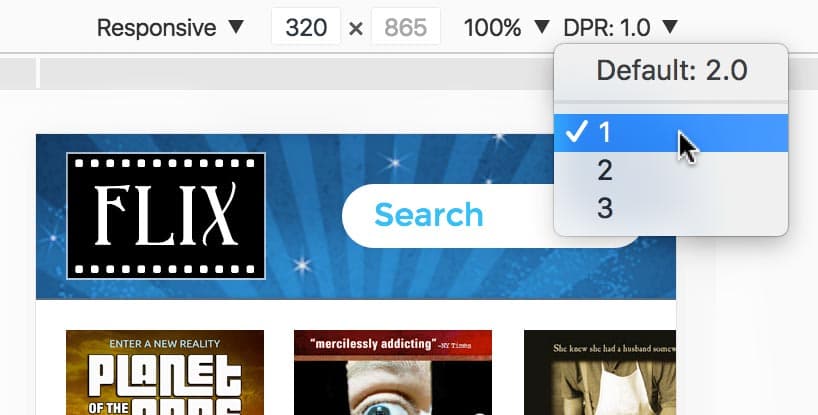
A new DPR: 2.0 option will appear to the right of the dimensions. It’s grayed out though. From the device menu (to the left of the dimensions) choose Responsive.
NOTE: DPR stands for device pixel ratio.
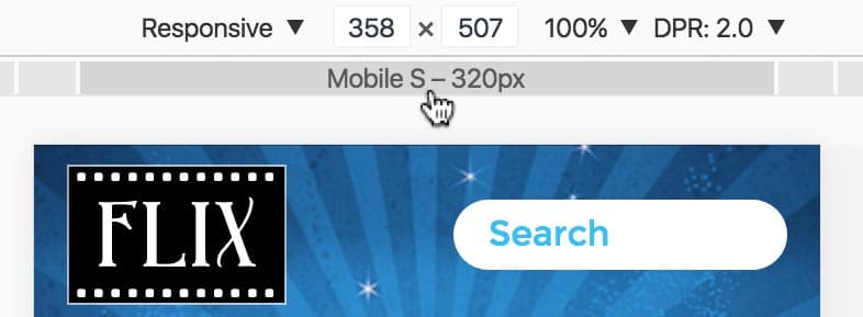
The DPR menu will no longer be disabled. Before using it though, let’s make sure your preview is set to a mobile size. As shown below, hover over the gray bar under the dimensions. You should see Mobile S—320px, so click once to switch to that size.
While watching the header background image, click on the DPR menu and choose 1. Notice the image changes.
- If you have a low-res screen, you can’t see the difference in the details because of the limitations in your screen, but you should notice a slight shift due to minor differences between the graphics.
- If you have a high-res screen, you can see the sharp background has now changed back to the original (blurrier) 1x.
Click on the DPR menu and choose Default: 2.0 to see the graphic switch back.
- If you have a low-res screen, you’ll only see a minor shift, but it won’t look better on your limited screen.
- If you have a hi-res screen, you’ll see the sharper image is back.