Bootstrap: More Elements & Nesting Grids
What This Tutorial Covers
Nested Grids
Grids inside grid columns for complex layouts.
Component Composition
Combine cards, navs, and forms in layouts.
Responsive Behavior
Nested grids adapt independently per breakpoint.
Noble Desktop's Web Design Certificate teaches Figma, HTML, CSS, and responsive design.
Learn how to add an email signup form and nest sections in this comprehensive guide on Mobile and Responsive Web Design.
Topics Covered in This Mobile & Responsive Web Design Tutorial:
Adding an Email Signup Form, Nesting Sections
Exercise Preview
Photos courtesy of istockphoto, Hakan Çaglav, Image #14393929, Renee Keith, Image #7827478.
Exercise Overview
In the previous exercise we started the basic layout of the page but we need to add some additional content. In this exercise, you’ll learn about some more of Bootstrap’s components and use the grid system to nest columns within other columns.
If you completed the previous exercise you can skip the following sidebar. We recommend you finish the previous exercise (5C) before starting this one. If you haven’t finished it, do the following sidebar.
If You Did Not Do the Previous Exercise (5C)
- Close any files you may have open.
- On the Desktop, go to Class Files > yourname-Mobile and Responsive Class.
- Delete the Bootstrap folder.
- Select the Bootstrap Getting Started Done folder.
- Rename the folder to Bootstrap.
For this exercise we’ll be working with the Bootstrap folder. Open that folder in your code editor if it allows you to (like Sublime Text does).
If index.html is not already open in your code editor, open it now.
Adding an Email Signup Form
We need to add an email signup form in the sidebar. After the second well (that contains the Jive at Five content), add the following:
<div class="well">
         <h4>Jive at Five</h4>
         <p>Happy Hour Drink Specials 5–8 pm</p>
      </div>
      <hr>
      <form>
         <p>Get email alerts for upcoming shows!</p>
         <div>
            <input type="email">
            <button>Sign Up</button>
         </div>
      </form></div>
</div>
<hr>
Save and preview index.html in a browser. There should be a text field and a Sign Up button, but there’s nothing special about their appearance.
Click into the text field and notice it has the browser’s default appearance/border.
Resize the browser and see that they don’t fill the line very well and sometimes break onto different lines.
We can use Bootstrap’s provided classes to improve the appearance of the text field and button. Return to your code editor and add the following bold code:
<form>
   <p>Get email alerts for upcoming shows!</p>
   <div>
      <input type="email" class="form-control">
      <button class="btn-default">Sign Up</button>
   </div>
</form>
Save and preview index.html in a browser. The Bootstrap component classes added some fancier styling to the button and the input field. Click into the text field and notice it now glows with a subtle CSS transition.
While the button matches the text field, it doesn’t stand out enough. Return to your code editor and change the class as shown below:
<form>
   <p>Get email alerts for upcoming shows!</p>
   <div>
      <input type="email" class="form-control">
      <button class="btn-primary">Sign Up</button>
   </div>
</form>
Save and preview index.html in a browser. The button should now be blue which provides a more obvious call to action. For more pre-defined button styles, refer to getbootstrap.com/css/#buttons
Now we’d like to get these two elements on the same line. Add the following class to indicate we want to group them together:
<form> <p>Get email alerts for upcoming shows!</p> <div class="input-group"> <input type="email" class="form-control"> <button class="btn-primary">Sign Up</button> </div> </form>- Save and preview index.html in a browser. The text field will now have squared corners on the right, but the button is too big to fit into that space. We need to do one more thing to get this to work.
Return to your code editor and add the following span around the button:
<form>
   <p>Get email alerts for upcoming shows!</p>
   <div class="input-group">
      <input type="email" class="form-control">
      <span class="input-group-btn">
         <button class="btn-primary">Sign Up</button>
      </span>
   </div>
</form>
Save and preview index.html in a browser. The button should now be squared on the left side and tucked into the space on the right of the text field. Resize the browser to see that these elements are now grouped together, filling 100% of the same line.
Nesting Columns
We need to add an Upcoming Shows section underneath the slideshow image. First we must add a new row after the slideshow.
- Switch back to your code editor.
Starting around line 39, after the slideshow placeholder image, add the following bold code:
<div class="col-sm-8">
   <img class="img-responsive" src="img/slideshow-low-lustre.jpg">
   <hr>
   <div class="row">

   </div>
</div>
<div class="col-sm-4">
We are going to have three upcoming shows beneath the slideshow. For now we’ll just add the images so we can see how the column classes behave when they are nested inside another column. Inside the new row div, add the following bold code:
<div class="col-sm-8">
   <img class="img-responsive" src="img/slideshow-low-lustre.jpg">
   <hr>
   <div class="row">
      <div>
         <img src="img/thumb-low-lustre.jpg">
      </div>
      <div>
         <img src="img/thumb-juliette.jpg">
      </div>
      <div>
         <img src="img/thumb-plastic-brain.jpg">
      </div>
   </div>
</div>
Save and preview index.html in a browser. Notice that the thumbnails stack instead of forming columns like we want. Let’s turn them into 3 columns.
Column widths are based on percentages when using Bootstrap’s rows. This allows you to nest multiple columns within a single column. You’re always working with a 12 column division, so you can further subdivide one main column into as many as 12 nested columns. This nesting principle is very useful and flexible. We have three upcoming shows, so we’ll use a class of col-sm-4 (3x4=12).
Return to your code editor and add the code as shown below:
<div class="row">
   <div class="col-sm-4">
      <img src="img/thumb-low-lustre.jpg">
   </div>
   <div class="col-sm-4">
      <img src="img/thumb-juliette.jpg">
   </div>
   <div class="col-sm-4">
      <img src="img/thumb-plastic-brain.jpg">
Save and preview index.html in a browser. The images should now be 3 columns in a single row but it’s difficult to see because the images are not scaling to fit inside the new columns. Previously we added an img-responsive class to make an image responsive. This Bootstrap class sets the max-width to 100%. Adding this class to all images throughout a site seems like a lot of work for something that a single CSS rule can fix for us.
Switch back to your code editor.
Let’s create our own CSS file. This is so we can change anything we don’t like about Bootstrap’s styling as well as add new styling.
In your code editor, create a new document.
Save it as main.css in the css folder.
In the empty CSS file, add the following rule:
img {
   max-width: 100%;
}
Save the file.
Switch back to index.html in your code editor.
Below the Bootstrap CSS file, link to the newly created main.css as shown below in bold:
<link rel="stylesheet" href="css/bootstrap.min.css">
   <link rel="stylesheet" href="css/main.css">
</head>
Save the file.
Preview index.html in a browser and notice that the 3 images now fit into their respective columns.
Switch back to index.html in your code editor.
Around line 39 remove the img-responsive class so you end up with the following code:
<img src="img/slideshow-low-lustre.jpg">NOTE: While this class doesn’t hurt anything, we no longer need it.
We just realized we have a fourth image and need another column. We’ll have to change the column span amount from 4 to 3 to accommodate another show. Add the following bold code:
<div class="row">
   <div class="col-sm-3">
      <img src="img/thumb-low-lustre.jpg">
   </div>
   <div class="col-sm-3">
      <img src="img/thumb-juliette.jpg">
   </div>
   <div class="col-sm-3">
      <img src="img/thumb-plastic-brain.jpg">
   </div>
   <div class="col-sm-3">
      <img src="img/thumb-dusty-shoes.jpg">
   </div>
</div>
Save and preview index.html in a browser. Sweet!
We have a lot of info we need to add for the upcoming shows. Rather than having you type it all yourself, we’ve prepared the HTML for you. In your code editor, open upcoming-shows.html from the snippets folder.
Select all the code.
Copy it.
Close the file.
You should be back in index.html. Select the four divs containing the upcoming shows:
<div class="col-sm-3">
   <img src="img/thumb-low-lustre.jpg">
</div>
Code Omitted To Save Space
<div class="col-sm-3">
   <img src="img/thumb-dusty-shoes.jpg">
</div>
Paste to replace it with the updated code.
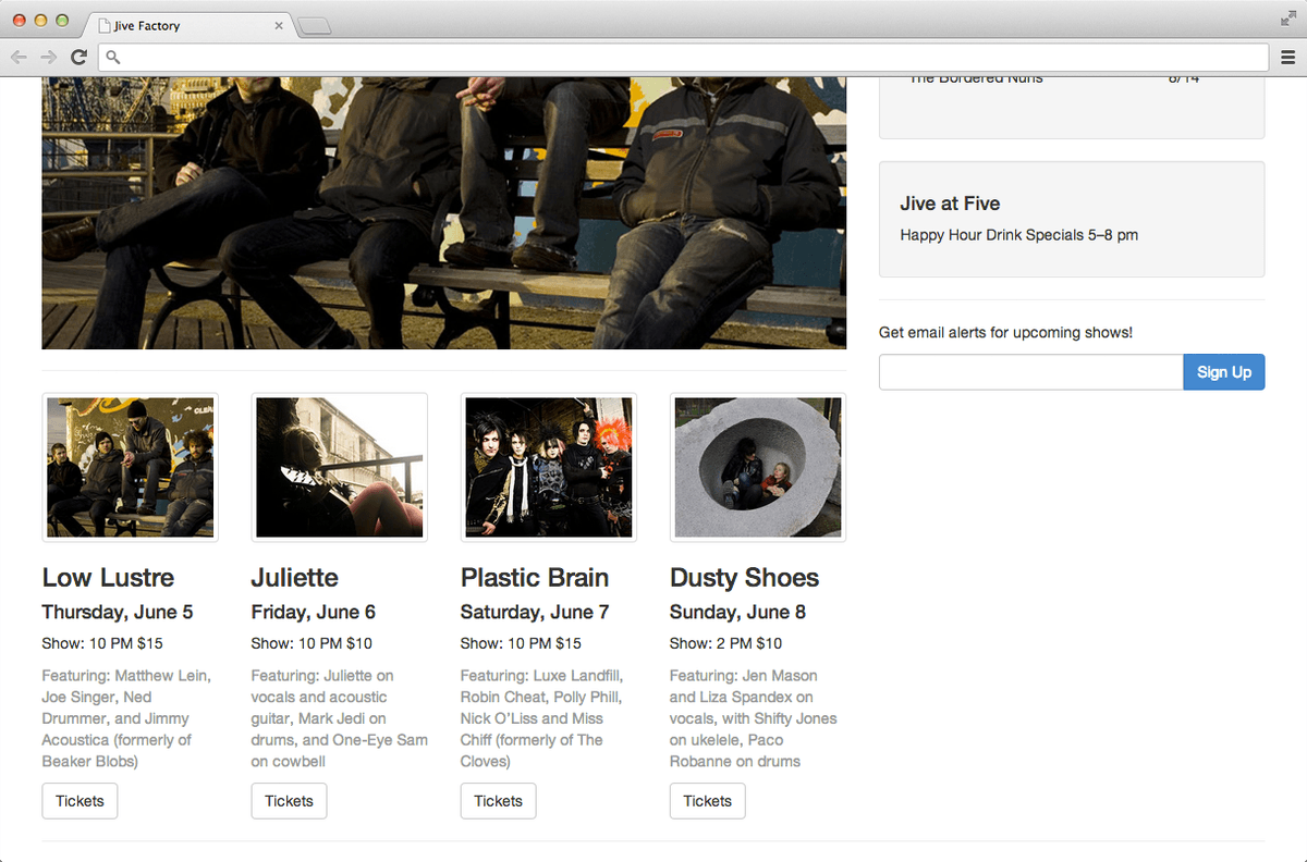
Save and preview index.html in a browser. You should now have text below each image in the four columns. The columns get too narrow at some screen sizes and they need more space between them when they stack on mobile, but we’ll improve those issues in the next exercise. Let’s spruce up this section by using some of Bootstrap’s classes to style a few of the elements.
Add an img-thumbnail class to the images as follows:
<div class="col-sm-3">
   <img class="img-thumbnail" src="img/thumb-low-lustre.jpg">
   <h3>Low Lustre</h3>
   <h4>Thursday, June 5</h4>
   <p>Show: 10 PM $15</p>
   <p>Featuring: Matthew Lein…
   <a href="#">Tickets</a>
</div>
<div class="col-sm-3">
   <img class="img-thumbnail" src="img/thumb-juliette.jpg">
Code Omitted To Save Space
<div class="col-sm-3">
   <img class="img-thumbnail" src="img/thumb-plastic-brain.jpg">
Code Omitted To Save Space
<div class="col-sm-3"> <img class="img-thumbnail" src="img/thumb-dusty-shoes.jpg">- Save and preview index.html in a browser. Notice that the four images in the columns now have attractive borders.
Let’s add a class of text-muted to the show’s description paragraph. Add the following code to those four paragraphs.
<div class="col-sm-3">
   <img class="img-thumbnail" src="img/thumb-low-lustre.jpg">
   <h3>Low Lustre</h3>
   <h4>Thursday, June 5</h4>
   <p>Show: 10 PM $15</p>
   <p class="text-muted">Featuring: Matthew Lein…
   <a href="#">Tickets</a>
</div>
<div class="col-sm-3">
Code Omitted To Save Space
<p class="text-muted">Featuring: Juliette…
   <a href="#">Tickets</a>
</div>
<div class="col-sm-3">
Code Omitted To Save Space
<p class="text-muted">Featuring: Luxe Landfill…
   <a href="#">Tickets</a>
</div>
<div class="col-sm-3">
Code Omitted To Save Space
<p class="text-muted">Featuring: Jen Mason…
   <a href="#">Tickets</a>
Save and preview index.html in a browser to see that the paragraphs are lighter.
The Tickets links would be nicer if they looked like buttons. Luckily, Bootstrap offers a class we can use. Return to your code editor.
Edit each of the four Tickets links by adding the following classes (do this to all four buttons):
<a href="#" class="btn-default">Tickets</a>Save and preview index.html in a browser to see that the ticket links now look like buttons. The page has really come together!