jQuery Lightbox: A Pop-up Image Viewer
What This Tutorial Covers
Modal Overlay
Darkened backdrop that focuses attention on the image.
Image Loading
Click to load and display larger images.
Modern Alternative
Vanilla JS lightboxes work without jQuery today.
Noble Desktop's JavaScript Development Certificate teaches modern JavaScript and React.
Discover how to enhance user experience on your website by learning how to use JavaScript & jQuery to create a lightbox effect for your photos.
Exercise Preview
Customizing the Look of the Arrows
While you still have the lightbox open, notice the arrows have a faint outline around them. It’s very close in color to the background, so you may not be able to see it depending on the brightness and contrast of your monitor. Don’t worry if you can’t see it, but know that we can change the fill or outline color of the arrows. Let’s do that next!
CTRL–click (Mac) or Right–click (Windows) on the lightbox’s right arrow (next) and choose Inspect.
In the DevTools, expand the button element to see the ::before and ::after elements inside.
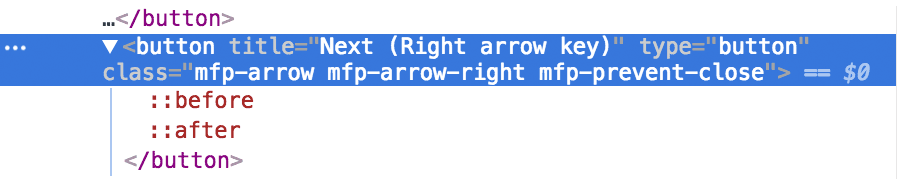
NOTE: The ::before element is the outline and the ::after element is the fill.
Select the ::before element.
In the Styles on the right, find the.mfp-arrow-right:before rule and notice that it has a property declaration of: border-left: 27px solid #3f3f3f;
Select the ::after element.
In the Styles on the right, find the.mfp-arrow-right:after rule and notice that it has the following property declaration: border-left: 17px solid white;.
To adjust the color of the fill and outline we can change these two elements. If we made you manually style these, you’d do many copying and pasting class names, colors, etc. so we’ve saved you some time and made a snippet.
Switch back to your code editor.
From the snippets folder, open magnific-arrow-colors.css.
Select and copy all the code.
Switch back to main.css.
Paste the new rules below the .mfp-bg rule (which starts around line 113).
NOTE: You can use this snippet in your own projects, but you’ll want to customize the colors to fit your design.
Save main.css.
Switch to Chrome and reload photo-gallery.html.
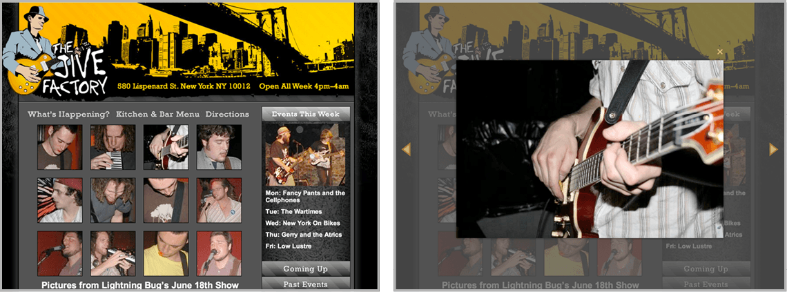
Click on any thumbnail image and notice the arrow colors better fit our design. Hover over them and notice the opacity changes so they appear brighter.
All that’s left to do is customize the color of the close X button at the top right. CTRL–click (Mac) or Right–click (Windows) on it and choose Inspect.
In the DevTools you should see a button element with a class of mfp-close. That’s what we can target with CSS.