Styling the Photos & Text
What This Tutorial Covers
CSS Selectors
Target elements precisely without overspecificity.
Typography
Font sizes, weights, and spacing for readable text.
Image Styling
Borders, shadows, and rounded corners for photos.
Noble Desktop's Front-End Web Development Certificate teaches HTML, CSS, and JavaScript — the complete front-end foundation.
Dive into this detailed exercise guide to learn how to code an image-rich, responsive webpage using native CSS capabilities of modern browsers, including techniques for using CSS animated transitions and media queries to ensure excellent display in any size browser.
Exercise Preview
Exercise Overview
Throughout the exercises in this book, you will code an image-rich webpage and learn how to take advantage of the awesome native CSS capabilities of modern browsers. You’ll build an elegant, responsive design where all content—including images and videos—resizes in accordance with browser size. You will also explore techniques for using CSS animated transitions that zoom, pan, and scroll. Along the way, you’ll use media queries to fine tune the content so it displays beautifully in any size browser, from a mobile device to a wide-screen display.
In this exercise you’ll get started by styling sections that have photo backgrounds which remain fixed on-screen while their text scrolls over top.
Getting Started
Before we get coding, let’s look at a finished version of the webpage we’re about to create and check out all of its great new CSS features.
Open a web browser. To see all the effects built into this page you’ll need to use Chrome, Safari, Firefox, or internet Explorer 10+. internet Explorer 9 and older do not support all the features.
To open a file, hit Command–O (Mac) or Control–O (Windows).
Navigate into Desktop > Class Files > Responsive CSS3 Scrolling Effects > Hawaii Done and double-click on index.html to open it.
We want to do a quick survey of all the highlights of the finished webpage.
First, make sure your browser window is as large as possible so you’re looking at the desktop design.
Scroll through the site, and take note of the following:
- The full-size background images don’t scroll along with the page, as is customary, but have a special static or “sticky” behavior.
- The Mt. Haleakala image displays as a moving panorama.
- Web fonts are fully integrated and the title fonts have a subtle shadow.
- The YouTube video zooms to full-size when you mouse over it.
- Most exciting of all, when you resize the browser window, note the responsive behavior of all the text and image elements. Much of the coding we’ll be doing will focus on ensuring that the page looks great in any size browser.
These are the CSS features you’ll soon see how to implement!
Let’s get to work! Launch your preferred code editor (such as Sublime Text, Atom, Dreamweaver, etc.).
Open the following file: Desktop > Class Files > Responsive CSS3 Scrolling Effects > Hawaii > index.html (Be sure to go into the Hawaii folder, not one of the Done folders.)
If you’re using a code editor that allows you to open an entire project folder such as Sublime Text, we suggest you open the Hawaii folder.
This file (index.html) is contains the text for the Hawaii webpage and some of the basic layout. On line 8 note the viewport meta tag.
<meta name="viewport" content="width=device-width, initial-scale=1">We added this code to save you some work, but it’s important to know that this tag is required for responsive pages to display properly on mobile devices.
Let’s check this page out in a web browser so we can see what work we need to do. Open a web browser and hit Command–O (Mac) or Control–O (Windows).
Navigate to Responsive CSS3 Scrolling Effects > Hawaii and double–click on index.html to open it.
Resize the window, making it narrower and wider. Notice how the main text column has a max-width of,000 pixels. This prevents the lines from getting too long to comfortably read, but allows for it to get narrower on small screens. When made narrower, the text already flows responsively because elements like the callout (pull quote) have a percentage-based width.
At this point the page is devoid of images, but there are text-based placeholders where we are going to make the photo panorama and the photo stack.
Coding the Image Styles
Because we want the images to do various things (such as animate or stay fixed as we scroll) we’ll create div tags for them instead of using img tags.
Switch back to index.html in your code editor.
Around line 17 add the following bold code:
<div class="page-layout">
   <div class="feature-wrap">

   </div>
   <div class="main-wrap">
By default, divs are 100% of the width of their parent element. We do want this div to be full-width, so that’s all set, but we also want the div to have a 2-pixel border at the top. We will have to add this in the CSS file.
Save index.html.
Open the following file: Hawaii > css > style.css
Take a brief look at the style.css file and notice that some basic CSS styles have already been defined to save you some work.
Let’s create a feature-wrap rule to create 2-pixel borders at the top and bottom of the div. Find the .main-wrap rule (around line 22) and add the following bold code underneath it:
.main-wrap {
   max-width: 1000px;
   margin: 45px auto;
   padding: 0 15px;
   font-family: 'Vollkorn', Georgia, serif;
}
.feature-wrap {
   border-top: 2px solid #181818;
   border-bottom: 2px solid #181818;
}
Save style.css.
Preview index.html in a web browser. Look very carefully for the dark border at the very top of the page. This will look much better once we get a picture inside.
NOTE: We recommend leaving the page open in the browser while you work so you can simply reload it to see each change.
Switch to index.html in your code editor.
Let’s take a moment to think about how we’ll code the page. We will have four feature-wrap divs, each containing photo highlights and text descriptions. Although the photos will share some of the same styles, each feature photo will have slight variations on the theme. It will be useful to lay out each separate photo feature as its own self-contained module—or div—that sits inside the feature-wrap div. Let’s start by adding the div we’ll use for the lead photo and header information.
Around line 18, inside the feature-wrap div, add a new div for photo feature headings, like so:
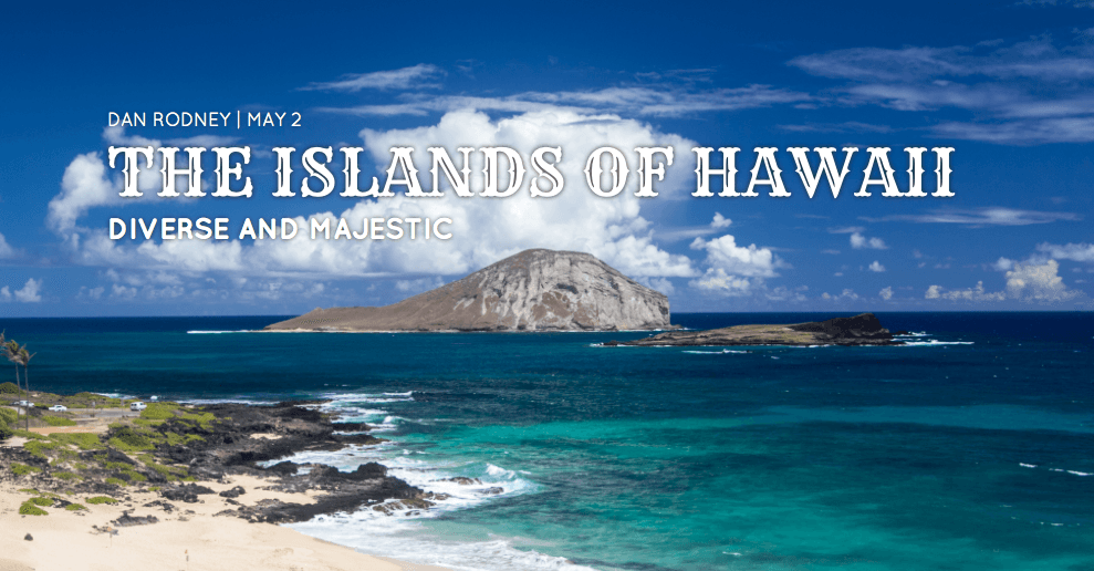
<div class="feature-wrap">
   <div class="photo lead">

   </div>
</div>
Note that we’ll use the photo class to share styles with all feature photos but the second class (lead) will be used to vary the style from feature to feature.
Next, let’s add some variously sized header text that will overlay the photograph in the newly created div. Type the following bold code:
<div class="photo lead">
   <h3>Dan Rodney | May 2</h3>
   <h1>The Islands of Hawaii</h1>
   <h2>Diverse and Majestic</h2>
</div>
Save the file.
Switch to style.css.
Scroll down to the very bottom of the file and add the following style:
.feature-wrap.lead {
   padding: 10% 0 30% 0;
}
Because we want this site to be a really responsive webpage, the padding values will often be percentages rather than absolute values.
NOTE: The order of four padding values goes clockwise starting at the top, or if you prefer a mnemonic: Top, Right, Bottom, Left = TRBL (Trouble).
Save style.css.
Reload index.html in your web browser. Notice the large headings, and try resizing the browser window in various ways to see how the 10% top padding and 30% bottom padding behave responsively to the changing window size.
Return to style.css in your code editor.
Add a background image to the lead style by adding the bold code as follows:
.feature-wrap.lead {
   padding: 10% 0 30% 0;
   background-image: url(../img/lead.jpg);
}
Save the file and reload the browser. The background image is there, but the photo is very large and you may only be able to see a portion of the top-left corner. Resize the page to see that the background image doesn’t change size, it’s just being cropped.
We want to see the whole lead background image and also have it resize responsively when we change the page size. In fact, we want all of our images to behave in this manner, so we should create a rule for the photo class.
Return to style.css and add the following bold code directly above the .feature-wrap.lead rule:
.feature-wrap.photo {
   background-repeat: no-repeat;
   background-position: center;
   background-size: cover;
}
Here’s how the new style breaks down:
background-repeat: no-repeatensures that the image doesn’t repeat (or tile) in an unsightly way.background-position: centerwill center align the image both horizontally and vertically.background-size: coveris a great new feature of CSS3 that tells the image to always scale up or down to fill the area, no matter the window size. This way we’ll always have as much of the photo showing as possible!
Save the file and reload the browser to see the changes.
- To see how the
background-size: coverfeature works, resize the page to different proportions. - Scroll up and down on the page. Currently the background image scrolls with the page, but we want to make it stay static as we scroll.
- To see how the
Return to style.css in your code editor.
Add the following bold code:
.feature-wrap.photo {
   background-repeat: no-repeat;
   background-position: center;
   background-size: cover;
   background-attachment: fixed;
}
Save the file and reload the browser. Try scrolling now, and see the new, fancier “static” behavior of the background image! You may notice that the cover setting is no longer working the same way. In wide windows it still works as expected, but when the window is narrower the photo becomes cropped instead of scaling to fit.
NOTE: background-attachment works well on desktops, but not on mobile devices. It’s not supported in Android Browser. IOS has a known conflict between background-attachment: fixed and background-size: cover that causes the image to be scaled to cover the full length of the webpage (so it gets really stretched out). In a later exercise we’ll disable the background-attachment: fixed on mobile devices, so it will only work on desktops.
Styling the Header Text
Our headings incorporate custom fonts from Google Fonts. We’ve already loaded the fonts to save you some work. If you’ve never used Google Fonts on your own before, you can find out more at fonts.Google.com
Return to style.css in your code editor.
Let’s work on styling the header text. Around line 28, find the .feature-wrap style and add the following new style below it:
.lead h1 { font-family: 'Rye', cursive; font-weight: 400; font-size: 3.6em; line-height: 1em; text-transform: uppercase; }- Save style.css and reload the browser to see your changes. What a snazzy typeface.
- Return to style.css in your code editor.
The heading looks a bit too close to the left-hand margin. Add the following code to add responsive margins to the top, right, and left of the h1 heading:
.lead h1 { font-family: 'Rye', cursive; font-weight: 400; font-size: 3.6em; line-height: 1em; text-transform: uppercase; margin: 1% 10% 0 10%; }- Save the file and reload the browser. Great, the spacing around the heading is much more balanced! Let’s fix up the other headings to look just as good.
- Return to style.css in your code editor.
Add the following two new styles beneath the .lead h1 style (which starts around line 32):
.lead h2 {
   font-family: 'Quicksand', sans-serif;
   font-size: 1.6em;
   line-height: 1em;
   text-transform: uppercase;
   margin: 1% 10% 0 10%;
}.lead h3 {
   font-family: 'Quicksand', sans-serif;
   font-weight: 400;
   font-size: 1.05em;
   text-transform: uppercase;
   margin: 0 10%;
}
NOTE: The h3 style has only two margins defined. The first value applies to the top and bottom margins, and the second value applies to the left and right margins. It’s a quicker way of writing
margin: 0 10% 0 10%and it looks cleaner too!Save the file and reload the browser.
Check out those new text styles. They’re all aligned nicely. Again, all of the margins are percentage-based, so if you resize the window to different sizes and proportions, the spacing and margins will change in subtle ways, ensuring that the site looks beautiful in any browser. Our header section is looking good for now. Let’s move on to coding and styling the photo panorama.
Styling the Photo Panorama
- The photo panorama will be another full-width feature-wrap section. Switch to index.html in your code editor.
- Scroll down until you find the words photo panorama (around line 48).
- Delete the words photo panorama.
In the empty space, type the following:
<div class="feature-wrap"> <div class="photo panorama"> </div> </div>- Save the file.
- Switch to style.css.
Add the following style at the very bottom of the file:
.feature-wrap.panorama {
   padding: 10% 0;
   background-image: url(../img/panorama.jpg);
}
Keep in mind that the .panorama is also inheriting all the features of the .photo style that we defined earlier (like background-size), so we only have to specify the things that will be different about the panorama section.
Save the file and preview index.html in the browser.
Scroll down to see that the panorama photo is looking good! Notice it has inherited the cover property and the special static scrolling behavior from the .photo style.
- Later on we will add a panoramic scrolling animation, but we’re not going to worry about that yet. First let’s work on the text that will overlay the panorama. Switch to index.html in your code editor.
Create a new div by typing the following around line 50:
<div class="photo panorama">
   <div class="text">

   </div>
</div>
This div will contain the panorama text. Type the following:
<div class="text"> Mt. Haleakala's southern face is vastly different from the north. </div>- Save the file.
- Switch to style.css.
Create a new style at the very bottom of the document:
.feature-wrap.text {
   font-family: 'Rye', sans-serif;
   font-size: 3em;
   line-height: 1.1em;
   color: #f1f1f1;
   text-align: center;
   margin: 0 25%;
   text-shadow: 0 4px rgba(0,0,0,0.5);
}
The text styling exists inside the .feature-wrap module because we only want this style to be used in the featured photograph areas.
The text-shadow property is a great new feature of CSS3. It will make our text easier to read as it floats over the images. Here is how that line of code breaks down:
text-shadow: 0These two numbers are the X-offset and y-offset (setting them both to zero will position the shadow directly behind the text).4pxThis number controls the blur size of the shadow. A larger number will create a larger shadow.rgba(0,0,0,0.5)The letters stand for red, green, blue, alpha (alpha means transparency). Setting all the RGB values to zero (as we just did) makes the shadow color black. The alpha works differently, on a scale from 0.0 to 1.0, where 0.0 is transparent and 1.0 is opaque. Because we set the value to 0.5, the text shadow will be 50% transparent.
Save the file and reload the browser.
Check out the new style on the panorama text! The text shadow makes the blurb easier to read in light areas, and the percentage-based responsive margins keep the text perfectly centered when you resize the browser window.
The panorama section is looking good for now, so let’s move on to coding another one of the site’s photo highlights.
Styling the Photo Stack
The next photo section we need to code is a photo stack: three large photos that will each occupy the entire screen as the viewer scrolls down the page.
- Switch to index.html in your code editor.
- Scroll down until you see the words photo stack around line 76.
- Delete the words photo stack.
In the empty space, type the following:
<div class="feature-wrap">
   <div class="photo stack">
      <div class="text">
         Hawaiian Luau: Good food & hula dancers!
      </div>
   </div>
</div>
Great! Our photo stack has three pictures, though. Because we want the second and third sections of the photo stack to behave like the one we just created, copy everything you just typed.
Paste the code two times below. You should end up with a total of three chunks of identical code.
Add the captions as shown below in bold:
<div class="feature-wrap">
   <div class="photo stack">
      <div class="text">
         Hawaiian Luau: Good food & hula dancers!
      </div>
   </div>
</div>
<div class="feature-wrap">
   <div class="photo stack">
      <div class="text">
         You're going to need a boat to get here!
      </div>
   </div>
</div>
<div class="feature-wrap">
   <div class="photo stack">
      <div class="text">
         Watch the sun rise from above. You're standing outside looking down at the clouds!
      </div>
   </div>
</div>
Save the file and reload the browser. Scroll down to see the three blocks of text we just typed against the white background, with the dark div borders above and below. They’re very close together, so let’s add some padding.
Switch to style.css in your code editor.
Add a new style for the photo stack around line 102, directly above the .feature-wrap.text style. Type the following:
.feature-wrap.stack {
   padding: 55% 0;
}
Save the file and reload the browser. Now each caption has plenty of space around it—each photo stack div is at least 110% of the browser window’s height because there is 55% padding on the top and 55% padding on the bottom. This is exactly what we want to make each photo take up the entire screen as the viewer scrolls down the page.
We have spots for three different stack photos, but we don’t yet have a way to style them uniquely. Let’s fix that. Switch to index.html in your code editor.
Make the changes shown below to differentiate each of the photo stack divs:
<div class="feature-wrap"> <div class="photo stack stack-one"> <div class="text"> Hawaiian Luau: Good food & hula dancers! </div> </div> </div> <div class="feature-wrap"> <div class="photo stack stack-two"> <div class="text"> You're going to need a boat to get here! </div> </div> </div> <div class="feature-wrap"> <div class="photo stack stack-three"> <div class="text"> Watch the sunrise from above the clouds. You're standing outside looking down at the clouds! </div> </div> </div>- Save the file.
- Switch to style.css.
Below the .feature-wrap.stack style (which starts around line 102) type the following style:
.feature-wrap.stack-one { background-image: url(../img/luau.jpg); }- Copy what you just typed.
Paste it twice below (for a total of three chunks of identical code) as follows:
.feature-wrap.stack-one {
   background-image: url(../img/luau.jpg);
}
.feature-wrap.stack-one {
   background-image: url(../img/luau.jpg);
}.feature-wrap.stack-one {
   background-image: url(../img/luau.jpg);
}
Change the photo filenames and the numbers of the stacks as shown below:
.feature-wrap.stack-one {
   background-image: url(../img/luau.jpg);
}.feature-wrap.stack-two {
   background-image: url(../img/coast.jpg);
}.feature-wrap.stack-three {
   background-image: url(../img/clouds.jpg);
}
Save the file and reload the browser.
The photo stack should be looking very good. The images are static and the text scrolls as we move down the page.
Maybe it’s a bit boring to keep all the text centered, though. Let’s change up the text alignment by creating classes that will let us align some of the text blurbs to the left and align others to the right.
Switch to index.html in your code editor.
Find the following code and make the changes in bold:
<div class="feature-wrap">
   <div class="photo stack-one">
      <div class="text left">
         Hawaiian Luau: Good food & hula dancers!
      </div>
   </div>
</div>
<div class="feature-wrap">
   <div class="photo stack-two">
      <div class="text right">
         You're going to need a boat to get here!
      </div>
   </div>
</div>
<div class="feature-wrap">
   <div class="photo stack-three">
      <div class="text left">
         Watch the sun rise from above the clouds. You're standing outside looking down at the clouds!
      </div>
   </div>
</div>
Save the file.
Switch to style.css.
Scroll to the bottom of the file and add the following rule to make sure that the photo stack text is a bit narrower, only 35% of the width of the parent div:
.feature-wrap.stack.text {
   width: 35%;
}
Below that, add a rule for left aligned text with a small left-hand margin:
.feature-wrap.stack.text.left {
   text-align: left;
   margin: 0 0 10%;
}
Almost done styling this text! Add the right aligned style as follows:
.feature-wrap.stack.text.left {
   text-align: left;
   margin: 0 0 10%;
}
.feature-wrap.stack.text.right {
   text-align: right;
   margin: 0 0 50%;
}
Save the file and reload the browser. Scroll down to check out the improvements to the photo stack! The text looks much more sophisticated with the latest changes.
We’ve done the basic styling on the three major feature-wrap sections of the site. It’s really coming along!