April 1, 2026Dan Rodney/6 min read

Multiple Backgrounds & Viewport Sizing Units (vw)

Master advanced CSS techniques for modern web design

Core Concepts You'll Master

Multiple Backgrounds

Learn to layer multiple background images and effects on a single HTML element using comma-separated CSS values.

Gradient Overlays

Discover how to colorize photos by overlaying transparent gradients for stunning visual effects.

Viewport Units

Master responsive typography that scales automatically with screen size using vw units.

Topics Covered in This HTML & CSS Tutorial:

Multiple Backgrounds on a Single Element, Colorizing a Photo by Overlaying a Transparent Gradient, Using Viewport Sizing Units (vw)
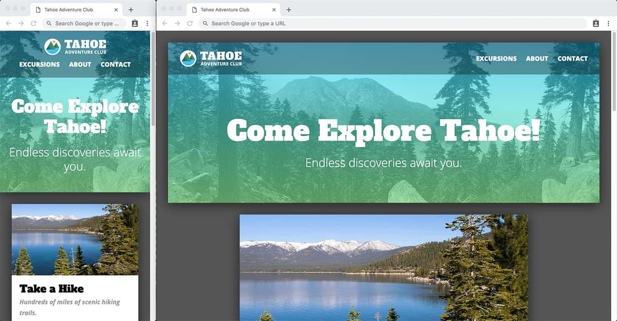
Exercise Preview

preview multiple backgrounds

Project Setup

This tutorial uses the Tahoe Multiple Backgrounds folder from Desktop > Class Files > Advanced HTML CSS Class. Make sure you have these files ready before starting.

Exercise Overview

In this exercise, you'll master the art of layering multiple backgrounds on a single HTML element—a powerful technique that opens up countless creative possibilities. You'll also learn to implement fluid typography using viewport units, creating text that scales intelligently across all screen sizes. These advanced CSS techniques will elevate your designs from static to dynamic, responding gracefully to any display environment.

Multiple Backgrounds

Modern CSS liberates us from the limitations of single backgrounds. By leveraging comma-separated background declarations, we can create sophisticated layered effects that would have required complex markup in the past. This technique is particularly valuable for creating texture overlays, pattern combinations, and visual depth without compromising semantic HTML structure.

  1. In your code editor, close any files you may have open.
  2. We'll be working with the Tahoe Multiple Backgrounds folder located in Desktop > Class Files > Advanced HTML CSS Class. Open that folder in your code editor if it allows you to (like Visual Studio Code does).
  3. Open index.html from the Tahoe Multiple Backgrounds folder.
  4. Preview index.html in a browser.

    This is the same content foundation we've been developing, enhanced with sophisticated design elements. We're about to add a pattern overlay to the header's background photo, demonstrating how multiple backgrounds create visual hierarchy and texture.

    NOTE: This design incorporates several advanced concepts (including drop shadows and modern layout techniques) which we'll explore in depth later in this book. These represent current industry standards as of 2026.

  5. Switch back to your code editor and open main.css from the css folder (in the Tahoe Multiple Backgrounds folder).
  6. Find the header rule and add the following code shown in bold. Pay careful attention to the comma—it's crucial for proper background layering:

    header {
       background: url(../img/pattern.svg), 
                   url(../img/masthead.jpg) right top / cover;
       color: #fff;
    }

    NOTE: Background layer order is fundamental to this technique. The first background sits on top, the second layer beneath it, and subsequent layers stack progressively deeper. This z-index-like behavior gives you precise control over visual hierarchy without additional markup.

  7. Save the file and reload the browser.

    • You should see a blue diamond pattern overlaying the black and white photograph.
    • The result may appear jarring initially—this deliberate contrast demonstrates the layering principle clearly. The pattern sits prominently on top because it's declared first, while the photo provides the foundational layer. Next, we'll refine this into a professional-quality effect.

Now that you understand the fundamental mechanics of background layering, let's explore a more sophisticated application that's become a cornerstone of modern web design.

Adding Multiple Backgrounds

1

Open Project Files

Navigate to the Tahoe Multiple Backgrounds folder and open index.html and main.css in your code editor.

2

Add Pattern Background

In the header rule, add the pattern.svg background before the existing masthead.jpg background, separated by a comma.

3

Test the Result

Save and reload the browser to see the blue diamond pattern layered on top of the background photo.

Background Order Matters

The first background in the comma-separated list appears on top, the second appears underneath, and so on. This stacking order is crucial for achieving the desired visual effect.

Coloring a Background Image by Overlaying a Gradient

CSS gradients function as background images, making them perfect partners for photographic backgrounds. This technique has revolutionized how we handle image colorization, moving beyond static photo filters to dynamic, CSS-controlled color overlays. The result is more maintainable code and consistent branding across different images.

  1. Return to main.css and replace the pattern with a gradient overlay using the following code shown in bold:

    header {
       background: linear-gradient(rgba(0,201,255,1), rgba(146,254,157,1)), 
                   url(../img/masthead.jpg) right top / cover;
       color: #fff;
    }
  2. Save the file and reload the browser.

    The gradient completely obscures the photograph because the alpha values are set to 1 (fully opaque). This demonstrates the gradient's complete coverage—now we'll introduce transparency to reveal the underlying image while maintaining the color overlay effect.

  3. Return to main.css and adjust the alpha transparency values from 1 to .6 as shown in bold:

    background: linear-gradient(rgba(0,201,255, .6), rgba(146,254,157, .6)), 
                url(../img/masthead.jpg) right top;
    }
  4. Save and preview index.html in a browser.

    Perfect! The semi-transparent gradient now creates a sophisticated color wash over the photograph. This technique provides consistent branding opportunities—you can apply the same gradient overlay to different photos while maintaining visual cohesion across your site. It's particularly effective for ensuring text readability over varied photographic backgrounds.

With our background mastery complete, let's tackle another essential modern CSS technique: viewport-relative typography that adapts fluidly to screen size.

Because CSS gradients are background images, you can combine a background image and a background gradient on a single element!
This fundamental concept opens up powerful design possibilities for modern web interfaces.

Creating Gradient Overlays

1

Replace Pattern with Gradient

Change the pattern.svg to a linear-gradient with RGBA color values from cyan to green.

2

Adjust Transparency

Change the alpha values from 1 to 0.6 to make the gradient 60% transparent, allowing the background image to show through.

3

Fine-tune the Effect

Experiment with different alpha values and colors to achieve your desired visual balance.

Sizing Type to the Viewport

  1. Resize your browser window from wide desktop to narrow mobile dimensions, observing how the heading maintains a fixed pixel size.

    Static typography creates suboptimal user experiences across device ranges. On mobile devices, oversized text overwhelms limited screen real estate, while on large displays, the same text appears diminutive and lost. Viewport units solve this by creating truly responsive typography that scales proportionally with screen dimensions—a technique that's become essential in our multi-device landscape.

  2. Return to your code editor.
  3. In the h1 rule, modify the font-size declaration as shown below in bold:

    h1 {
       font-size: 11vw;
       margin-bottom: 20px;

    Code Omitted To Save Space

    }

    NOTE: Viewport width units (vw) create proportional scaling where 11vw equals 11% of the viewport width. On a 320px mobile screen: 320 × 0.11 = 35.2px. On a 1200px desktop: 1200 × 0.11 = 132px. This mathematical relationship ensures your typography maintains visual harmony across all screen sizes while preserving readability.

  4. Save the file.
  5. Switch back to the browser and reload. Resize the window across different dimensions and observe the fluid font scaling. The mobile experience should feel balanced, but desktop sizes may appear overwhelming.

    Unrestricted viewport scaling can create extreme results on large screens. Professional implementations require breakpoint refinements to maintain optimal reading experiences across the full spectrum of devices.

  6. Return to your code editor.
  7. Within the existing min-width: 600px media query, add the refined h1 rule as shown below in bold:

    @media (min-width: 600px) {
       h1 {
          font-size: 7.5vw;
       }
       main {
  8. Save the file.
  9. Switch back to the browser and reload.

    • Test the responsive behavior by resizing from mobile through desktop dimensions.
    • The typography should now feel appropriate for small and medium screens, though large displays may still benefit from further refinement.
  10. Return to your code editor.
  11. Within the existing min-width: 1100px media query, add the final scaling adjustment as shown below in bold:

    @media (min-width: 1100px) {
       h1 {
          font-size: 6vw;
       }
       body {
  12. Save the file.
  13. Switch back to the browser and reload. Test the full responsive range from mobile through large desktop displays.

    Excellent! You've now implemented a three-tier responsive typography system that maintains visual hierarchy and readability across all screen sizes. This approach represents current best practices for fluid typography, balancing automation with designer control to create optimal reading experiences for every user.

Fixed vs Viewport Units

FeatureFixed PixelsViewport Units (vw)
ResponsivenessStatic sizeScales with screen
Mobile ExperienceOften too largeProportional sizing
Desktop ExperienceOften too smallScales appropriately
MaintenanceMultiple breakpointsAutomatic scaling
Recommended: Viewport units provide better responsive design with less code complexity.

Font Size Calculation Examples

320px screen (11vw)
35
600px screen (7.5vw)
45
1100px screen (6vw)
66
1200px screen (6vw)
72

Implementing Responsive Typography

1

Set Base Viewport Size

Change h1 font-size to 11vw for mobile-first responsive scaling.

2

Add Medium Screen Breakpoint

At 600px and above, reduce font-size to 7.5vw to prevent text from becoming too large.

3

Optimize for Large Screens

At 1100px and above, set font-size to 6vw for optimal desktop viewing experience.

Viewport Width Calculation

The vw unit represents 1% of the viewport width. So 11vw on a 320px screen equals 320 × 0.11 = 35.2px, while the same value on a 1200px screen equals 132px.

Key Takeaways

1Multiple backgrounds can be applied to a single element using comma-separated values in CSS
2Background order matters - the first background appears on top, subsequent ones layer underneath
3CSS gradients are treated as background images and can be combined with photos for color overlays
4RGBA alpha values control transparency, allowing background images to show through gradient overlays
5Viewport width (vw) units create responsive typography that scales with screen size automatically
6Media queries can fine-tune viewport unit sizing for optimal display across different screen sizes
711vw equals 11% of viewport width, making text proportionally larger on bigger screens
8Combining multiple CSS techniques creates sophisticated visual effects with minimal code

RELATED ARTICLES