Turning a Design into a Clickable Prototype
What This Tutorial Covers
Prototype Tab
Figma's dedicated mode for adding interactions.
Connections
Wire screens together with hotspot connections.
Sharing for Review
Generate shareable links for stakeholder feedback.
Noble Desktop's UX/UI Design Certificate teaches Figma in depth alongside the full UX process.
Get a comprehensive understanding of prototyping with Figma, including topics such as linking between frames, creating overlays, fixing element positions, and more in this detailed tutorial.
Exercise Preview
Creating a Prototype
In Figma, if you’re not on the homescreen (file browser), do the following:
- In the Desktop app: Click the
 Home tab (Mac users can also choose File > Open File Browser).
 - In the Web app: Click the Main menu button
 and choose Back to files.
- In the Desktop app: Click the
- To open a local file, click
 Import file (may be an icon near the top right).
 Navigate into Desktop > Class Files > Figma Class > Pulse and double–click on Pulse—Ready for Prototyping.fig to open it.
Notice that we’ve added a new frame for the design of the nav menu. When someone taps on the menu icon in the navbar, we’re going to want the nav menu to appear over that screen.
- In the right panel, at the top click on Prototype.
- Zoom to 100% by hitting Shift–0.
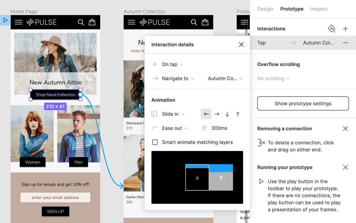
- Near the top of the Home Page frame, select the Shop New Collection button.
- To zoom out and see all the frames, zoom to fit all by hitting Shift–1.
- Hover over the right side of Shop New Collection button and drag the blue circle that appears onto the Autumn Collection frame to create a link.
In the Interaction details panel that opens on the right, under Animation change Instant to Slide in. The rest of the settings should be as follows:

On the Autumn Collection frame, select the top left photo (Distressed Denim Jacket) in the product grid of 4 photos.
NOTE: When you hover over an element, the blue interaction circle can appear on any side (top, bottom, left, or right) to make accessing it easier. It does not matter which side you drag that circle from.
Drag the photo’s blue circle onto the Product Page frame to create a link.
To the left of the Home Page frame, the name Flow 1 appeared. Double–click on Flow 1 and rename it Pulse Mobile Flow.
NOTE: You can have multiple flows (showing different possible paths), each of which can be named.
Previewing the Prototype
Click onto an empty area of the canvas to deselect.
We make sure nothing is selected so the preview will start on the Home screen. If a frame is selected, the preview will open to the selected frame.
At the top right of the window, click the Present button
 . If you’re using Figma in a browser, some browsers (like Safari) may block the pop-up window unless you give it permission (in Safari an icon will appear in the address bar which you can click to open the pop-up).
A new tab (or window in some browsers) will open and you should see the Home Page.
- Click on the Shop New Collection black button and it should animate to the other frame!
- Click on the Distressed Denim Jacket photo to go the product page.
- Hit the Left Arrow to go the previous frame (the Right Arrow also works to navigate between frames).
Notice that the height of the preview is the size of a phone, and you must scroll down to see the rest of the design. (You won’t see scrollbars, but you can drag up and down like you would on a touchscreen device, or use your scrollwheel or trackpad to scroll.)
NOTE: You can set the device and appearance in the Prototype panel when nothing is selected.
Close the presentation tab (or window).
Wiring up the Navbar
We want the navbar’s logo to always take us to the home page. That should be done in the navbar main component, which is currently on the home page. The problem is you can’t link to the frame you’re already on. We’ll need to move the navbar main component off the home page.
- Zoom to 100% by hitting Shift–0.
- At the top of the Home Page, drag the navbar up so it sits above the Home Page frame (outside of the frame).
- Select the navbar on the Autumn Collection frame.
- Copy it by pressing Cmd–C (Mac) or CTRL–C (Windows).
- Click on the name of the Home Page frame.
- Paste the navbar by pressing Cmd–V (Mac) or CTRL–V (Windows).
- Select the nav main component that sits above the Home Page frame (the one outside the frame).
- Zoom to the selection by hitting Shift–2.
- Double–click on the PULSE logo to select it.
- A blue circle will appear to the right of the logo. Drag the blue circle down to the Home Page frame.
- In the Interaction details panel that opens on the right, the animation should already be set to Slide In, but we want it to come from the other direction. So click the right facing arrow button
 .
.
Creating a Nav Menu Overlay
- In the navbar outside the frame, hover over the menu icon (the 3 white lines) and when you see a purple outline around it, click once to select.
- To see all the frames, zoom to fit all by hitting Shift–1.
- Drag the blue circle from the menu icon to the leftmost Nav Menu frame.
In the Interaction details panel that opens on the right:
- Change Navigate to to Open overlay.
- Then set the following:

- Click onto an empty area of the canvas to deselect.
At the top right of the window, click the Present button
or hit Cmd–Option–Return (Mac) or CTRL–ALT–Enter (Windows).Click on the menu icon in the navbar.
The Nav Menu should slide down. Because we gave the Nav Menu frame a black background with a partial transparency, you can see through it to see what’s behind.
- Keep the presentation tab (or window) open, but switch back to the tab/window for your file (later when we switch back to the present tab it will automatically update).
- Zoom in on the navbar on the Nav Menu.
- We need to add a close button to the menu and make it work. On the Nav Menu frame, double–click on the menu icon to select it.
We made this menu icon a component, and we also made an X close button component we can swap this out with. This makes it easier to switch between the graphics, because we can easily swap one component for another.
In the right panel, at the top click on Design.
Above Constraints click on
 menu icon and in the menu that appears click on close icon.
In the navbar notice you now have an X close button!
This swap worked perfectly because both of the component frame sizes are the same. If they were different sizes the new art would be stretched or squished to fit into the size of the original component.
Tip for Sizing Components
When resizing components, Figma will also resize the art inside the component, which is not always want you want to do. You can hold Cmd (Mac) or CTRL (Window) when resizing a component to change the frame size without altering the size of the art in that component! That’s how we got the menu and close icons to be the same frame sizes, while the art inside each is a different size.
You can also use a free plugin called Frame Resizer to make all selected components (which are frames) the same size in one action!
- Now we need to make the close icon actually close the overlay. With the close icon still selected. In the right panel, at the top click on Prototype.
- Under Interactions, click on Tap to open the Interaction details panel.
- In the Interaction details panel that opens, change Open overlay to Close overlay.
- Switch back to the present tab that should still be open (it automatically updates so we’ll be able to see the change we just made).
- The menu should still be open, so click the X close button to close the menu.
Click on the menu icon in the navbar to open the menu and close it again. Nice!
Fixing the Position of Elements so They Don’t Scroll
- Switch back to the tab for your file.
- Zoom to fit all by hitting Shift–1.
- Select the navbar on the Home Page frame.
- At the top left, click the Main menu button and choose Edit > Select all with > Select all with same instance.
- In the Prototype panel, under Scroll behavior set Position to Fixed (stay in place).
- At the top right of the window, click the Present button or hit Cmd–Option–Return (Mac) or CTRL–ALT–Enter (Windows).
- In the presentation tab/window, scroll down and notice the navbar stays at the top of the screen and the rest of the content scroll under it.
- Close the presentation tab/window.