Component Properties & Variants
What This Tutorial Covers
Component Variants
Multiple states (hover, active, disabled) within one component.
Boolean Properties
Toggle layers on and off via component properties.
Instance Swap
Swap nested instances within a component instance.
Noble Desktop's UX/UI Design Certificate teaches Figma in depth alongside the full UX process.
Discover the scope of topics covered in our Figma tutorial, from component properties to creating and using component variants, and grasp how to manage numerous appearances and states for a single component.
Exercise Preview
Opening the File
In Figma, if you’re not on the homescreen (file browser), do the following:
- In the Desktop app: Click the
 Home tab (Mac users can also choose File > Open File Browser).
 - In the Web app: At the top left, click the Main menu button
 and choose Back to files.
- In the Desktop app: Click the
- To open a local file, click
 Import file (may be an icon near the top right).
 Navigate into Desktop > Class Files > Figma Class and double–click on Variants.fig to choose it.
Once the file has uploaded, click Done and double–click on the file to open it.
Creating Variants (Variant Properties)
According to Figma, “Variants allow you to group and organize similar components into a single container. This simplifies your component library and makes it easier for everyone to find what they need.” tinyurl.com/fig-variant
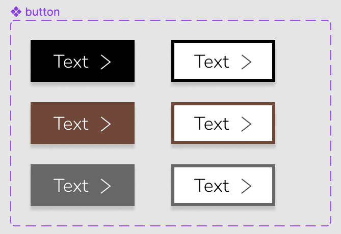
Instead of many unrelated components, we’ll keep everything together as one component with variants. We’ll make a button with variants for color (black, brown, and gray) and appearance (solid and outline), and with/without an arrow icon.
- At the top right of the window, click on the zoom percentage and choose Zoom to 200%.
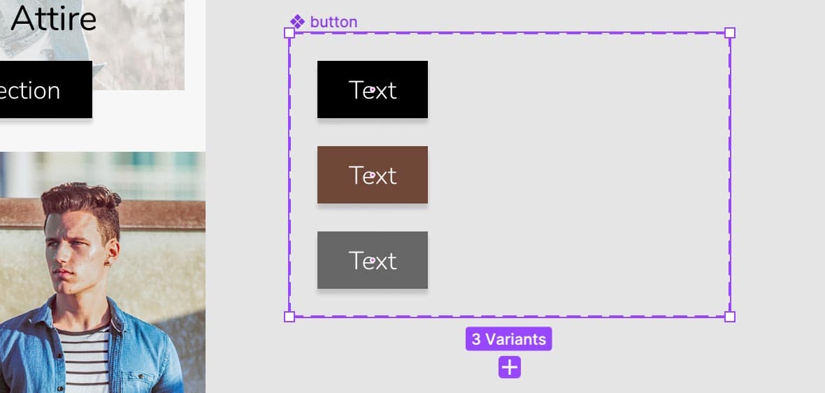
- To the right of the Home Page frame, select the button main component by clicking on its name.
In the middle of the toolbar, click the Add variant
 button.
In the canvas notice a second button appearance has been created.
In the Design panel:
- Notice a new Property 1 has been made with a value of Variant2.
- Change Variant2 to Brown.
- Double–click on Property 1 and change it to Color (hit Return (Mac) or Enter (Windows) to apply it).
- In the canvas, select the top variant.
In the Design panel, click on Default and change it to Black (hit Return (Mac) or Enter (Windows) to apply it).
- Now that things are named properly, we must change the design. We have 2 colors already saved as color styles. In the button component set, select the bottom button.
- In the Design panel, to the right of Fill click the Style button

- In the Color Styles panel that opens, click the Brown circle.
Click on an empty area to make sure nothing is selected.
Adding Another Variant
Let’s create some more variants, starting with a third color option (gray).
- To the right of the Home Page frame, select the button component set by clicking on its name.
- At the bottom of the component set, click the Plus(+) button that appeared.
- The new variant will be selected. In the Design panel, next to Color change Color3 to Gray (hit Return (Mac) or Enter (Windows) to apply it).
- In the Design panel, to the right of Fill click the Style button
- In the Color Styles panel that opens, click the Gray circle.
- Click on an empty part of the canvas to make sure nothing is selected.
Adding a Text Component Property
Variants let you create multiple variations within a component, but there are some types of changes that Figma has pre-built for you so you don’t have to create too many variants. These are called component properties and there are 3 types: text, boolean, and instance swap. Let’s look at text first.
- Select the SIGN UP button again.
In the Design panel on the right, component area labeled button you see the variant option we just made, but there’s no option regarding the text.
When making a design system that will be used by many people (not just yourself), for some components you may not want people to change the text. For other components (like this one), you expect people to change the text. So how are others to know when they can or cannot change the text? Let’s make that obvious by showing them a text option.
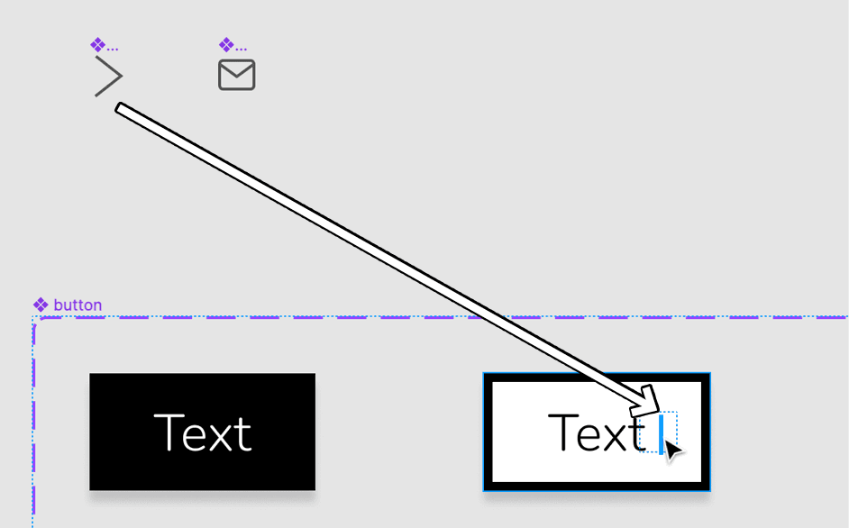
To the right of the Home Page frame, in any of the 3 variants, double–click on the text to select it the text frame (without highlighting the text inside).
Below the text, click the target button
 to select the same text element across all 3 variants.
- In the Design panel, to the right of Content click Create text property
 .
. - The default options are fine, so click Create property.
- Select the SIGN UP button’s instance again.
In the Design panel, notice there’s now a Text property that says Sign Up.
Whenever you use an instance of this button component, you can change the text either in the Design panel or by double–clicking the instance and changing it. If there’s not a Text property in the Design panel, this indicates to others they should not change the text.
Adding More Variant Properties
Now that we have 3 color options, we want each color to also have a version that uses a outline appearance instead of a solid background.
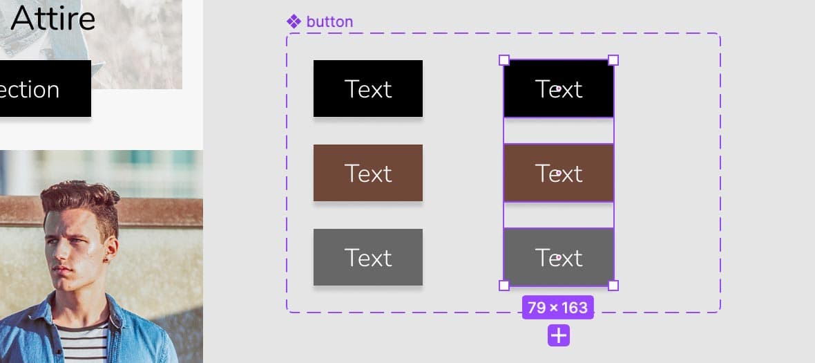
We’re going to add more variants to our button component set, so let’s make it bigger so we have room to see them all:
- Select the button component set by clicking on its name.
- Drag the right side over (with room for more a bit more than 2 columns), like this:
- In the button component set, select any of the variants.
- Hit Cmd–A (Mac) or CTRL–A (Windows) to select them all.
Hold Option (Mac) or ALT (Windows) and drag a set of copies to the right so you end up with 2 columns as shown below (leave a bit of room between for when we add icons into the buttons):
- With the 3 new variants still selected (the right column), at the top left click the Main menu and choose Object > Swap fill and stroke.
We won’t see the strokes, because there’s no thickness. In the Design panel, scroll down and under Stroke:
- Set the stroke weight
 to 3
to 3 - Change Center to Inside.
- Set the stroke weight
- Let’s change the text color to black. In the Design panel, below Selection colors, click on the white switch (FFFFFF) and change it to black.
- Close the color picker.
Let’s add a white background to these button. With the 3 buttons still selected, in the Design panel, to the right of Fill click the Plus(+) button.
If the Fill color is not already white, set it to white now.
- Now we must create a property to control the outline appearance, and set the values for it. Select the button component set by clicking on its name.
In the Design panel, to the right of Properties click the Plus(+) button and choose Variant.
- For Name type in Appearance
- Change Value to Solid
- Click Create property.
- In the canvas, select the black outline variant (top of the right column).
In the Design panel:
- Under Current variant, to the right of Color hover over the value and from the menu (the down arrow) choose Black.
- To the right of Appearance, click on Solid and type Outline (hit Return (Mac) or Enter (Windows) to apply it).
In the canvas, select the brown outline variant and in the Design panel:
- To the right of Color, hover over the value and from the menu choose Brown.
- To the right of Appearance, hover over the value and from the menu choose Outline.
In the canvas, select the gray outline variant and in the Design panel:
- Set Color to Gray.
- Set Appearance to Outline.
Setting up the Design for Boolean Component Properties (Toggle On/Off)
Properties with only 2 values: true and false (or off and on) are called a boolean. They’ll give us a toggle switch instead of a menu. Let’s add an arrow icon for our button, which we can turn on or off using a boolean.
- We must add an arrow into each of our variants. Select the arrow component (it’s above the button component set).
Our buttons were made with auto layout, so we can add the arrow into that in a couple different ways.
As shown below, hold Option (Mac) or ALT (Windows) and drag the arrow into the white background button after the text… and when you see a blue line, release to place the arrow there.
Let’s see another way to add the arrow. Again select the arrow component:
- Hit Cmd–C (Mac) or CTRL–C (Windows) to copy it.
Select the 5 variant buttons which don’t have the arrow yet.
Hit Cmd–V (Mac) or CTRL–V (Windows) to paste the arrow into all of them at once! Auto layout places it after the text.
The very dark gray arrow is hard to see on the solid background buttons (left column). Select one, then holding Shift and click on the others (so the 3 arrows on the solid background buttons are selected).
In the Design panel, towards the bottom under Selection colors click on the gray (555555) and change it to white (FFFFFF).
Your button variants should now look as follows:
Making the Boolean Values Work
Now that we have the designs, we need to finish setting up the variant properties.
- Select any one of the arrows in the button component set.
- Below the arrow, click the target button to select them across all the variants.
In the Design panel, to the right of Layer (the section above Fill) click Create boolean property
.- Name it Has Icon
- Value should already be set to True.
- Click Create property.
- Click in an empty area to deselect.
- In the Home Page frame, select the Shop New Collection button.
In the Design panel, to the right of Has Icon, click the toggle switch
 off and on to hide or show the arrow.
In the Design panel, change the Color and Appearance to see they still work with the arrow. Nice!
NOTE: Variant properties (like the Appearance property we made) can also be made with boolean values by typing true and false (or on and off) for the values. Our Appearance property currently has 2 states (Solid and Outline), so we could have used boolean values. We may add more appearances in the future though, so we’ll keep the flexibility of how it’s currently set up.
Adding an Instance Swap Component Property
We want this button to able to able to use another icon in place of the arrow. We already have an email icon component we can use, but we need to update the button component to allow for instance swapping.
- In the main button component, select any one of the arrows.
- Below the arrow, click the target button to select them all.
In the Design panel, to the right of arrow instance name, click Create instance swap property
.- Name it Icon
- Value should already be set to arrow.
- To the right of Preferred values click the Plus(+).
- Check on email
- Click Create property.
- Now let’s try it out! In the Home Page frame, select the SIGN UP button.
- Change Appearance to Outline.
In the Design panel, to the right of Icon click on the menu and choose email.
The icon should update!
Change Appearance to Solid.
The icon color should update to stay in keeping with the text.
Change Appearance back to Outline.
NOTE: The icon should change color (black or white), but if it does not:- Double–click into the instance and select the nested icon component.
- Change the color in the Design panel manually (by changing the color found under Selection colors).
Important Details to Know About Instance Swapping
For the color overrides to be preserved, the icons must have the same layer name(s) inside. If they have different numbers of layers, fills vs. strokes, etc. that may mess it up so you have to manually color the icon.
To merge all the vectors into one (so they can have the same name) try selecting them. Then CTRL–click (Mac) or Right–click (Windows) on them in the canvas and choose Flatten.
If the icons are not the same exact size, they will become distorted when swapped. When making the icons:
- Figure out the largest height and width you need.
- Select all the icon components (frames).
In the Toolbar at the top, click on Resources
 .
.- Click on Plugins.
- Search for Frame Resizer.
- Hover over Frame Resizer click Run to the right.
- Choose a desired reference point (like the center point) and set W and H to the largest width and height you figured out earlier.
NOTE: If you don’t use this plugin, you’d have to resize each icon component’s frame individually by holding Cmd (Mac) or CTRL (Windows) while dragging to resize the frame and make them all match the same width and height.
Position each icon’s art within the empty space of its frame.