Turning a Design into a Clickable Prototype
What This Tutorial Covers
Prototype Mode
XD's dedicated mode for adding interactions.
Triggers & Actions
Tap, drag, and hover triggers connecting screens.
Sharing for Review
Generate shareable links for stakeholder feedback.
Noble Desktop's UX/UI Design Certificate teaches Figma — Adobe paused major XD development, so most teams have moved on.
Dive into this comprehensive Adobe XD tutorial and learn how to create prototypes, link artboards, record demonstrations, and much more in a practical and easy-to-follow manner.
Exercise Preview
Creating a Prototype
- In Adobe XD, go to File > Open from Your Computer or hit Cmd–Shift–O (Mac) or CTRL–Shift–O (Windows).
Navigate into Desktop > Class Files > Adobe XD Class > Pulse and double–click on Pulse—Ready for Prototyping.xd to open it.
This design is very similar to the previous exercise, except:- The navbar at the top of the page is a bit different.
- There is a new artboard for the design of the nav menu. When someone taps on the menu icon in the navbar, the nav menu would appear over the screen.
- At the top left of the window click Prototype.
- Zoom to 100% by hitting Cmd–1 (Mac) or CTRL–1 (Windows).
- XD needs to know which screen to show first. This is called the Home screen. Notice the blue home icon at the top left of the Autumn Collection artboard indicates it’s currently the Home screen.
- We want the Home Page artboard to be the Home screen. At the top left of the artboard, click on the Home Page artboard name.
As shown below, at the top left of the Home Page artboard click the gray Home icon so it changes to blue.

Above the artboard Flow 2 will appear. Double–click on Flow 2 and rename it Pulse Main Flow.
NOTE: You can have multiple user flows (showing different possible paths), each of which can be named.
- We don’t want the Flow 1 that was already started in this file, so click the blue Home icon for the Autumn Collection artboard to uncheck it.
- Click onto an empty part of the canvas to deselect.
- Near the top of the Home Page artboard, select the Shop New Collection button.
- To zoom out and see all the artboards, zoom to fit all by hitting Cmd–0 (Mac) or CTRL–0 (Windows).
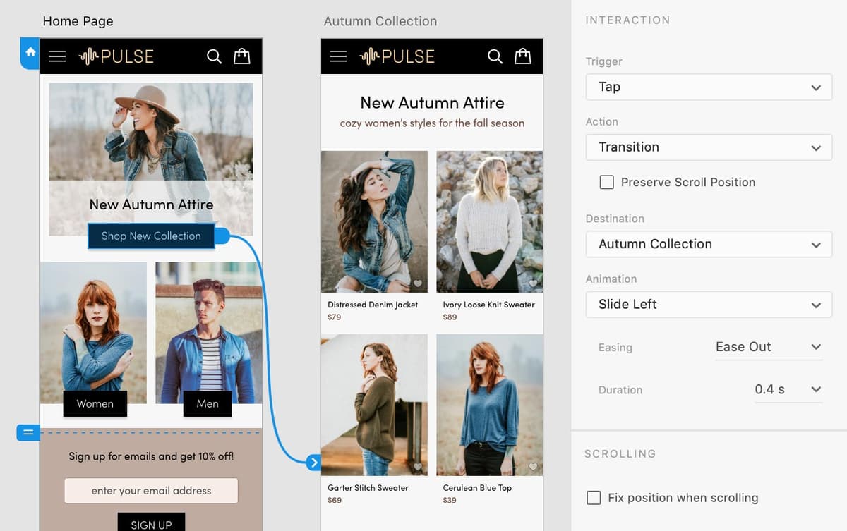
- To the right of the selected button, there’s a blue arrow. Drag that blue arrow onto the Autumn Collection artboard to create a link.
In the Property Inspector on the right, set the following:
- Trigger: Tap
- Action: Transition
- Leave Preserve Scroll Position unchecked.
- Destination: Autumn Collection (will already be set)
- Animation: Slide Left
- Easing: Ease Out
- Duration: 0.4 s
- Leave Fix Position When Scrolling unchecked.
- On the Autumn Collection artboard, double–click on the top left photo (Distressed Denim Jacket) in the product grid of 4 photos. (The double–click should go into the repeat grid and select the photo.)
Drag the blue arrow onto the Product Page artboard to create a link.
Previewing the Prototype
Click onto an empty part of the canvas to deselect.
We make sure nothing is selected so the preview will start on the Home screen. If an artboard is selected, the preview will open to the selected artboard.
- At the top right of the window, click the Desktop Preview button
 .
. - A preview window will open and you should see the Home Page. Click on the Shop New Collection black button and it should animate to the other artboard!
- Click on the Distressed Denim Jacket photo to go the product page.
- Hit the Left Arrow to go the previous artboard (the Right Arrow also works to navigate between artboards).
Close the preview window.
Slide Versus Push Transitions
- The slide transition moves the new screen in over the previous screen, slightly darkening the previous screen.
- The push transition moves the new screen in next to the previous screen, and does not darken the previous screen.

Wiring up the Navbar & Creating a Nav Menu Overlay
- If the Libraries panel is not open, at the bottom left of the window click the
 icon.
icon. - In the Libraries panel, CTRL–click (Mac) or Right–click (Windows) on the navbar component and choose Edit Main component.
- Zoom to the selection by hitting Cmd–3 (Mac) or CTRL–3 (Windows).
- Let’s make the logo take us to the homepage. Double–click on the black background of the navbar to go into the component. You won’t see anything change, but you will now be able select things inside this component.
- Hover over the PULSE logo and when you see a blue outline around the logo click once to select the logo.
- A blue arrow will appear to the right of the logo. Click the blue arrow.
In the Property Inspector on the right, set the following:
- Trigger: Tap
- Action: Transition
- Leave Preserve Scroll Position unchecked.
- Destination: Home Page
- Animation: Slide Right
- Easing: Ease Out
- Duration: 0.4 s
- Hover over the menu icon (the three white lines) and when you see a blue outline around it, click once to select.
- To see all the artboards, zoom to fit all by hitting Cmd–0 (Mac) or CTRL–0 (Windows).
- Drag the blue arrow from the menu icon onto the Nav Menu artboard.
In the Property Inspector on the right, set the following:
- Trigger: Tap
- Action: Overlay
- Destination: Nav Menu (will already be set)
- Animation: Slide Down
- Easing: Ease Out
- Duration: 0.3 s
Click onto an empty part of the canvas to deselect.
XD automatically closes an overlay when you click it, so we don’t have to do anything to make the X close button on the Nav Menu actually close the overlay!
At the top right of the window, click the Desktop Preview button
.TIP: To open the preview you can hit Cmd–Return (Mac) or CTRL–Enter (Windows).
The preview window floats above the XD file, so you can still interact with your design and see the preview update. For example:
- Click on the Autumn Collection artboard to change focus from the preview window to the XD file.
- Click once more on the Autumn Collection artboard to see it appear in the preview window.
- Click on the preview window to activate it.
- Click on the menu icon in the navbar to see the Nav Menu appear.
- Click the X close button (or anywhere else on the overlay) to close the menu.
- Click on the PULSE logo in the black navbar to go to the Home Page.
Notice that the height of the preview is the size of a phone, and you must scroll down to see the rest of the design. (You won’t see scrollbars, but you can drag up and down like you would on a touchscreen device, or use your scrollwheel or trackpad to scroll.)
Background Blur
Blurred backgrounds are used throughout the iOS interface. For webpages viewed in Safari, we can also blur backgrounds using CSS. That doesn’t yet work in other browsers, but it can still can be used as progressive enhancement. Let’s see how to create a background blur in XD.
- Zoom to 100% by hitting Cmd–1 (Mac) or CTRL–1 (Windows).
- In the Nav Menu artboard (the left-most artboard), click on the dark background that covers the artboard.
- In the Property Inspector, set Opacity
 to 100%.
 In the Property Inspector, check on Background Blur and set the following options (for Blur Amount, Brightness, and Effect Opacity):

- Click onto an empty part of the canvas to deselect.
- At the top right of the window, click the Desktop Preview button .
- Click on the menu icon in the navbar to see how the background blur looks when the menu is on top of page content. Cool!
- Click the X close button to close the menu.
Scroll down and notice the black navbar (at the top) scrolls out of view.
Let’s see how to fix the navbar to the top of the screen.
Close the preview window.
Fixing the Position of Elements so They Don’t Scroll
- Zoom to fit all by hitting Cmd–0 (Mac) or CTRL–0 (Windows).
- Select the navbar on the Home Page artboard.
- Holding Shift and click on the navbars on the Autumn Collection and Product Page artboards.
- In the Property Inspector, check on Fix Position When Scrolling.
- At the top right of the window, click the Desktop Preview button .
- In the preview window, scroll down and notice the navbar stays at the top of the screen and the rest of the content scroll under it.
- Close the preview window.
- This prototype is done! Save the file.
Optional Bonus: Making a Recording of a Prototype
XD on a Mac can record a video of you interacting with a prototype. This can be useful for getting client feedback, showing work in your portfolio website, and more.
XD on Windows does not have a built-in recording. Instead you can use the Win–G keystroke to record using the Windows Game recording tool but we do not have instructions for that process.
- Click onto an empty part of the canvas to deselect.
At the top right of the window, click the Desktop Preview button
.Mac: At the top right of the preview window, click the Record button
 to start recording.
Windows: Hit Windows–G to record using the Windows Game recording tool (and then follow the onscreen prompts).
- Click on the Shop New Collection black button.
- Click on the PULSE logo to go back to the Home Page.
- Click the menu icon to open the nav menu.
- Click the X close button to close the menu.
- At the top right of the preview window, click the Record button again to stop recording.
- In the dialog that appears, navigate into Desktop > Class Files > Adobe XD Class > Pulse.
- Name the file Pulse Demo.mp4
- Click Save.
- Close the preview window.
- Let’s look at the movie we just exported. Keep the file open in XD, but switch to the Desktop (the Finder on Mac or Windows Explorer on Windows).
- Navigate into Desktop > Class Files > Adobe XD Class > Pulse.
Double–click on Pulse Demo.mp4 and play the movie!
NOTE: Think about what you want to show and the speed of your interactions. The recording is done in real time, so consider how long the viewer may need to look at a screen and figure out what’s going on. Be careful with the cursor position. Use it to draw attention to important things and try not to be distracting with it.