April 1, 2026Dan Rodney/9 min read

Repeat Grids: Free Adobe XD Tutorial

Master Adobe XD Repeat Grids for Efficient Design

What You'll Learn in This Tutorial

Create Repeat Grids

Learn how to transform single design elements into repeating grid layouts instantly using XD's powerful Repeat Grid feature.

Customize Content

Discover how to efficiently update multiple grid items with unique text and images using drag-and-drop techniques.

Adjust Design

Master global design changes that apply to all grid items while maintaining individual content customization.

Topics Covered in This Adobe XD Tutorial:

Creating a Repeat Grid, Customizing the Content, Adjusting the Design

Exercise Preview

preview repeat grid

Project Goal

Transform a single NYC attraction card into a complete 3x2 grid showcasing 6 different attractions with unique photos, headings, and descriptions.

Exercise Overview

Modern digital interfaces rely heavily on repetitive design patterns—user profiles, product cards, news feeds, and content galleries. XD's Repeat Grids feature transforms what could be tedious manual work into an efficient, scalable process. This exercise demonstrates how to leverage Repeat Grids to create professional layouts that would typically require hours of copy-and-paste work. You'll discover how design changes propagate globally across grid items while content remains individually customizable—a workflow that mirrors real-world design systems used by major tech companies.

Repeat Grid Benefits

6
attractions to display
3
columns in final grid
2
rows in final layout
1
original element to start
Why Use Repeat Grids

Repeat Grids eliminate the tedious process of manually duplicating and positioning design elements, making it much easier to create consistent layouts for user lists, product grids, and similar repeating content.

Creating a Repeat Grid

  1. In Adobe XD, go to File > Open from Your Computer or hit Cmd–Shift–O (Mac) or CTRL–Shift–O (Windows).
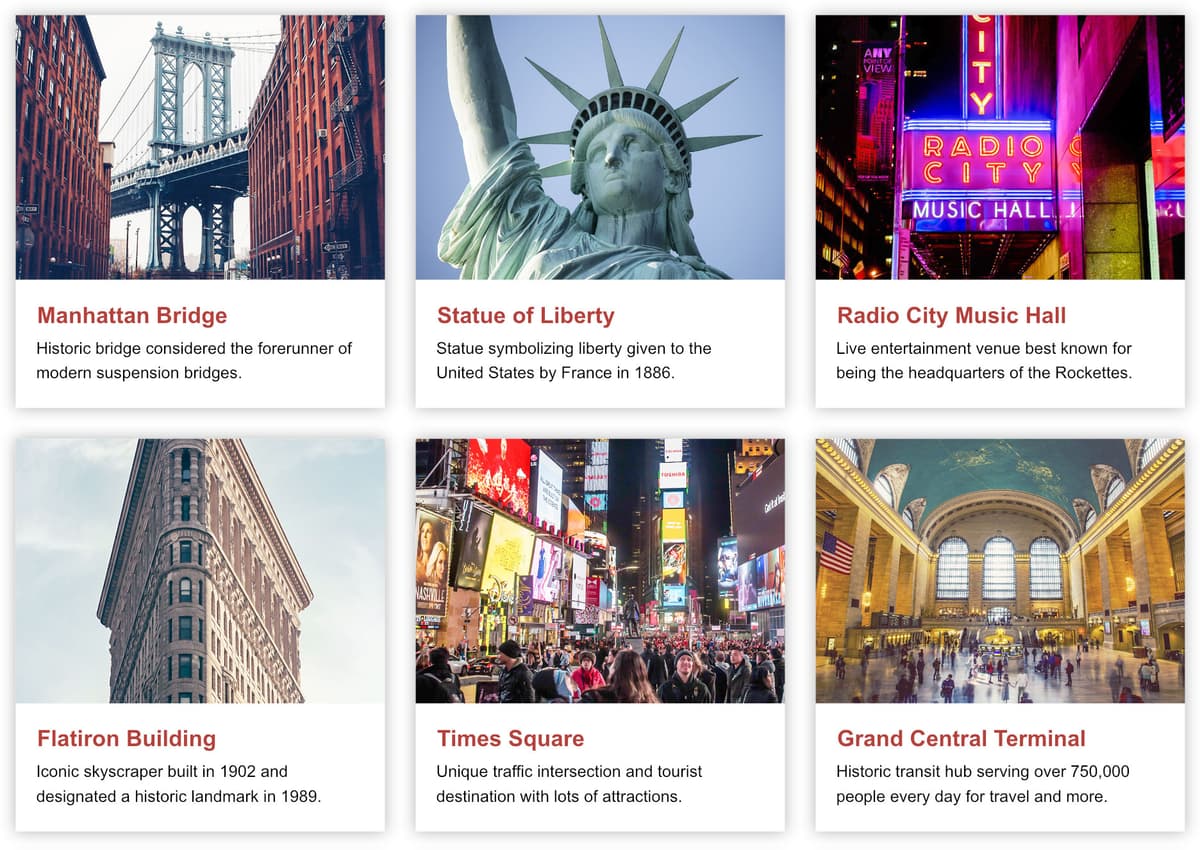
  2. Navigate into Desktop > Class Files > Adobe XD Class > Repeat Grid and double–click on NYC Attractions.xd to open it.
  3. Examine the layout structure: below the main content column, you'll find a sample attraction featuring a photo, heading (Manhattan Bridge), and descriptive text. This represents our content template that will multiply into a comprehensive grid showcasing six NYC attractions arranged in a 3×2 layout.
  4. Zoom to a comfortable working level where you can clearly see the Manhattan Bridge content while maintaining visibility of the layout grid's full width and the space below for grid expansion.
  5. Select all three components of the attraction template by dragging a selection around:

    • The bridge photo
    • The Manhattan Bridge heading
    • The descriptive text (Historic bridge considered…)

    This selection defines the repeatable unit—think of it as creating a reusable component that will maintain its internal relationships as it multiplies.

  6. In the Property Inspector, locate and click the Repeat Grid button near the top. This activates XD's intelligent duplication system.
  7. Two directional handles now appear—one extending right, one extending down. Drag the right handle eastward to generate two additional content sections, creating a three-column layout. Notice how XD automatically spaces and aligns the duplicated content.
  8. Drag the bottom handle downward to create a second row. The efficiency gain is immediately apparent—six content blocks created in seconds rather than minutes of manual duplication.
  9. Fine-tune the column spacing by hovering over the area between columns until you see the pink spacing indicator highlight.
  10. With the pink highlight active, drag rightward to increase spacing until the grid aligns with your layout columns. Monitor the numeric feedback at the top of the spacing area—aim for 30px to match the established grid system.

    repeat grid adjust column spacing

  11. Apply consistent vertical spacing by hovering below the first row until the pink highlight appears, then adjusting until the spacing reads 30px. This creates visual harmony and maintains your design system's rhythm.

    NOTE: XD's current implementation requires manual dragging for grid spacing adjustments—direct numeric input isn't available, though this may change in future updates.

Setting Up Your First Repeat Grid

1

Select Elements

Drag a selection around the photo, heading, and description that will form your repeating unit.

2

Activate Repeat Grid

Click the Repeat Grid button in the Property Inspector to enable grid functionality.

3

Expand Horizontally

Drag the right handle to create additional columns (aim for 3 total sections).

4

Add Rows

Drag the bottom handle down to reveal a second row of content.

Spacing Control

Hover over the space between columns or rows to see pink highlights, then drag to adjust spacing. Set both column and row spacing to 30px to match the layout grid.

Customizing the Content

The true power of Repeat Grids emerges when populating them with unique, meaningful content. XD's intelligent content management allows individual customization while maintaining design consistency—a critical capability for creating convincing prototypes that stakeholders can meaningfully evaluate.

  1. Begin customizing the second attraction. In the top row's middle column, double-click the Manhattan Bridge heading to target the text element.
  2. Double-click again to enter text editing mode, or press Return (Mac) or Enter (Windows) for direct text access.
  3. Replace the text with Statue of Liberty and press Esc to return to selection mode.
  4. Observe that other grid items remain unchanged—this demonstrates XD's content independence within Repeat Grids, where individual elements can be customized without affecting their counterparts.

    Rather than manually editing each text block, XD offers a powerful bulk content update feature through drag-and-drop text files. This workflow mirrors how design teams handle large-scale content updates in professional environments.

  5. Keep XD visible while switching to your file system (Finder on Mac, Explorer on Windows). This parallel view enables the drag-and-drop workflow.
  6. Navigate to Desktop > Class Files > Adobe XD Class > Repeat Grid to access the prepared content files.
  7. Position your windows so both the desktop folder and the XD repeat grid are simultaneously visible—this setup is crucial for the next steps.
  8. Examine the provided text files:

    • text1-headings.txt
    • text2-descriptions.txt

    Each file contains six lines corresponding to your grid items. XD will map the first line to the first grid position, second line to second position, and so forth—this systematic approach ensures content accuracy and prevents mismatched information.

  9. Drag text1-headings.txt onto any heading in your grid. The blue highlight confirms proper element targeting, and XD automatically distributes the content across all heading positions.
  10. Verify that all six headings now display unique attraction names—this bulk update saved significant time while maintaining accuracy.
  11. Repeat the process for descriptions by ensuring both desktop and XD remain visible.
  12. Drag text2-descriptions.txt onto any description text block to populate all descriptions with appropriate, unique content.
  13. Complete the content update with the photo assets. Maintain your split-screen setup between desktop and XD.
  14. Navigate into the photos subfolder within the Repeat Grid directory.
  15. Drag 4-flatiron.jpg onto the photo above the Flatiron Building heading.
  16. Notice XD's alternating pattern behavior—every other photo updates, creating a more varied appearance than uniform duplication. This feature works well for quick mockups, but we'll achieve full customization with complete photo replacement.
  17. Select all photos in the folder (click 1-manhattan-bridge.jpg, then Shift-click 6-grand-central.jpg to select the complete range).
  18. Drag the entire selection onto any grid photo. XD's intelligent mapping will distribute images appropriately across all positions.
  19. Verify that each attraction now displays its corresponding image—proper file naming (using numerical prefixes) ensures correct content matching.

    XD's behavior now shifts: having established unique images for each position, dropping a single image will only affect that specific grid item, enabling targeted updates without disrupting the entire grid.

  20. Click an empty area to deselect the grid and review your progress—six unique, content-rich attraction cards created through efficient bulk operations.
  21. Save your work to preserve these customizations.

Content Update Methods

Pros
Individual editing by double-clicking any text element
Bulk text updates via drag-and-drop from .txt files
Multiple image replacement using file selection
Automatic alphabetical/numerical ordering for bulk imports
Cons
Cannot type specific spacing values - must drag to adjust
Must use separate files for different text elements
Photo filename numbering required for proper ordering

Bulk Content Replacement Process

1

Prepare Text Files

Create .txt files with one line per grid item (6 lines total for headings and descriptions).

2

Drag Text Files

Drag text1-headings.txt onto any heading to update all headings simultaneously.

3

Update Descriptions

Drag text2-descriptions.txt onto any description to replace all description text.

4

Replace Images

Select all numbered photo files and drag onto any image to update all photos in order.

Adjusting the Design

With authentic content in place, you can now refine the visual design with confidence. Repeat Grids maintain the crucial distinction between content (which stays individual) and design (which updates globally)—this behavior mirrors component-based design systems used throughout the industry.

  1. Open the Libraries panel if it's not already visible by clicking the libraries panel icon icon at the bottom left.
  2. Target any heading in the grid with a double-click to select the text element for styling changes.
  3. In the Libraries panel, click directly on the red color swatch (the colored box itself, not the text label—this distinction is important for proper color application).
  4. Observe the immediate global update—all headings adopt the red color simultaneously. This demonstrates the power of design consistency in Repeat Grids.

    This global update behavior is fundamental to maintaining design system integrity: visual changes propagate across all instances while content remains protected from unintended modifications.

  5. With the heading still selected, hold Shift and click the description below to select both text elements simultaneously.
  6. In the Property Inspector, click the Align Left button text align left to adjust text alignment across all grid items.
  7. Click an empty area to deselect and observe the universal alignment change—another example of efficient, systematic design updates.

  8. Reset your view to 100% zoom using Cmd–1 (Mac) or CTRL–1 (Windows) for accurate design work.
  9. Implement a more substantial design enhancement by creating card-style layouts with backgrounds and shadows—a pattern common in modern interface design. Double-click the Manhattan Bridge heading to enter the grid editing mode.
  10. Select the Rectangle tool rectangle tool from the toolbar.
  11. Draw a rectangle encompassing the photo and text content, aligning with the Bootstrap Grid columns for a 360px width. Watch as the rectangle appears simultaneously across all grid items—this real-time preview demonstrates the power of systematic design changes.

    repeat grid draw white box

  12. Send the rectangle behind the content using Object > Arrange > Send to Back to create proper layering hierarchy.
  13. Return to the Select tool select tool to continue styling.
  14. In the Property Inspector, uncheck Border to remove the default stroke.
  15. Enable Shadow to add depth and visual hierarchy to your cards.
  16. Click Shadow to access the color picker and adjust transparency to 30% on the far right of the Hex controls.
  17. Close the color picker by clicking Shadow again.
  18. Configure shadow properties: X:0 Y:0 B:15 for a subtle, professional drop shadow effect.
  19. Notice the shadow clipping issue—shadows on top and left edges are cut off by the grid container boundaries. This is a common layout challenge that requires spatial adjustment.
  20. With the rectangle selected (confirming you're in grid edit mode), press Cmd–A (Mac) or CTRL–A (Windows) to select all elements within the grid item.
  21. Verify selection of all four elements: rectangle, photo, and two text blocks.
  22. Shift content rightward by 15 pixels to accommodate shadow space:

    • Hold Shift + Right Arrow once (10px movement)
    • Press Right Arrow five times (5px additional movement)
  23. Apply the same downward adjustment:

    • Hold Shift + Down Arrow once (10px movement)
    • Press Down Arrow five times (5px additional movement)
  24. Click an empty area to deselect and verify that shadows now display properly on all four sides of the first card.

    NOTE: Keyboard adjustments provide pixel-perfect precision compared to dragging, which is crucial for professional design work. Over-adjustment can cause content clipping on opposite edges.

  25. Realign the grid with your layout system. Click once on the grid container (avoid double-clicking, which would enter edit mode).
  26. Move the entire grid left by 15px: Hold Shift + Left Arrow once, then press Left Arrow five times to restore grid alignment.
  27. Hide the layout grid using Cmd–Shift–' (Mac) or CTRL–Shift–' (Windows) to focus on your design without visual clutter.
  28. Refine spacing around text elements. Double-click in the space between the photo and Manhattan Bridge heading to select the background rectangle.
  29. Drag the bottom-middle handle downward to create balanced padding that matches the space between photo and heading.
  30. Select the Manhattan Bridge heading, then Shift-click the description to select both text elements.
  31. Nudge text rightward using Shift + Right Arrow twice for proper left margin.
  32. With text still selected, drag the right-middle handle inward to create appropriate right-side spacing within the card layout.
  33. Complete the grid refinement by clicking empty space to deselect all elements.
  34. Select the grid container (single click, not double-click) to access grid-level controls.
  35. Expand the right boundary by dragging the right handle until all third-column content is fully visible. Exercise caution to avoid:

    • Revealing shadow artifacts from a phantom fourth column
    • Accidentally moving content into hidden column positions
  36. Adjust row spacing by hovering below the top row until the pink highlight appears, then dragging to achieve 30px spacing (monitor the left-side numeric indicator).
  37. Expand the bottom boundary carefully—drag the bottom handle to reveal the complete second row without creating unwanted third-row shadows.
  38. Click an empty area to deselect and appreciate your professional card-based layout with proper spacing, shadows, and alignment.
  39. Save and close the file to preserve your completed design system demonstration.

Global vs Individual Changes

In repeat grids, design changes (colors, alignment, shadows) apply globally to all items, while content changes (text, images) remain individual to each grid item.

Creating Card-Style Design

1

Add Background

Draw a rectangle over one grid item - it automatically appears on all items.

2

Layer Management

Send the rectangle to back and remove borders while adding drop shadows.

3

Fix Shadow Clipping

Move all elements 15px right and down to prevent shadow cropping by the grid container.

4

Realign Grid

Move the entire repeat grid container to realign with the layout grid after content adjustments.

Final Design Refinements

0/4

Key Takeaways

1Adobe XD's Repeat Grid feature transforms single design elements into organized grids instantly, eliminating manual duplication work
2Content can be efficiently updated in bulk by dragging text files or multiple images directly onto any grid element
3Design changes in repeat grids apply globally to all items, while content changes remain specific to individual grid elements
4Proper spacing control requires dragging pink-highlighted areas between grid items rather than typing specific values
5Shadow effects may be clipped by grid containers, requiring strategic repositioning of elements and the entire grid
6File naming with numbers ensures proper order when bulk-importing images into repeat grid elements
7Libraries panel integration allows instant color and style updates across all grid items simultaneously
8Precise element positioning using keyboard shortcuts (Shift + Arrow keys) provides better control than manual dragging

RELATED ARTICLES