Creating New Files & Designing on a Grid
What This Tutorial Covers
Artboard Setup
Create artboards sized for the target device.
Layout Grids
Column grids that drive consistent layout decisions.
Snap & Guides
Visual aids for pixel-perfect alignment.
Noble Desktop's UX/UI Design Certificate teaches Figma — Adobe paused major XD development, so most teams have moved on.
Learn to design a basic website layout using a grid system, specifically the popular Bootstrap, in this Adobe XD tutorial that covers file creation, text importing, file navigation, and designing on a grid.
Exercise Preview
Creating a Blank New File
Launch Adobe XD.
NOTE: This book has been tested with Adobe XD version 49.0.12.14. If you’re using a different version, most things should still work the same or similarly. To see what’s new in XD, visit tinyurl.com/axdnew
- You should see the welcome screen that shows options for a phone, tablet, desktop, and custom size. If you don’t see it, go into the File > New or press Cmd–N (Mac) or CTRL–N (Windows).
As shown below, click on the icon for Web 1920 (or whatever your Web size is).

NOTE: You can click on the Web 1920 menu to change its default size.
- At the top left of the artboard, double–click on Web 1920 – 1 and change the name to Desktop.
- Hit Return (Mac) or Enter (Windows) to apply the name change.
- Make sure the artboard is still selected (outlined in a blue bounding box). If it isn’t, click on the artboard’s name (Desktop) to select it.
The panel on the right is called the Property Inspector. In it change the width (W) to 1280 and hit Return (Mac) or Enter (Windows) to apply.
NOTE: All measurements in XD are in pixels, which is what we use in web and UI design. 1280 pixels is a common width for small desktops.
- Deselect the artboard by clicking on the gray area outside the artboard.
- Let’s add an artboard. In the Toolbar on the left, select the Artboard tool
 .
. - In the Property Inspector on the right, under the second section (Tablet) click on iPad, Nexus 9 and a new artboard should appear to the right of the Desktop artboard.
Let’s insert one more artboard. Because the iPad artboard is still selected you’ll see the options for it at the top of the Inspector, but below that we still have the list of presets to insert new ones. Click on iPhone 6,7, 8, SE (you may need to scroll down in the Property Inspector to see it).
TIP: To duplicate an artboard, hold Option (Mac) or ALT (Windows) while dragging the artboard’s name (at the top left).
In the Toolbar on the left, choose the Select tool
 .
.
Navigating Around a File
- In the Toolbar on the left, choose the Select tool .
- Zoom in by holding Cmd (Mac) or CTRL (Windows) and pressing the Plus(+) key a couple times.
- Zoom out by holding Cmd (Mac) or CTRL (Windows) and pressing the Minus(–) key a couple times.
- Hold the Spacebar (the cursor will change to a hand icon
 ) and drag anywhere in the canvas to scroll around.
 - To open the Layers panel, go to the bottom left of the window and click the
 icon. (If the Layers panel was already open, that button will close it, so click it again to open it.)
 - In the Layers panel (that opens on the left), you should see a list of Artboards.
XD lets us quickly navigate between artboards in this panel. Double–click on the artboard icon
 to the left of iPhone 6,7, 8, SE – 1 (as shown below) to go that artboard and zoom to fill your screen! Do not double–click on the name, because that is how you would rename the artboard.
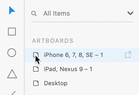
The Layers panel would now show us the layers inside this artboard, but we don’t have any yet. To go back to the list of artboards, at the top of the Layers panel click the arrow
 to the left of iPhone 6,7, 8, SE – 1.
Designing on a Grid
Designers often use grids to align elements and create a consistent visual structure for the layout. Web developers can use a grid system to code the website. While grids are not required, they are especially helpful when designing responsive sites (sites that are optimized for phones, tablets, and desktops). Grids can streamline the workflow so the design is easier to create, and then easier to code.
Grid systems typically used by web developers have specific gutter amounts and column widths for specific screen sizes. If the developer you’ll be working with is using a particular grid system, it’s best to use a matching grid. For our design we want to use the popular 12-column Bootstrap grid. If you want to learn more about Bootstrap and its grid, visit getbootstrap.com/docs/4.5/layout/grid
- The Layers panel, double–click on the artboard icon to the left of Desktop go to that artboard and zoom to fill your screen.
- In the Property Inspector on the right, under Grid check it on and make sure the menu is set to Layout.
- Below that, Columns should already be set to 12.
- Set Gutter Width to 30 and hit Return (Mac) or Enter (Windows) to apply it.
Notice the space between columns has changed.
To save you time we’ve created a Bootstrap grid template you can use, so you won’t have to measure out all the layouts grids (and add some guides that XD’s layout grid does not make).
- Go to File > Open from Your Computer or hit Cmd–Shift–O (Mac) or CTRL–Shift–O (Windows).
- Navigate into Desktop > Class Files > Adobe XD Class.
- Double–click on Bootstrap 4 Grid Template.xd to open it.
Do a File > Save As Local Document.
NOTE: File > Save As will only save Adobe XD documents into your Adobe Creative Cloud online storage.
- This page will be about NYC, so let’s put it into the appropriate folder. Navigate to Desktop > Class Files > Adobe XD Class > NYC.
Name the file About Page.xd and click Save.
If you see a message about Continue saving to your computer? click Continue.
Notice there are artboards with aqua blue columns for a layout grid sized to match Bootstrap’s specs for phone, tablet, and desktop.
Dan Rodney, a Noble Desktop instructor, created this Bootstrap grid. The template and future updates are available at danrodney.com/blog/adobe-xd-bootstrap4-grid For more info about Bootstrap’s different grid sizes, see the sidebar at the end of the exercise.
- In the Layers panel on the left, you should see a list of the three artboards.
Double–click on the artboard icon
to the left of Desktop to make the Desktop artboard fill the screen.
Adding Text
- We need to create a heading at the top left of the page. In the Toolbar, choose the Text tool
 .
. - Click anywhere on the artboard to create some text. Don’t worry about being exact, we’ll position it in a moment.
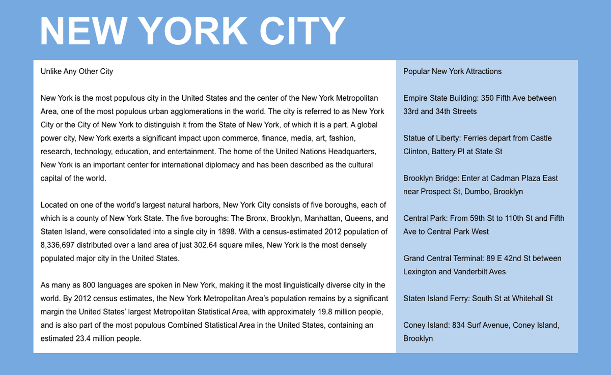
- Type New York City
- Press Esc to select the text box.
- There’s a circle resize handle on the bottom. Drag that circle down to make the text bigger (and notice the type size in the Property Inspector changes as you drag).
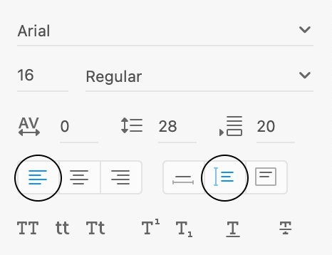
With the text selected, in the Property Inspector set the following (including the circled options):

- In the Toolbar on the left, choose the Select tool .
As shown below, drag it into position so the left edge aligns with the first solid aqua column. It won’t snap to the column, but you can line it up visually.

Importing & Styling Text
We want to make two columns of text (a main column and a sidebar). We’ve saved each column’s text as a plain text file (.txt) so you can import it directly into XD.
- Go to File > Import.
- Navigate to Desktop > Class Files > Adobe XD Class > NYC.
- We want to import two text files. Click once on Text—main.txt to select it.
- Hold Shift and click on Text—sidebar.txt so both files are selected.
- Click Import.
Two text boxes will be created in the middle of the artboard. With both text boxes selected, in the Property Inspector set the following (including the circled options):
Click in an empty area of the canvas or artboard to deselect the text.
NOTE: Line Spacing
 is the same thing as line-height in CSS (or leading in print design).
TIP: To get the default line spacing
, type 0 and hit Return (Mac) or Enter (Windows).As shown below, drag the Unlike Any Other City text box into position under the New York City heading.

As shown below, resize the width of the text box so it spans 8 of the solid aqua columns.

Now for the sidebar. Drag the Popular New York Attractions… text box so it vertically aligns with the top of the text in the main column (a smart guide should appear to help you align it) and aligns with the aqua column to the right of the main column.

Resize the width of the sidebar box so it spans the remaining 4 aqua columns:

- Click on a blank area of the artboard (not the canvas outside) to deselect.
- Let’s see how the layout looks without the layout grid choose View > Hide Layout Grid, or hit Cmd–Shift–
'(Mac) or CTRL–Shift–'(Windows). - Choose View > Guides > Hide All Guides or hit Cmd–; (Mac) or CTRL–; (Windows).
To see the design at the size it will be in a web browser choose View > 100%.
Adding Colored Backgrounds for the Columns
Text and image content typically align with the aqua columns. Backgrounds (such as colors, borders, etc.) typically align with the midpoint between the columns (marked by lines in our template). The gutters (empty space between the grid’s 12 columns) are 30 pixels, so there’s 15px from the aqua content column to the gutter midpoint line. This provides some padding around the content of each column.
- Hit Cmd–Shift–
'(Mac) or CTRL–Shift–'(Windows) to show the layout grid. - Choose View > Guides > Show All Guides or hit Cmd–; (Mac) or CTRL–; (Windows).
- In the Toolbar, select the Rectangle tool
 .
. As shown below, draw a rectangle over the four columns of sidebar text. Be sure to line it up with the gutter divider guide (not the solid aqua columns).

- In the Property Inspector, uncheck Border.
- In the Property Inspector, reduce Opacity
 to 50%.
 - In the Layers panel, double–click on Rectangle 1 and rename it to sidebar bg.
- In the Layers panel, drag the sidebar bg layer below the Popular New York Attractions… layer.
- In the Toolbar, choose the Select tool .
- The gray text is a bit hard to read. On the artboard, click on the sidebar text to select it.
- Hold Shift and click on the main column text so both text columns are selected.
- In the Property Inspector, click on Fill to open the color picker.
- Choose black and hit Esc to close the pop-up.
- In the Toolbar, select the Rectangle tool .
As shown below, draw a rectangle over the main text column. Be sure to line it up with the gutter divider guide (not the solid aqua columns).

- In the Property Inspector, uncheck Border.
- In the Layers panel, double–click on Rectangle 1 and rename it to main column bg.
- In the Layers panel, drag main column bg below the Unlike Any Other City… layer.
- Hit Cmd–Shift–
'(Mac) or CTRL–Shift–'(Windows) to hide the layout grid. - Choose View > Guides > Hide All Guides or hit Cmd–; (Mac) or CTRL–; (Windows).
That’s it for now. Save the file and close it.
NOTE: Keep in mind that when designing on Bootstrap’s grid, your design will be easier to code when you stick to the grid. You can break off the grid and do something custom, but that will require custom coding by a developer. Don’t feel restricted by the grid. Use it when you can, and break from it if needed.