Adjusting the Layout for Tablets & Mobile Phones
What This Tutorial Covers
Multi-Artboard Workflow
Phone, tablet, and desktop in one document.
Responsive Resize
Auto-adapt designs as artboards scale.
Mobile-First Practice
Design phone first, scale up to larger screens.
Noble Desktop's UX/UI Design Certificate teaches Figma — Adobe paused major XD development, so most teams have moved on.
Learn how to adeptly modify desktop-sized designs for smaller screens such as tablets and mobile phones using Adobe XD, with this comprehensive tutorial covering topics such as designing with Bootstrap’s grid and adapting designs for different devices.
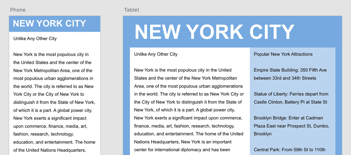
Exercise Preview
Adapting the Design for Tablets
- In the Toolbar, choose the Select tool
 .
. Let’s copy over the elements from the Desktop artboard. To make both artboards fill the screen:
- In the Layers panel, click on Tablet.
- In the Layers panel, Shift–click on Desktop.
- Zoom to the selection by hitting Cmd–3 (Mac) or CTRL–3 (Windows).
- You should only see the two artboards. Click on a blank area of the canvas to deselect both artboards.
- Click on the NEW YORK CITY text to select it.
- Hit Cmd–C (Mac) or CTRL–C (Windows) to copy it.
- Select the Tablet artboard by clicking on its name at the top left of the artboard.
- Hit Cmd–V (Mac) or CTRL–V (Windows) to paste.
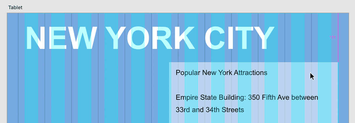
- The text is a bit large for this layout. In the Property Inspector change the size to 70 (font size is in the Text section under the font name).
Drag the text so the left edge lines up with the leftmost solid aqua column and move it up until it snaps to the top of the artboard.
NOTE: At any point during this exercise, feel free to zoom in or out as needed by holding Cmd (Mac) or CTRL (Windows) and hitting Plus(+) or Minus(-).
As shown below, on the Desktop artboard drag a selection box over the sidebar text and background color by starting your drag outside the elements, and dragging until the selection box touches the background and text. Both elements will become selected:
- Hit Cmd–C (Mac) or CTRL–C (Windows) to copy the two elements.
- Click anywhere on the Tablet artboard to switch to it. (You can verify which artboard you’re on by looking at the top of the Layers panel).
- Hit Cmd–V (Mac) or CTRL–V (Windows) to paste. It will be pasted in the center of the artboard.
- Zoom to 100% by hitting Cmd–1 (Mac) or CTRL–1 (Windows).
Position the sidebar’s right side at the far right edge of Bootstrap’s container. As shown below, move the sidebar so its right edge aligns with the far right guide. The top position is up to you, but refer to the image as a guide.
- Click on a blank area of the canvas to deselect.
- In the Tablet artboard, click on the sidebar text to select it.
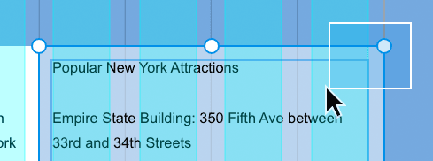
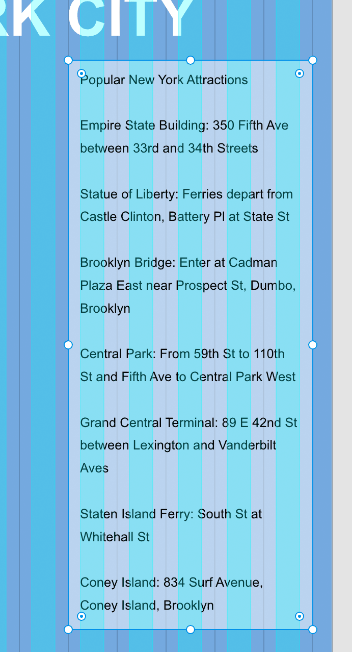
The sidebar text column needs to be narrower. Drag the text box’s left-middle handle in so it ends up being 5 columns wide (as shown below):
NOTE: The sidebar spans 4 columns on the desktop, but that’s a bit small for the tablet layout. Grid systems don’t require elements to span the same amount of columns across screen sizes. So on the tablet we’ll make the sidebar span 5 columns.
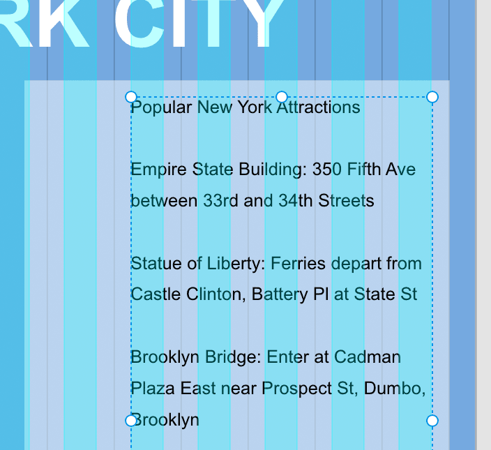
- The sidebar’s light blue background color is too short. Click on it to select it.
Drag the background color’s bottom-left handle until it’s tall enough to fit the text and it lines up with the gutter divider guide (as shown below):
If you can’t see the Desktop artboard, scroll to it by holding Spacebar and dragging.
Mac Users: If you’re using a trackpad, you can use a 2-finger drag to scroll. You can also zoom using a 2-finger pinch.
- On the Desktop artboard, drag a selection over the white background and its text (the main column) so both elements are selected.
- Hit Cmd–C (Mac) or CTRL–C (Windows) to copy them.
To paste the items onto the Tablet artboard:
- Scroll over to the Tablet artboard if needed.
- Click anywhere on the Tablet artboard to switch to it.
- Hit Cmd–V (Mac) or CTRL–V (Windows) to paste.
Now you can really see how much smaller the Tablet artboard is.
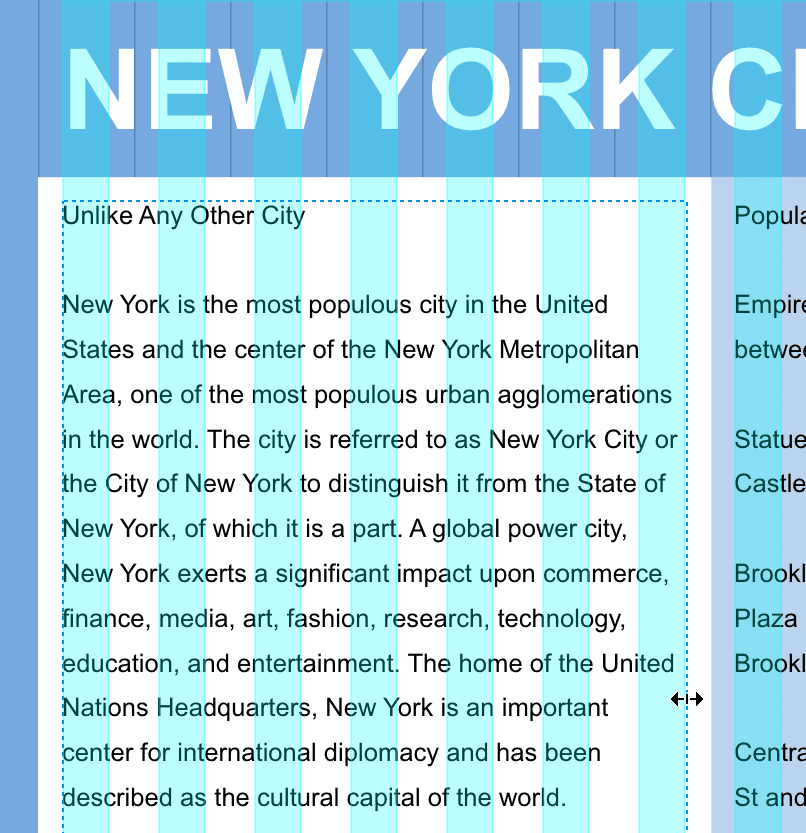
As shown below, align the white box’s left edge with the far left guide (the edge of Bootstrap’s container). It should snap into place. Vertically align it with the sidebar (which it should also snap to even though you can’t see the top of it).
- Click in an empty area of the canvas to deselect the elements.
- Click on the main column’s white background to select it.
- Pull the background’s right-middle handle inward until it snaps to the edge of the sidebar’s background.
- Select the main column’s text box.
Drag the text box’s right-middle handle so it lines up with the aqua column as shown below:
- Let’s resize the artboard so it’s tall enough to fit all the text. Click in the gray canvas outside the artboard.
- In the Layers panel, click once on the Tablet artboard.
- Drag the artboard’s bottom-middle handle down until you see all the text and some extra space (we’ll be extending the column’s white background next).
- On the Tablet artboard, click on the main column’s white background to select it.
- Drag the bottom-middle handle down so it ends below the text, with some extra space.
- Click on the sidebar’s light blue background to select it.
- Drag the bottom-middle handle down until it lines up with the white background of the main column.
- Hit Cmd–Shift–
'(Mac) or CTRL–Shift–'(Windows) to hide the layout grid. - Choose View > Guides > Hide All Guides or hit Cmd–; (Mac) or CTRL–; (Windows).
Zoom to 100% by hitting Cmd–1 (Mac) or CTRL–1 (Windows).
NOTE: You may think the padding on the left and right is a bit tight. This is the least amount of padding you’d see, because slightly larger screens will have the same width content area, but more space on the left/right sides. Padding amounts in pre-built grid systems are predefined, and you may or may not be able to customize them. For this reason, some people prefer to create their own grid systems or customize the appearance of pre-made grid systems. To keep things simple, we’re sticking with Bootstrap’s predefined grid.
Do a File > Save.