Bootstrap: More About Grids & Components
What This Tutorial Covers
Grid Modifiers
Offset, ordering, and reset classes.
Component Library
Cards, navs, modals, and other prebuilt components.
Customization
Sass overrides for branded Bootstrap implementations.
Noble Desktop's Full-Stack Web Development Certificate teaches HTML, CSS, JavaScript, React, Node.js, and the modern web stack.
Enhance your web development skills with our tutorial that covers nesting grids, adding a navbar, and other components, as well as showing and hiding elements at specific sizes for an optimized web design experience.
Topics Covered in This Web Development Tutorial:
Nesting Grids, Adding a Navbar & Other Components, Showing & Hiding Elements at Specific Sizes
Exercise Preview
Photos courtesy of istockphoto, Hakan Çaglav, Image #14393929, Renee Keith, Image #7827478.
Exercise Overview
In this exercise, you’ll learn more about Bootstrap’s grid system and components.
Getting Started
The files for this exercise pick up where the previous exercise left off, but we’ll start with a new folder in case you experimented with anything in that exercise.
- In your code editor, close any files you may have open.
- For this exercise we’ll be working with the Bootstrap More Grids folder located in Desktop > Class Files > yourname-Flexbox Grid Class. You may want to open that folder in your code editor if it allows you to.
- Open index.html from the Bootstrap More Grids folder.
Preview index.html in a browser.
- This page is the same as what you created in the previous exercise.
- Below the photo, we want to add a heading and a row of additional photos.
Leave the page open in the browser and return to your code editor.
Nesting Grids
- Switch to your code editor.
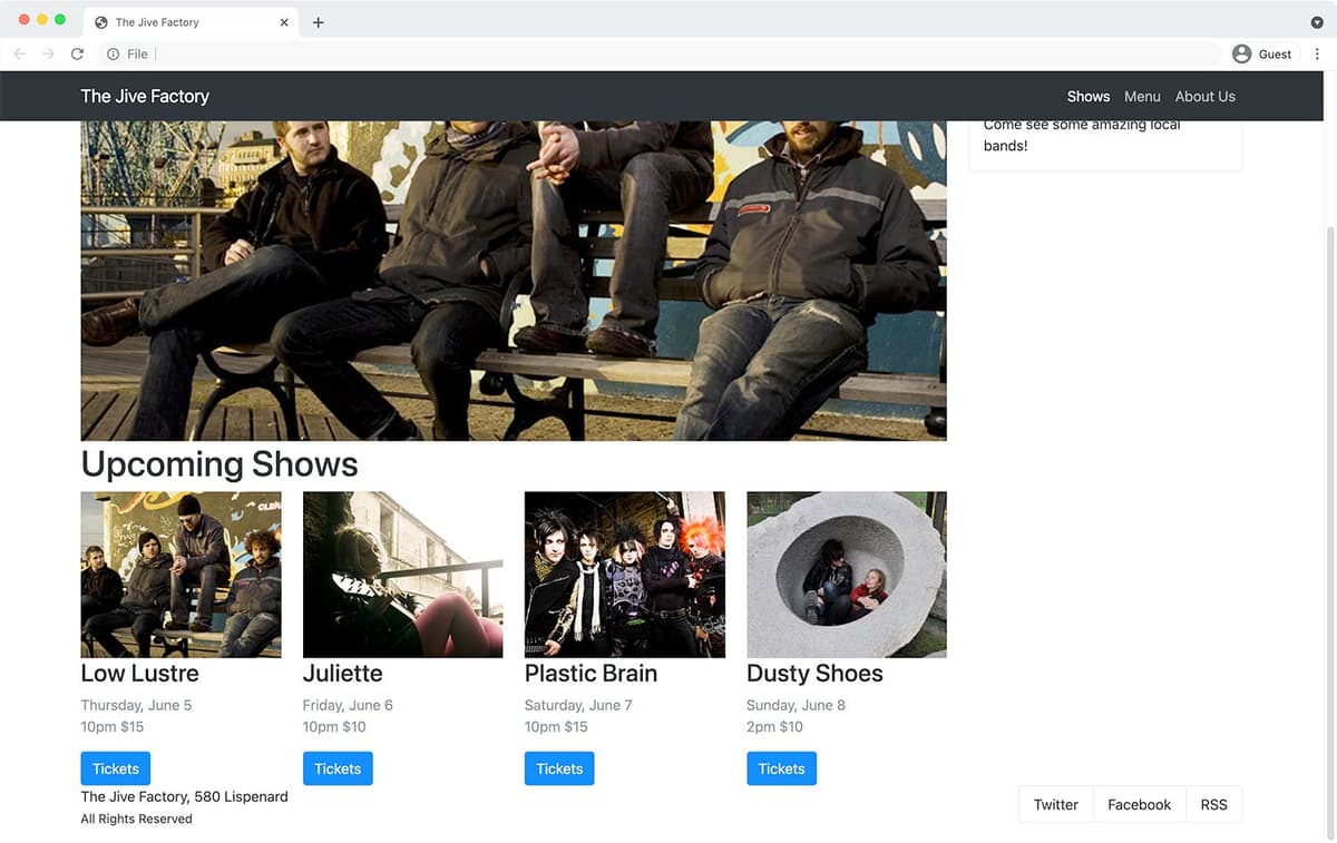
Below the image in the left column, add a heading:
<div class="row">
   <div class="col-lg-8 col-xl-9">
      <img src="img/large-low-lustre.jpg">
      <h1>Upcoming Shows</h1>
   </div>
Below the h1, add a row:
<div class="row">
   <div class="col-lg-8 col-xl-9">
      <img src="img/large-low-lustre.jpg">
      <h1>Upcoming Shows</h1>
      <div class="row"></div>
   </div>
Below the heading we want to add multiple columns, so let’s create our first column. Inside the new row div, add our first column with a placeholder image:
<h1>Upcoming Shows</h1>
<div class="row">
   <div class="col">
      <img src="img/small-plastic-brain.jpg">
   </div>
</div>
Copy and paste that column so you have a total of 3 columns:
<h1>Upcoming Shows</h1>
<div class="row">
   <div class="col">
      <img src="img/small-plastic-brain.jpg">
   </div>
   <div class="col">
      <img src="img/small-plastic-brain.jpg">
   </div>
   <div class="col">
      <img src="img/small-plastic-brain.jpg">
   </div>
</div>
Save the file and reload the page in your browser.
- Notice that the 3 images (below the Upcoming Shows heading) fit on a single line.
- Switch back to index.html in your code editor.
Create a fourth column and image, by pasting one more column:
<div class="row">
   <div class="col">
      <img src="img/small-plastic-brain.jpg">
   </div>
   <div class="col">
      <img src="img/small-plastic-brain.jpg">
   </div>
   <div class="col">
      <img src="img/small-plastic-brain.jpg">
   </div>
   <div class="col">
      <img src="img/small-plastic-brain.jpg">
   </div>
</div>
Save the file and reload the page in your browser.
- Notice how it automatically adjusts to 4 columns because the layout is using flexbox. Sweet!
- We have more info we need to add for the upcoming shows (and a different image for each). To save you typing, we’ve prepared the HTML for you.
- Switch back to your code editor.
- Open upcoming-shows.html from the snippets folder.
- Select and copy all the code.
- Close the file.
You should be back in index.html. Select the 4 column divs containing the upcoming shows:
<div class="col">
   <img src="img/small-plastic-brain.jpg">
</div>
Code Omitted To Save Space
<div class="col"> <img src="img/small-plastic-brain.jpg"> </div>- Paste to replace it with the updated code.
Save the file and reload the page in your browser.
- You should now have text below each of the 4 different band images. Notice the show date/time/price is a bit lighter than the other text, because we added a Bootstrap class of text-muted for you.
- We don’t want 4 columns on small screens. One column would be good on mobile, switching to 2 columns on slightly larger screens, and finally 4 columns on larger screens. To make 2 columns, each column will need to span 6 Bootstrap columns (6+6=12).
- Switch back to your code editor.
Set the following sizes on all 4 columns under the Upcoming Shows:
<div class="col-sm-6 col-xl-3">
   <img src="img/small-low-lustre.jpg">
Code Omitted To Save Space
<div class="col-sm-6 col-xl-3">
   <img src="img/small-juliette.jpg">
Code Omitted To Save Space
<div class="col-sm-6 col-xl-3">
   <img src="img/small-plastic-brain.jpg">
Code Omitted To Save Space
<div class="col-sm-6 col-xl-3">
   <img src="img/small-dusty-shoes.jpg">
Save the file, reload the page in your browser, and notice:
- By starting columns on sm (small) screens, xs (extra small) screens will not be columns and will therefore stack. On sm (small) screens and wider we have 2 columns. On xl (extra large) and wider we have 4 columns.
- The images on mobile would look better if they scaled up to fill the entire width. We could do this via CSS, but Bootstrap offers a class to do this as well.
- Switch back to your code editor.
Add the following class on all 4 images:
<div class="col-sm-6 col-xl-3">
   <img src="img/small-low-lustre.jpg" class="w-100">
Code Omitted To Save Space
<div class="col-sm-6 col-xl-3">
   <img src="img/small-juliette.jpg" class="w-100">
Code Omitted To Save Space
<div class="col-sm-6 col-xl-3">
   <img src="img/small-plastic-brain.jpg" class="w-100">
Code Omitted To Save Space
<div class="col-sm-6 col-xl-3">
   <img src="img/small-dusty-shoes.jpg" class="w-100">
Save the file and reload the page in your browser.
- Resize the window to see that when the upcoming shows stack, the images are now the full width of the page. That looks much better.
- The Tickets links would be nicer if they looked like buttons. Luckily, Bootstrap has classes we can use.
- Switch back to your code editor.
Add the following classes to each of the 4 Tickets links:
<a href="#" class="btn-primary">Tickets</a>NOTE: There are other button styles (btn-secondary, btn-warning, btn-danger, and more) which you can see at getbootstrap.com/docs/5.0/components/buttons.
Save the file and reload the page in your browser to see that the Tickets links now look like buttons.
Showing & Hiding an Element at Specific Sizes
- Switch back to your code editor.
For small screens, hide the large image that’s above the Upcoming Shows h1 by adding the following classes.
<img class="d-none d-lg-block" src="img/large-low-lustre.jpg">
<h1>Upcoming Shows</h1>
NOTE: The d-none sets display to none on all screens. The d-lg-block changes display to block on lg and xl screens.
Save the file and reload the page in your browser.
- Notice the large image above the Upcoming Shows heading is hidden on smaller screens, and visible on larger screens.
Adding a Navbar
Let’s add the website’s navigation at the top of the page. To start, we’ll use the navbar code we copied from the Bootstrap website.
Switch back to your code editor and open navbar.html from the snippets folder.
NOTE: This (and all other Bootstrap code) is found on Bootstrap’s website. The navbar code can be found at getbootstrap.com/docs/5.0/components/navbar
- Select and copy all the code.
- Close the file.
- You should be back in index.html.
Paste the code after the start of the body tag, as shown below:
<body>
   <nav class="navbar-expand-lg navbar-light bg-light">
Code Omitted To Save Space
</nav>
   <div class="container">
      <div class="row">
This navbar collapses on smaller sized screens, creating a menu icon that expands when you click on it. This effect uses JavaScript, so we need to add the Bootstrap JS file to our page.
At the bottom of the page, add the following link:
</div>
   <script src="js/bootstrap.min.js"></script>
</body>
Save the file and reload the page in your browser.
- Resize the window to see that on smaller screens the navbar will collapse to a 3-lined menu button (often called a hamburger icon because it’s like a hamburger patty in a bun) at the top right of the page.
- Click the hamburger icon a couple times to expand and collapse it.
- Switch back to your code editor.
Let’s start replacing the placeholder content with real text, and removing things we don’t need.
Replace the Navbar placeholder title with The Jive Factory as shown below:
<div class="container-fluid">
   <a class="navbar-brand" href="#">The Jive Factory</a>
As shown below, replace Home and Link, with Shows and Menu:
<ul class="navbar-nav me-auto mb-2 mb-lg-0">
   <li class="nav-item">
      <a class="nav-link active" aria-current="page" href="#">Shows</a>
   </li>
   <li class="nav-item">
      <a class="nav-link" href="#">Menu</a>
   </li>
The ul tag navbar-nav you’re working in has 4 li tags.
- Keep the first 2 li tags (which contain the Shows and Menu links we just made).
- Delete the next 2 li tags (the nav-item dropdown and the last li tag which contains a disabled link).
- Your list should end up with only 2 li tags, as shown below:
<ul class="navbar-nav me-auto mb-2 mb-lg-0">
   <li class="nav-item">
      <a class="nav-link active" aria-current="page" href="#">Shows</a>
   </li>
   <li class="nav-item">
      <a class="nav-link" href="#">Menu</a>
   </li>
</ul>
Let’s make one more link. Copy and paste the Menu list item:
<ul class="navbar-nav me-auto mb-2 mb-lg-0">
   <li class="nav-item">
      <a class="nav-link active" aria-current="page" href="#">Shows</a>
   </li>
   <li class="nav-item">
      <a class="nav-link" href="#">Menu</a>
   </li>
   <li class="nav-item">
      <a class="nav-link" href="#">Menu</a>
   </li>
</ul>
In the second Menu list item, change the text to About Us:
<li class="nav-item"> <a class="nav-link" href="#">Menu</a> </li> <li class="nav-item"> <a class="nav-link" href="#">About Us</a> </li>- Below the list, we don’t need the search form, so delete the entire form tag.
Save the file and reload the page in your browser.
- Resize the browser window and notice the hamburger menu appears at a screen size that is still capable of showing the menu items we have. We can change this.
On the nav tag, change the navbar-expand size from lg to sm as shown below:
<body>
   <nav class="navbar-expand-sm navbar-light bg-light">
Save the file and reload the page in your browser.
- Resize the window to see that the hamburger icon now only displays at smaller screens, so we see the 3 nav links at more screen sizes.
- Switch back to your code editor.
Switch to a dark navbar by changing light to dark (in 2 places):
<nav class="navbar-expand-sm navbar-dark bg-dark">Save the file and reload the page in your browser.
- The navbar should now be a dark gray.
- On wide screens we’d like the 3 nav links to be on the right side.
- Switch back to your code editor.
On the navbar-nav list, change me (which stands for margin end… like flex end versus start) to ms (which stands for margin start) and shown below:
<ul class="navbar-nav ms-auto mb-2 mb-lg-0">Delete the mb (margin bottom) classes so you end up with the following:
<ul class="navbar-nav ms-auto">Save the file and reload the page in your browser.
- The 3 nav links should now be on the right side of wide screens.
- Switch back to your code editor.
Make the navbar stick to the top of the screen by adding sticky-top to the nav tag:
<nav class="navbar-expand-sm navbar-dark bg-dark sticky-top">Save the file and reload the page in your browser.
- Make the page short enough to scroll.
- As you scroll notice the navbar remains fixed to the top of the screen.
- Moving onto a different issue… make the window wide enough so you can see how the navbar’s content extends to the far left/right and does not align with our columns of content. You may like that, but let’s see how to make it align if that’s what you prefer.
- Switch back to your code editor.
To constrain the navbar’s content to the same width as the page’s content, change container-fluid to container as shown below:
<nav class="navbar-expand-sm navbar-dark bg-dark sticky-top">
   <div class="container">
Save the file and reload the page in your browser.
- The navbar’s content should now align with the columns on the page. How you want to style your navbars is up to you, so this change is optional. We’re just showing you some options.
- Isn’t it cool what we could do using only Bootstrap’s provided CSS and JS? So far we’ve done everything by only writing HTML (except for 2 basic CSS rules)!