CSS Transitions
What This Tutorial Covers
transition Property
Smooth changes between CSS values over time.
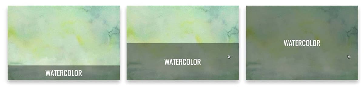
Hover Transitions
Most common use case — smooth hover state changes.
Performance
Transition transforms and opacity for GPU acceleration.
Noble Desktop's Front-End Web Development Certificate teaches HTML, CSS, and JavaScript — the complete front-end foundation.
Delve into this comprehensive HTML and CSS tutorial, which provides an in-depth exploration of CSS3 transitions, transitioning position coordinates, adding easing with transition-timing-function, and custom easing with Ceaser.
Exercise Preview
Custom Easing with Ceaser
There are ways to customize the transition-timing-function (ease). Trying to figure out the coordinates of complex cubic Bézier curves is quite a headache, but luckily for us, developer (and former Noble Desktop instructor) Matthew Lein put together Ceaser (CSS Easer = Ceaser), a handy code generator that outputs CSS snippets with cubic-bezier coordinates you can easily customize.
- In a new browser tab/window, go to matthewlein.com/tools/ceaser
From the Easing menu, choose easeOutExpo.
This list of presets includes approximations of most Penner Equations. You can also create your own custom easing curve using the graph.
Penner Equations
Robert Penner is a Flash developer who is well-known for his open source Flash innovations. The “Penner easing functions” are a de facto standard that now power numerous animation libraries in multiple languages, from jQuery to the GreenSock Animation Platform (GSAP), to CSS and more. For more info visit robertpenner.com/easing
- Set the Duration to 300 (that’s 300 milliseconds or 0.3 seconds).
- Click the Height button a few times to preview the look of this animation.
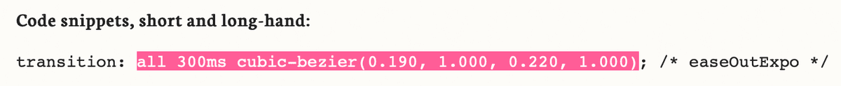
Select the transition values as shown below and copy it.
- Switch back to main.css in your code editor.
In the rule for .category.description, replace the transition’s current values by pasting in the custom cubic-bezier values so the code looks like this:
.category.description {Code Omitted To Save Space
transition: all 300ms cubic-bezier(0.190,1,000,0.220,1,000); }- Save the file, then reload the page in your browser.
Hover over the photos and notice the animation starts out fast and slows down at the end, so the transition feels snappier.