Animating the Panorama & Making the Layout Responsive
What This Tutorial Covers
CSS Animation
Keyframe and transition-based animation in pure CSS.
Media Queries
Responsive breakpoints for phones, tablets, and desktops.
Performance
Animation choices that perform well on every device.
Noble Desktop's Front-End Web Development Certificate teaches HTML, CSS, and JavaScript — the complete front-end foundation.
Learn how to animate a panorama background photo and make it responsive to any screen size using CSS3 in this exercise.
Exercise Preview

Disabling the Fixed Background Images on Mobile Devices
In a previous exercise we made the background images remain fixed to the window as we scroll, creating a cool scrolling effect. As we mentioned in that exercise, that scrolling effect won’t work on mobile devices, or can cause display issues on iOS. Let’s see how we can disable that effect on mobile devices.
- Return to style.css in your code editor.
Using CSS media queries we can change the styling of elements based on the size of the web browser. Above the first set of keyframes type the following bold code:
@media (max-width: 600px) {

}
@-webkit-keyframes moving-bg {
NOTE: This code is a CSS media query. Any styles placed inside the media query will not be applied, unless the media query is true. This media query means “for any browsers 600 pixels wide or less, use the following styles.” A browser wider than 600 pixels would not use the styles we’re about to code.
Add the following bold code:
@media (max-width: 600px) {
   .feature-wrap.photo {
      background-attachment: scroll;
   }
}
NOTE: When two CSS rules target the same element in the same way, they are equally specific. When specificity is equal, a later rule overrides an earlier rule. This rule comes farther down in the code, so it overrides a rule above that sets background-attachment: fixed;
- Save the file and preview it in Chrome (so we can use it’s DevTools).
- Resize the browser window so it’s large (more than 600 pixels) and notice that the photo backgrounds are still fixed to the page as you scroll.
- Resize the browser to be smaller than 600 pixels wide, and notice the backgrounds now scroll along with the page. This will work properly on mobile devices.
- Resize the window as large as you can make it.
- To open the DevTools, CTRL–click (Mac) or Right–click (Windows) on the page and choose Inspect.
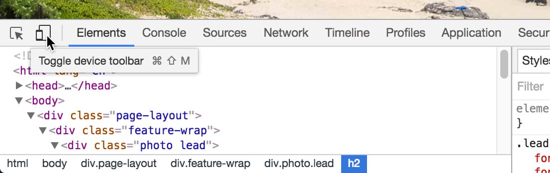
As shown below, at the top left of the DevTools window, click the Toggle device toolbar button
 :
:
As shown below, at the top left of the emulator you can choose a device. As shown below, choose the iPad Pro.

- Reload the page to make sure it’s displayed properly.
Scroll the page to see that the background images are fixed. While it appears to work fine in here, Chrome is emulating the iPad Pro size, not the iOS Safari rendering engine. On the iPad these images will be sized wrong and look bad.
While our CSS media query took care of a large majority of mobile devices, some tablets (such as the iPad) are bigger than the 600px we used and will still have the fixed background attachment (which is a problem on these devices). We could make the media query larger to accommodate them, but the iPad Pro is 1366px when held horizontally. If we make the media that large, we’d disable the scrolling effect for many desktop users who could see it! That’s not a good solution.
CSS can’t differentiate between desktop and mobile devices, so we’ll need to use a bit of JavaScript. Don’t worry if you don’t know JavaScript, we’ve written the code for you!
- Keep the page open in Chrome with the Device Toolbar open so we can reload it after making some changes.
- Switch back to your code editor.
- Open Hawaii > snippets > mobile-detection.html
- Select all the code in the file.
- Copy the code.
- Close mobile-detection.html.
- Switch to index.html in your code editor.
- Find the
<body>tag around line 14. Paste the code just below the body tag:
<body>
<script>
   var isMobile = navigator.userAgent.match(/(iPhone|iPod|iPad|Android)/);
   if( isMobile!= null ) {
      document.body.className += ' ' + 'mobile';
   }
</script>
This code detects iPhone, iPod, iPad, or Android devices. If it detects one of those mobile devices, it adds a mobile class to the body tag that we can use to create styles specific to mobile devices.
Detailed Explanation: When you visit a website, a line of text (called a user agent string) is reported to the browser. Our JavaScript searches that text for iPhone, iPod, iPad, or Android. If it finds one, it returns what it finds, otherwise nothing (null) is returned. If it finds one of those devices, we add a mobile class to the body tag. We can then use CSS to target mobile devices with the mobile class added by JavaScript!
- Save the file.
- Return to style.css.
Find the .feature-wrap.photo rule (which starts around line 88) and below that add the following bold code:
.feature-wrap.photo {
   background-repeat: no-repeat;
   background-position: center;
   background-size: cover;
   background-attachment: fixed;
}
.mobile.feature-wrap.photo {
   background-attachment: scroll;
}
NOTE: This rule will only be applied if JavaScript detects an iPhone, iPod, iPad, or Android device. If someone has JavaScript disabled, the other CSS rule we created in the 600px media query will still take care a lot of mobile devices.
Switch back to Chrome and reload the page.
NOTE: While Chrome does not use the iOS Safari rendering engine, this emulator does spoof the user agent string so the page will think that it’s on an actual iPad Pro (which means our JavaScript should work).
- Try scrolling now, and you should see the background images scroll with the page, so it will now work properly in mobile phone and tablets.
- Close the DevTools window by clicking the X at the top right.
- Reload the page to make sure it’s displayed properly.
Try scrolling again, and if the window is more than 600px wide the background images should be fixed. Now the fixed scrolling effect works everywhere we want it to, and is turned off anywhere it won’t work. Awesome!