Becoming an Accessibility-Conscious Designer: Mobility & Cognition
Accessibility Design Checklist
Noble Desktop's UX/UI Design Certificate covers accessibility, inclusive design, and the user research methods that keep real users at the center of every decision.
The importance of designing web content that is accessible to blind or vision-impaired users, and deaf or hearing-impaired users, is widely understood. But that does not end the process of creating accessible content.

Mobility and cognition are new frontiers in graphic and user experience design. Making web content accessible to disabled people, or people with mental health issues of various kinds, presents new challenges and new opportunities for designers. Arming yourself with an understanding of what that means enhances your value as a graphic or UX/UI designer.
Designing for Mobility-Impaired Users

Web design for mobility-impaired users means designing websites that can be navigated, and content that can be accessed, without a mouse. Mouseless functionality helps:
- Amputees
- People with paralysis
- People with Carpel-Tunnel Syndrome
- People who have difficulty with precise hand movements
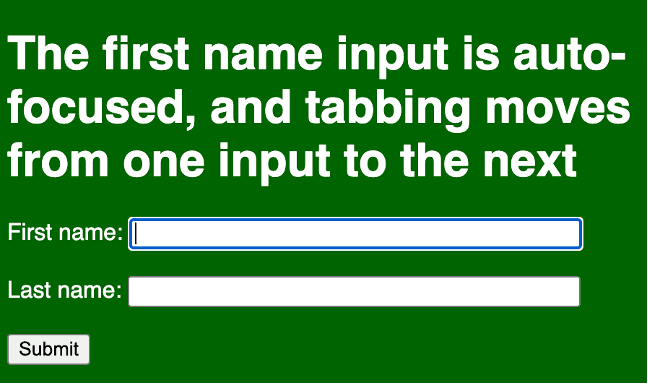
As is the case in much of accessible design, the key is using best practices. Forms created with automatically focused (selected) inputs can be completed without a mouse. And labels make it easier for people who have trouble controlling a mouse to select an input.
So, for example, this code:
<form action="/signup.php">
<label for="fname">First name:</label>
<input type="text" id="fname" name="fname" size=45 autofocus><br><br>
<label for="lname">Last name:</label>
<input type="text" id="lname" name="lname" size=45 ><br><br>
<input type="submit">
</form>
Creates this keyboard-accessible form.
Avoiding Flickering, Flashing, and Strobing

Another dimension of designing for physically challenged users is avoiding flashing or flickering that can trigger seizures in people with Epilepsy or other neurological disabilities. While it is technically possible to create flickering or flashing content with HTML, CSS, or other technology (like JavaScript), a more common issue is video.
A widely applied standard is avoiding content that flickers or flashes more than three times a second. Avoiding or minimizing flashing that can trigger medical conditions falls under the Operable category in universally recognized Web Content Accessibility Guidelines (WCAG).
If flashing is really essential in a graphic design, there are options for making the content accessible to people who cannot be subjected to flashing. WCAG has a specific formula for calculating a basic level of compliance if flashing is dim and limited to a small area. Flashing is strictly prohibited under Success Criteria 2.3.2 (Level AAA), which is more stringent.
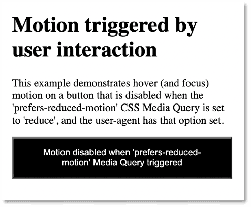
When it is essential to include flickering or flashing video in a website, warning signs and messages can be used to alert users who are subject to negative medical impact if flashing is used. Users can be given the option to avoid seeing the video (as in the screengrab from TikTok earlier in this section).
Another option is to create a media query (HTML code that detects a user’s environment and provides alternate CSS) that can be used to prevent the display of flashing video, and alert users that this is happening.
Designing for Maximum Cognition

What is Cognitive Accessibility?
Cognitive impairment is more complex and more challenging to measure than other elements of accessibility. It involves physical and psychological issues, including some considered personal and private that are not easily measured (like depression or anxiety).
Cognitive accessibility is probably at the end of most designers’ focus when it comes to creating accessible design. Yet it may well have the widest direct applicability. And it undoubtedly has the most collateral applicability in the sense that closed captioning helps people who are deaf but everyone else. Like a lot of a lot of accessibility innovations help a much wider audience.
Specific medical conditions that need to be taken into consideration in accessible design include:
- ADHD
- Alzheimer’s Disease
- Aphasia
- Autism
- Dementia
- Dyslexia (reading, writing, spelling words out of order)
- Dyscalculia (inability to preform math calculations)
But there are also what we might call “external” cognition factors that should be taken into consideration in accessible design, including:
- Mental or physical exhaustion
- Depression
- Distraction (a user has something on her mind, or is being distracted by environmental events)
- Anxiety
While cognitive disabilities are hard to pin down, wide ranging, and very personal, those challenges open the door to graphic and web design that is accessible to everyone.
How so? Well, think about it: creating a user experience (UX) and user interface (UI) that works for a distracted, or sleepy user, or someone who has short-term memory issues, tends to create a more inviting, accessible experience for all users. Who among us, for example, hasn’t had their attention pulled in different directions while engaging web content?
Does this mean there are no rules, no protocols, no techniques specific to design that is accessible to cognitively-impaired users? Kind of. But there are some basic dos and don’ts.
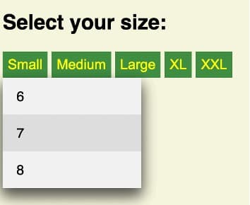
Avoid providing overwhelming, confusing, or an unnecessarily large set of options for users. Keep menus to five options or less if at all possible. Replace a menu like this:

With one like this:
Provide clear guidance in filling out forms, including meaningful and timely error messages. Find a sleep-deprived tester, ask them to fill out a long form in a short period of time with a lot of distracting light and sound in the room, and see which of the following sets of options they click reflexively.

Or…

If you are saying to yourself: “That’s obvious!” You’re right. But you’re also pointing to an important method: keep options as simple as possible. You’ll be making interaction accessible to cognitively impaired users, but also to everyone.
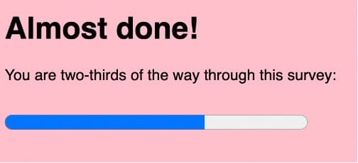
You can make content for users suffering from anxiety more accessible by letting them know where they stand in the process of whatever it is they are doing. If they are filling out a form, let them know how much more they have to do. If they are waiting on a download or upload, provide a progress bar.
Here are some basic principles and techniques with wide applicability for improving cognitive accessibility:
- Make logging into a site as simple as possible (without compromising security).
- Channel users’ attention to key content.
- Provide content in several formats; if you use video, provide a transcript.
- Organize instructions in clear steps with progress indicators.
- Design clear error signals and easy error recovery to make forms simple to finish.
- Use consistent styling, for example, design links that are blue when not visited but purple when visited.
- Filter out distractions.
- Provide intuitive navigation and layout.
As you can see in these examples, identifying and addressing accessibility for cognitively-impaired users is both complex, and a matter of just plain good, coherent, thoughtful user experience and user interface design.
Key Takeaways